Tag Archives: Google Earth

Ask a Techspert: How do satellite images work?

When flying, I am firmly a window seat person. (And I can’t wait to start flying again… or at least get out of my apartment.) Not because I’m annoyed by the beverage cart hitting my elbows (though I am), or because I like to blankly stare out at the endless sky (which I do), but because I enjoy looking down at the streets, buildings and skyline of my destination as we land. It’s thrilling to watch cars move, see skyscrapers cast shadows on the street or check out the reflection of the sun in a body of water. For most of human history, it was impossible to even imagine what Earth looked like from above, and only in the past century have we been able to capture it. 

Today, satellite imagery is one of the most popular features on Google Maps. Capturing the world from above is a huge undertaking, matching millions of images to precise locations. But how does satellite imagery actually work? How often are images updated? What are some of the biggest challenges to bringing satellite imagery to more than 1 billion users?

To answer these questions, I reached out to our satellite imagery techspert, Matt Manolides. Matt is Google’s Geo Data Strategist. He’s worked at Google for over 14 years and he gave me an aerial view (pun intended) of how satellite imagery works.

How do we accumulate the images used in Google Maps? Do we actually use satellites? 

The mosaic of satellite and aerial photographs you can see in Google Maps and Google Earth is sourced from many different providers, including state agencies, geological survey organizations and commercial imagery providers. These images are taken on different dates and under different lighting and weather conditions.

In fact, there’s an entire industry around doing aerial surveys. Companies cut holes in the bottom of planes, and cameras take pictures as they fly overhead. In many areas around the world, this is happening constantly. In parts of the world where there isn’t an established aerial survey market, we rely on satellites. With aerial surveys, we get very high-quality images that are sharp enough to create detailed maps. Satellites produce lower-quality imagery, but are still helpful because they provide global coverage. 

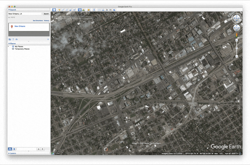
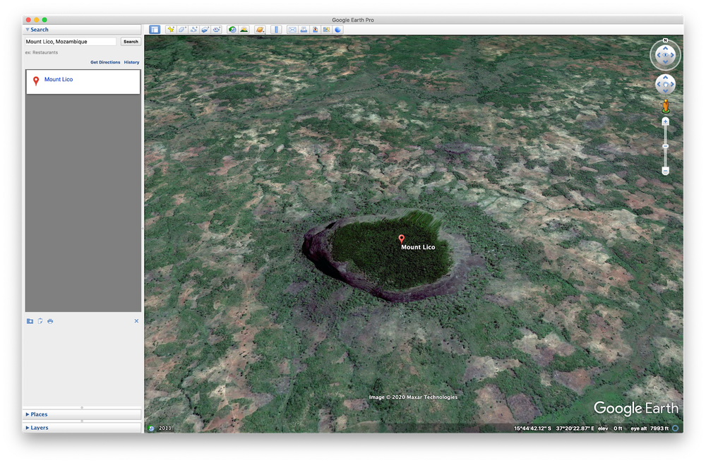
Today, you can explore 36 million square miles of high-resolution satellite images in Google Maps and Google Earth, which covers more than 98 percent of the entire population.

When do the images meet the map? 

“Google obtains commercially-available satellite imagery from a range of third parties, and our team stitches the images together to create a seamless map,” Matt tells me. This is a process called photogrammetry and, according to Matt, we’re increasingly able to automate our photogrammetry process using machine learning to help accurately place images and improve resolution. 

For aerial data, the images are delivered on hard disks and we upload them into Google Cloud. For satellite imagery, the data is uploaded directly from our providers to Google Cloud. The imagery is delivered in a raw format, meaning it’s not yet positioned on the ground and is separated into red, blue and green photos, as well as panchromatic images, which includes finer details. We then combine the jumble of images so they all line up and have an accurate placement in the real world, and generally look beautiful.  

Hard drives with satellite imagery in a room

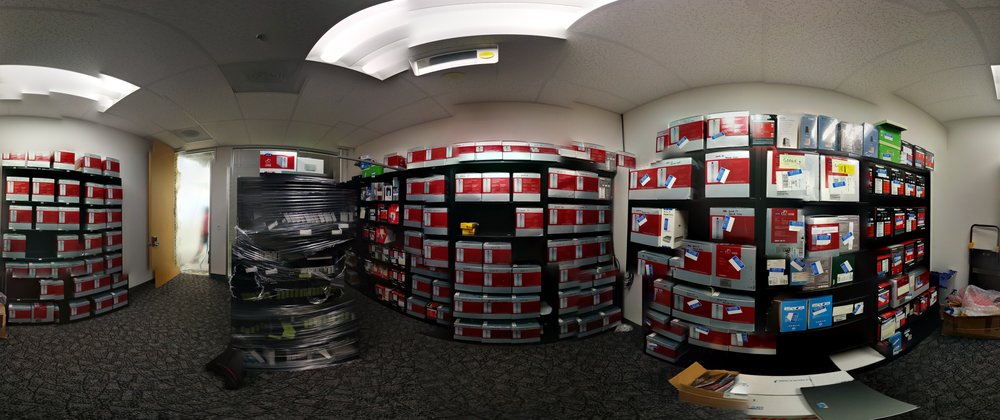
Rooms full of hard drives, each one jam-packed with aerial images.

How often do you update satellite images? 

“We aim to update satellite imagery of the places that are changing the most,” Matt says. For instance, because big cities are always evolving, we try to update our satellite images every year. For medium-sized cities, we try to update images every two years, and it goes up to every three years for smaller cities. Overall our goal is to keep densely populated places refreshed on a regular basis and to keep up with a changing world, so we will refresh areas more frequently when we think there’s lots of building or road construction going on.

Why do we sometimes see mysterious objects on Maps? What are they? 

Matt explains that sometimes the way the images are collected can create optical illusions. One of the most common instances of this are “sunken ships,” which are actually regular, operating ships that might appear underwater due to the way the satellite imagery gets layered together. Other times, sunlight can reflect off something shiny, and it will look like a strange white object that some believe are haunted houses or other such spookiness.

sinking_ship.png

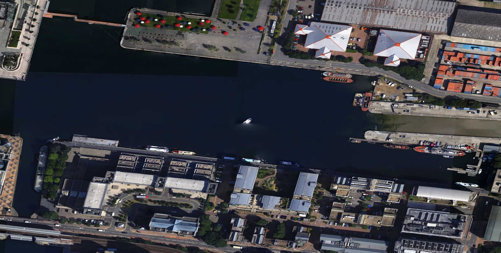
A spooky "sunken ship" illusion in London. 

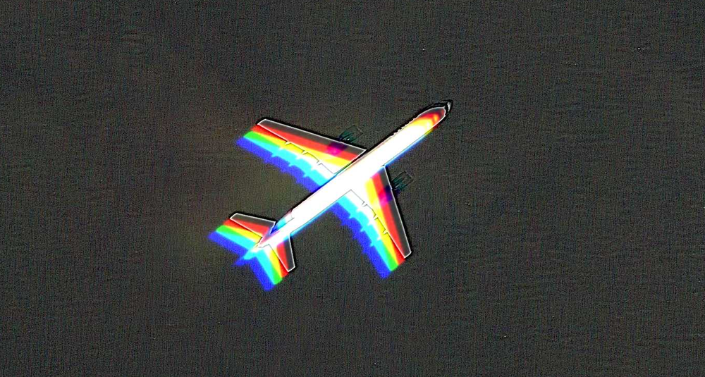
Because the satellite cameras take multiple pictures at the same time, but in different color spectrums, a fast-moving object, like a plane, can look strange, like several identical but differently-colored planes flying over each other. 

"Rainbow" plane image

As for Matt, his favorite part is finding public events that are happening when the images are captured. From hydroplane races to car shows, it’s fascinating to see events in the overhead imagery. 


“When I was a kid growing up in Seattle, I always loved the hydroplane races that would happen each summer. It was a thrill to realize that we captured one from the air back in 2010,” Matt says. “The imagery isn’t visible in Google Maps anymore, but you can still see it using Google Earth Pro’s Historic Imagery feature, which lets you browse our full catalog of imagery.”

Hydroplane races

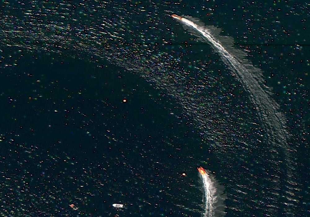
A hydroplane race on Lake Sammamish, Washington, on June 10, 2010. 

Source: Google LatLong


How we’re supporting climate action in European cities

Climate action can have the biggest impact in cities, which are responsible for 70 percent of the world's CO₂ emissions. That’s why we committed to helping more than 500 cities reduce 1 gigaton of carbon emissions annually by 2030 as part of our ambitious plan for climate action. To help reach that goal, ICLEI-Local Governments for Sustainability, with grant support from Google.org, is funding six projects. The projects will use actionable data to test new strategies that can reduce emissions and improve air quality in cities across Europe. 

ICLEI is a global network of more than 1,750 local and regional governments committed to sustainable urban development. Last fall, we granted $4 million in funding to them to establish the ICLEI Action Fund and support nonprofits and academic institutions in Europe and Latin America that are leading data-driven climate action efforts. Here’s a look at the projects that have been funded and what we’ve learned so far. 

Projects selected for funding across Europe

 The Centre for Sustainable Energy plans to establish an open-source, city-wide energy dataset in Birmingham, England. The team will also develop analysis tools that can model decarbonisation options for buildings in the city, overlay and integrate public datasets, and aggregate granular socioeconomic data. 

With these tools, the Centre hopes to develop city-wide interventions and smaller community initiatives that will help the city reach its overall decarbonisation goals. “By combining emissions data for buildings, transport, and energy infrastructure with socioeconomic data, and distributing local community grants, we’ll be able to help residents deliver targeted carbon reduction projects, and support the City Council and Route to Zero Task Force to deliver their city-wide climate emergency ambitions,” said Rachel Coxcoon, Programme Director at the Centre for Sustainable Energy. 

In Hamburg, the CityScienceLab of the HafenCity University will develop a tool incorporating data from Google’s Environmental Insights Explorer (EIE), Hamburg’s urban data platform and other sources. With this tool, they plan to help the city identify areas that can be used as “urban testbeds” for prototyping energy innovations in the Altona, Norg and Bergedorf districts. The prototyping process will help visualise and simulate projects to better understand their projected impact on the city. 

Other Action Fund grantees and their projects include: 

  • Deutsche Umwelthilfe in Berlin: To help the city reach its air quality and carbon-free transport goals, they plan to analyze data about air quality, noise levels and traffic, and use EIE to advocate for data-driven changes to cycling and other transportation infrastructure.
  • Carbon Co-Op in Greater Manchester: Working with local partners, they'll develop multi-sector energy plans for the regions and pilot three citizen-led projects focused on sustainable mobility and energy-efficient buildings. A newly developed urban energy dashboard will help them track impact. 
  • Miljopunkt Amager in Copenhagen: Using Google Air View, traffic data and community-collected data, they’ll test new urban space designs that may improve air quality. 
  • Air Pays de la Loire in Nantes: Using real-time air quality datasets that account for traffic conditions, they will provide citizens and local authorities with tools to make decisions about transportation management and traffic regulation systems.

The latest insights from cities taking data-driven climate action 

Through these projects, we’ve seen how cities are thinking about data-backed sustainability planning and action. So far, we’ve seen trends that can be applied globally.  

First, starting small can lead to a big impact—especially when it comes to data. City-level data can point decision-makers in the right direction, while neighborhood or district data can create the necessary community buy-in for more specific programs or interventions. Second, actionable data can help citizens make informed day-to-day decisions and take action. After all, informed citizens are a critical piece of the puzzle. Last, we saw a huge interest in cities looking to improve air quality through more efficient and low-carbon transportation options. 

To have a meaningful impact on climate change, data-driven approaches must be scaled across the globe. That’s why Google.org provided ICLEI’s Global Secretariat with additional funding to develop case studies so they can share best practices that emerge from the Action Fund with cities around the world that are looking to implement similar data-driven climate interventions. 

 One of our goals at Google is to unlock climate ambitions with data, insights, and innovation to overcome today’s climate crisis. We’re excited to continue supporting leading organizations, such as ICLEI, and cities that share that goal. 

Image Credit: Google Earth image of Paris, France 2019, Aerodata International Surveys, Maxar Technologies, The GeoInformation Group | InterAtlas

Source: Google LatLong


Environmental Insights Explorer Expands: 100 Australian councils and counting

Environmental Insights Explorer 

Reducing greenhouse gas (GHG) emissions is a crucial step in fighting the climate crisis. And cities now account for more than 70 percent of global emissions. But measuring exactly which activities—whether it’s buildings, cars, or public transport—are contributing to emissions, and by how much, is complex. Without this information, cities can neither understand the challenges they face, nor the impact of their environmental policies. 

This is the problem we’re working to solve with Environmental Insights Explorer (EIE), an online platform that provides building and transportation emissions, as well as solar potential analysis to make it easier for cities to measure progress against their climate action plans. Launched in 2018 for a handful of cities around the world including Melbourne, with Sydney, Canberra and Adelaide then added in 2019, EIE has helped councils accelerate GHG reduction efforts. Today, we’ve expanded EIE data access to thousands of cities worldwide, including 100+ Australian councils. 

To scale data access to local governments, policy makers and community groups, we’re also developing partnerships with leading Australian organisations, councils, and climate change experts. This includes a new partnership with Ironbark Sustainability and Beyond Zero Emissions to make EIE transportation data available for 100+ councils in Snapshot—a free tool that calculates major sources of carbon emissions, including stationary energy, transport, waste, agriculture, and land-use change. Snapshot allows municipalities to easily compare their sources of carbon emissions. This data integration will provide updated GHG profiles and enable local government policy decision-making for more than 86 percent of the country's population to put councils on a fast track for delivering commitments, building local resilience, and ensuring economic recovery. 
Accelerated city-wide analysis 
By analysing Google’s comprehensive global mapping data together with GHG emission factors, EIE estimates city-scale building and transportation carbon emissions data with the ability to drill down into more specific data such as vehicle-kilometres travelled by mode (automobiles, public transit, biking, etc.) and the percentage of emissions generated by residential or non-residential buildings. 
The insights that EIE provides have traditionally required many months of research, and a lot of resources for cities undertaking a climate action plan. Using Google’s proprietary data coupled with machine learning capabilities, we can produce a complete survey of a city that can be assessed very quickly. In this way, EIE allows cities to leapfrog tedious and costly data collection and analysis. 
EIE transport data now available in Snapshot for 100+ councils 

The next chapter 
Over the next few months, we’ll be working together to help Australian councils learn more about data insights from EIE and expand data coverage to more councils. We hope that by making EIE data accessible to more councils across Australia, we’ll help nurture an ecosystem that can bring climate action plans to life. 


Cities: where climate action can have the most impact

Cities bring people and ideas together. They increase living standards, spur innovation, increase opportunity, and encourage collaboration. Cities can also be the most environmentally sustainable way for people to inhabit our planet, if we can address the reality that cities are currently responsible for 70 percent of the world’s CO₂ emissions. While this may seem like an insurmountable challenge, it’s actually a tremendous opportunity. Cities can become centers of climate action, and lead the world in driving economic recovery and resilience. 

As part of Google's most ambitious decade of climate action, we’re making a commitment to help more than 500 cities and local governments reduce an aggregate of 1 gigaton (that’s one billion tons) of carbon emissions per year by 2030 and beyond.

To do this, we'll empower city planners and policymakers with the Environmental Insights Explorer (EIE), a platform we developed by analyzing Google’s comprehensive global mapping data together with standard greenhouse gas (GHG) emission factors. Today, we’re expanding access to EIE, going from 122 cities with access to more than 3,000 cities worldwide—a 25-fold increase. We’re also partnering with leading organizations, like ICLEI and Ironbark Sustainability, to support local climate action planning.

EIE platform

Request EIE data access for your city and learn more about Google’s other city climate action.


Turning climate insights into action

For cities to make a meaningful impact in reducing their carbon emissions tomorrow, they need to know where they stand today.

Yet according to the Global Covenant of Mayors, an international alliance of nearly 10,000 cities and local governments committed to fighting climate change, less than 20 percent of cities are able to execute on their commitments to climate action due to a lack of time, resources and data. And with COVID-19 leaving many localities with reduced budgets and limited resources, it’s even harder to build out a baseline emissions inventory or a robust climate plan.

With Environmental Insights Explorer, cities can leapfrog the constraints associated with lengthy climate studies. Cities can use EIE’s anonymized, aggregated mapping data and emissions insights to easily estimate the carbon footprint of their buildings and transportation activities, as well as discover their solar energy potential. Information that once required complicated onsite measurements and months to compile can now be assessed virtually, helping cities dedicate their energies toward action.

Cultivating partnerships with climate action leaders and cities worldwide

When it comes to climate change, we all need to work together. Nonprofits, businesses, universities and other leaders play an important role in testing new ideas and partnering with cities to implement the ones that work.

We’ve collaborated with partners to scale data access. Leading organizations like Local Governments for Sustainability (ICLEI ) and Ironbark Sustainability are integrating EIE data into their own tools, helping digitize emissions measurement and planning. With EIE data, Ironbark Sustainability is automating how they provide greenhouse gas emission information to local government councils across Australia so decision-makers can target their climate action activities.

Sign up for EIE.png

With the Insights Workspace dashboard in EIE, cities can review and evaluate emissions data. Data for more than 3,000 cities is freely available by registering for access at http://goo.gle/eie.

To help spark even more data-driven climate action, last year Google.org committed $4 million in funding to ICLEI Local Governments for Sustainability to create the ICLEI Action Fund. The fund awards projects from local organizations in Europe, Mexico and South America focused on using environmental datasets to reduce citywide emissions.


Today, ICLEI is announcing the first two selected projects. In Hamburg, HafenCity University is creating a tool to help the city identify spaces and districts that can be used as urban testbeds for prototyping sustainable mobility, building efficiency and solar energy development projects. In Monterrey, Mexico, Instituto Tecnológico de Monterrey received a grant to refine and amplify EIE data to help municipalities in the Monterrey region develop climate action plans. They’ll also use the data to run a model of traffic patterns in Monterrey to assess the electrification of a fleet of buses and how to optimize  transit routes.  


Supporting economic recovery and resilience with climate action

Efforts to combat climate change are both essential and a once-in-a-generation moment to create impactful jobs and modernize infrastructure. As communities are working to combat, and recover from, a global pandemic, reducing carbon emissions can and should support that recovery. 

Already, cities and local governments across the world are using EIE to set bold climate action plans and support economic development:

The opportunity in front of us all

We’ve always viewed challenges as opportunities to be helpful and make things better for everyone. To build a better future and protect our planet, we’ll continue focused efforts that help our partners take climate action and strengthen investments in technologies to make a carbon-free world a reality.

Here’s to you: 15 years of Google Earth stories

We’ve always said that if Google Maps is about finding your way, Google Earth is about getting lost. With Google Earth, you can see our planet like an astronaut from space, then travel anywhere on it in seconds with a click or tap. Even after an entire afternoon exploring cities, landscapes and stories on Google Earth, you'll have barely scratched the surface.

Now 15 years old, Google Earth is still the world’s biggest publicly accessible repository of geographic imagery. It combines aerial photography, satellite imagery, 3D topography, geographic data, and Street View into a tapestry you can explore. But Google Earth is much more than a 3D digital globe. The underlying technology has democratized mapmaking allowing anyone to better understand our world, and take action to create positive change.

Of the billions of people who have used Google Earth over the years, here are 15 stories that have inspired us:

1. Responding to natural disasters. Two months after Google Earth launched, we quickly realized that people were not just using it to plan their vacations. Hurricane Katrina hit the Gulf Coast in August 2005, and the Google Earth team quickly worked with the National Oceanic and Atmospheric Administration (NOAA) to make updated imagery available to first responders on the ground to support rescue efforts, relief operations and understand the hurricane’s impact.

Hurricane Katrina Google Earth imagery

Hurricane Katrina imagery in Google Earth helped support rescue efforts, relief operations and understand the hurricane’s impact.

2. Taking virtual field trips. In 2006, former English teacher, Jerome Burg, first used Google Earth to create Lit Trips, tours that follow the journeys of literature’s well-known characters. Today the project includes more than 80 Lit Trips for teachers and students of all grade levels. Each tour includes thought-provoking discussion starters, classroom resources and enrichment activities.

Walk Two Moons in Google Earth

This Lit Trip brought the classic young adult novel, Walk Two Moons, to life in Google Earth.

3. Protecting culture. When Chief Almir of the Suruí people first glimpsed Google Earth on a visit to an Internet cafe, the indigenous leader immediately grasped its potential as a tool for conserving his people’s traditions. In 2007, Chief Almir traveled thousands of miles from the Brazilian Amazon to Google headquarters to invite Google to train his community to use Google Earth. The Suruí people went on to build their Cultural Map on Google Earth which included hundreds of cultural sites of significance in their rainforest.

The Surui Cultural Map shows the Surui tribe of the Amazon's vision of their forest, including their territory and traditional history.

The Surui Cultural Map shows the Surui tribe of the Amazon's vision of their forest, including their territory and traditional history.

4. Decoding animal behaviors. In 2008, German and Czech researchers used Google Earth to look at 8,510 domestic cattle in 308 pastures across six continents. The images led them to make the amazing discovery that certain species of cattle and deer align themselves to the magnetic poles while grazing or resting.

Cows in Google Earth imagery

Scientists used Google Earth to find which species of cattle and deer align themselves to the magentic poles

5. Reuniting families. Saroo Brierley was accidentally separated from his family at the age of five and  ended up in an orphanage. Luckily, Saroo was adopted by a loving family in Australia. As an adult, Saroo was curious about his origins and painstakingly traced his way back home to India using the satellite imagery in Google Earth. He was able to reunite with his biological mother in 2011 after 25 years apart. View the story in Google Earth.

Saroo Brierley found his childhood home after being lost for 25 years. Follow along as Saroo walks through just how he did it.

Saroo Brierley found his childhood home after being lost for 25 years. Follow along as Saroo walks through just how he did it.

6. Helping communities impacted by war. The HALO Trust—the world's oldest, largest and most successful humanitarian landmine clearance agency—uses Google Earth to identify and map mined areas. The HALO Trust has cleared 1.8 million landmines, 11.9 million items of other explosive remnants of war and 57.2 million of small arms munitions in 26 countries and territories around the world. 

Two HALO staff in Nagorno Karabakh studying the minefields with Google Earth

Two HALO staff in Nagorno Karabakh studying minefields with Google Earth.

7. Protecting elephants from poachers:To protect elephants from poachers seeking their ivory tusks, Save the Elephants built an elephant tracking system. Starting in 2009, they have outfitted hundreds of elephants with satellite collars to track their movements in real time on Google Earth. Their partner organizations, including rangers at the Lewa Wildlife Conservancy, use Google Earth in the fight against elephant poachers across the conservancy and privately owned rangelands in Kenya.

Google & Save the Elephants partner to raise awareness about African elephants

Google & Save the Elephants partnered to raise awareness about African elephants

8. Discovering unknown forests. Dr. Julian Bayliss used Google Earth to explore high-altitude rainforests in Africa. For almost as long as Google Earth has existed, Dr. Bayliss has been systematically flying over northern Mozambique in Google Earth and scanning the satellite imagery. One day he came across what appeared to be a mountaintop rainforest. His virtual discovery set off a chain of events that led to the discovery of an untouched rainforest ecosystem atop Mount Lico in 2018.

Mount Lico in Google Earth

An untouched, mountain-top rainforest ecosystem is discovered with Google Earth.

9. Supporting students in rural classrooms. Padmaja Sathyamoorthy and others who work at the India Literacy Project (ILP) use Google Earth to build interactive content for rural classrooms, helping improve literacy for 745,000 students across India. Padmaja says, “ILP has made history and geography come alive with new tools and media content that capture the imagination of young minds. The project expands students’ horizons. It’s not just about learning curriculum from a textbook. I believe it creates a curiosity and a love for learning that will last a lifetime.”

The  India Literacy Project uses Google Earth to build interactive content for rural classrooms
The India Literacy Project uses Google Earth to build interactive content for rural classrooms.

10. Inspiring positive environmental change. The nonprofit organization,  HAkA, used Google Earth to show threats to the Leuser Ecosystem, the last place on Earth where orangutans, rhinos, elephants and tigers coexist in the wild. This Google Earth tour helped raise awareness about the region and incited positive changes in the area.

Threats to the Leuser Ecosystem in Google Earth

HAkA's Google Earth tours have helped raise awareness about ecosystem threats in Indonesia.

11. Falling more in love with our planet. Google Earth VR, which was released in 2016, gave people the chance to see the Earth from a new perspective. Whether they experienced the overview effect or toured far flung locations, one thing remained constant — people couldn’t get enough.

Google Earth VR flyover

You can soar over mountains with Google Earth VR.

12. Celebrating global language diversity. In 2019, Tania Haerekiterā Tapueluelu Wolfgramm, a Māori and Tongan woman traveled across the Pacific ocean to interview and record the speakers of 10 different Indigenous languages for Google Earth. The project featured 50 Indigenous language speakers from around the world in honor of the 2019 International Year of Indigenous Languages.

Indigenous languages in Google Earth

Hear 50 indigenous language speakers in Google Earth.

13. Catching (fictional) super thieves. People around the world followed the trail of Carmen Sandiego and the V.I.L.E. operatives by solving the three capers launched in Google Earth in 2019.

Carmen_Game.png

14. Telling more compelling news stories. Journalists have long used the rich imagery in Google Earth to create more engaging stories. Vox Video used Google Earth Studio to tell the story of how the Event Horizon telescope collected 54-million-year-old photons to take the first ever picture of a black hole.

What it took to collect these 54-million-year-old photons from a supermassive black hole.

See what it took to collect these 54-million-year-old photons from a supermassive black hole.

15. Homecoming during COVID-19. During Golden Week in Japan, most people visit their hometowns, but this year that wasn’t possible due to COVID-19. To help homesick natives, a group from Morioka city developed a tour in Google Earth that let people virtually take the bullet train to Morioka station and visit beloved locations in the city.

Morioka city tour in Google Earth.png

Travel to charming Morioka, Japan in Google Earth, whether you're a traveller or native far from home.

A big thank you to everyone for being with us on this journey. Our hope is that Google Earth will continue to inspire curiosity and move us to care more deeply about our beautiful planet and all who live here. We look forward to seeing what the next 15 years brings!


Camp Google is now open


Dear parents,
The summer months have always reminded me of balmy days, of kids running around outdoors, and lazy spells of relaxing and reading their favourite books and playing games. But we are well aware of how these past months have upturned everything we’ve known about normalcy, with the lockdown being a central part of our lives since the onset of Coronavirus. These life changes have been profound, and the effect on our kids is more than ever -- their sense of familiarity has been jarred, with the reality of schools being closed, classes shifting online, and the summer break being curtailed.  I know as a mother, I have personally felt bad that I can’t give my twins Aarav and Saanvi the summer they work hard for all year.  While this is out of our hands, we all still wish to give our children something special.
Which is why this year, along with a few friends and experts, we have created a very special program to help kids and their parents get excited about spending time together, by engaging in fun and learning experiences.
We are very happy to bring you Camp Google 2020.
At Camp Google 2020, we have a wide range of fun and engaging activities lined up for your kids: 
  • Craft an engaging story using one of our many tools -- for example, tell a wildlife tale using Augmented Reality animals in Search
  • Journey across India exploring the craft and traditions of our country on Google Arts & Culture
  • Learn about our country’s natural resources and how to preserve them on Google Earth
  • Get introduced to the world of programming, with Scratch (you don’t even need to write a single line of code!)
  • … and plenty more!
There’s something new and exciting to learn every day.
At the end of the camp, your child could also win the opportunity to attend a masterclass with the YouTubers themselves, have their prize-winning entries posted on Google India’s social handles, and get the best entry from the storytelling segment published in our Read Along app. 
Beginning 1st July and over the course of the following two weeks, there will be five assignments that kids can access on the Camp Google 2020 website, and Google’s social media page, which will be accompanied by a set of instructions that will answer all your “how to” questions. Each of these assignments will also include elements that teach kids to stay safe online, with guidance on how to be a good digital citizen. We will also have sessions being conducted by leading experts in psychology, to help motivate the children and give them something to aspire to in these times. And remember: assignments can be submitted until 20th July, so make haste!
We hope that the engaging activities we have lined up will bring back the excitement of summer for your kids, and help them develop skills and hobbies they can use all throughout the year. 
Wishing you safe, fun, and memorable times together.

Posted by Sapna Chadha, Senior Director of Marketing, Southeast Asia & India

Maps that bring us closer, even when we’re apart

With much of the world physically apart right now, people are finding creative ways to use custom-built maps to maintain a shared sense of community, albeit virtually.


In 2007, we launched a tool called My Maps to help people create their own custom maps on top of Google Maps. With a simple drag-and-drop interface you can add placemarks, draw lines and shapes, and embed text, photos and videos. You can share your map via public URL, embed it on websites or publish your map for others to see.


Over the past four months, we’ve seen a surge in the number of people creating and viewing My Maps. From December 2019 to April 2020, we saw nearly a billion more My Maps creations, edits and views compared to the same time period last year, growing from 2 billion to nearly 3 billion. With My Maps, communities have been sharing helpful, local information in rapidly changing situations—from COVID-19 testing sites and food banks to where first responders can access childcare facilities.


Maps can help us and our communities stay safe

A map can be helpful in ways that a simple list of text is not: it helps us instantly see information in the context of where we are, with the locations of the resources we might need.

My Maps animation

With My Maps, anyone can be a cartographer. People can import their own data into a custom map, similar to how the San Francisco Department of Homelessness & Supportive Housing mapped downtown hand-washing and hygiene stations to support hand hygiene and reduce the spread of COVID-19. With a spreadsheet or KML you can have your own custom map in no time.


Some maps take a bit more than hand-drawn points and polygons. For that, My Maps creators can import their own mapping data and mash it up with other sources. 


For example, the online newspaper Briarcliff Daily Voice created a My Map showing the spread of coronavirus cases in the New York City metropolitan area, using data from three state healthcare agencies and the city’s health department. Pennsylvania.gov has leveraged My Maps to inform Pennsylvanians about coronavirus cases by county. And The Chicago Sun-Times has a map showing where to get tested for coronavirus in the Chicago area.
Food bank

Anyone can be a force for good with simple, easy-to-use maps

In the past few months, we've seen how powerful this small set of relatively simple features can be. People are using My Maps to to be forces for good and coordinate relief efforts.


Map by map, people are connecting each other to resources for caring for ourselves and others, while staying healthy and informed. We’re seeing everyone from members of Congress to local nonprofits use Google My Maps to visualize information like school lunch pick-up spots to the spread of the virus in our communities.


Here are 10 helpful My Maps we’ve seen developed by communities around the world:


Keeping a shared sense of community, even when you're physically apart

As much as these maps are informative and helpful, they’re also uplifting. After a group of Brooklyn, NY moms asked neighbors to put pictures of rainbows in house windows so kids could track them down, one parent created a map showing the rainbows’ locations all over the city and suburbs. Now people worldwide are pitching in and adding their own rainbow locations to the map.

Mapping Rainbows with Google My Maps

If you’d like to experiment with My Maps, we’re putting together tutorials on skills like merging datasets and embedding maps online. Visit the Google Earth Medium channel in the coming weeks to learn more.

Maps that bring us closer, even when we’re apart

With much of the world physically apart right now, people are finding creative ways to use custom-built maps to maintain a shared sense of community, albeit virtually.


In 2007, we launched a tool called My Maps to help people create their own custom maps on top of Google Maps. With a simple drag-and-drop interface you can add placemarks, draw lines and shapes, and embed text, photos and videos. You can share your map via public URL, embed it on websites or publish your map for others to see.


Over the past four months, we’ve seen a surge in the number of people creating and viewing My Maps. From December 2019 to April 2020, we saw nearly a billion more My Maps creations, edits and views compared to the same time period last year, growing from 2 billion to nearly 3 billion. With My Maps, communities have been sharing helpful, local information in rapidly changing situations—from COVID-19 testing sites and food banks to where first responders can access childcare facilities.


Maps can help us and our communities stay safe

A map can be helpful in ways that a simple list of text is not: it helps us instantly see information in the context of where we are, with the locations of the resources we might need.

My Maps animation

With My Maps, anyone can be a cartographer. People can import their own data into a custom map, similar to how the San Francisco Department of Homelessness & Supportive Housing mapped downtown hand-washing and hygiene stations to support hand hygiene and reduce the spread of COVID-19. With a spreadsheet or KML you can have your own custom map in no time.


Some maps take a bit more than hand-drawn points and polygons. For that, My Maps creators can import their own mapping data and mash it up with other sources. 


For example, the online newspaper Briarcliff Daily Voice created a My Map showing the spread of coronavirus cases in the New York City metropolitan area, using data from three state healthcare agencies and the city’s health department. Pennsylvania.gov has leveraged My Maps to inform Pennsylvanians about coronavirus cases by county. And The Chicago Sun-Times has a map showing where to get tested for coronavirus in the Chicago area.
Food bank

Anyone can be a force for good with simple, easy-to-use maps

In the past few months, we've seen how powerful this small set of relatively simple features can be. People are using My Maps to to be forces for good and coordinate relief efforts.


Map by map, people are connecting each other to resources for caring for ourselves and others, while staying healthy and informed. We’re seeing everyone from members of Congress to local nonprofits use Google My Maps to visualize information like school lunch pick-up spots to the spread of the virus in our communities.


Here are 10 helpful My Maps we’ve seen developed by communities around the world:


Keeping a shared sense of community, even when you're physically apart

As much as these maps are informative and helpful, they’re also uplifting. After a group of Brooklyn, NY moms asked neighbors to put pictures of rainbows in house windows so kids could track them down, one woman created a map showing the rainbows’ locations all over the city and suburbs. Now people worldwide are pitching in and adding their own rainbow locations to the map.

Mapping Rainbows with Google My Maps

If you’d like to experiment with My Maps, we’re putting together tutorials on skills like merging datasets and embedding maps online. Visit the Google Earth Medium channel in the coming weeks to learn more.

Source: Google LatLong