Like all good IT organizations, you religiously measure the performance and availability of your services and applications. But if those apps run in the cloud, critical components are often delivered by a third party or the cloud provider. In the case of a service disruption or degraded performance, how do you know what the problem is—your code, the network, or the provider? And, if the problem is with the service provider, how do you convince them to take action as quickly as possible?
Here at Google Cloud, we are the first cloud provider to report detailed standardized metrics on the behavior of our more than 130 Google Cloud service APIs, and how they are experienced by your applications. Today, we are happy to announce Transparent SLIs (service level indicators) - fine-grained detail about the behavior of Google Cloud Platform (GCP) services as related to your workloads. We display this data in Stackdriver Monitoring dashboards, and it's the same kind of data that Google SREs use to keep our services up and running. (Visit this post to learn more about SLIs.)
Transparent SLI metrics go far beyond simple up/down monitoring of our services. Now, you can debug subtle interactions between your application and our service from Stackdriver metrics such as how many transactions you sent, the rates of their various response codes, and their latency distribution. Then, for each service, you can slice and dice the metrics according to:
- Service name
- Method
- API version
- Credential ID
- Location
- Protocol (HTTP / gRPC)
- HTTP Response Code (e.g. 402)
- HTTP Response Code class (e.g. 4xx)
- gRPC Status Code
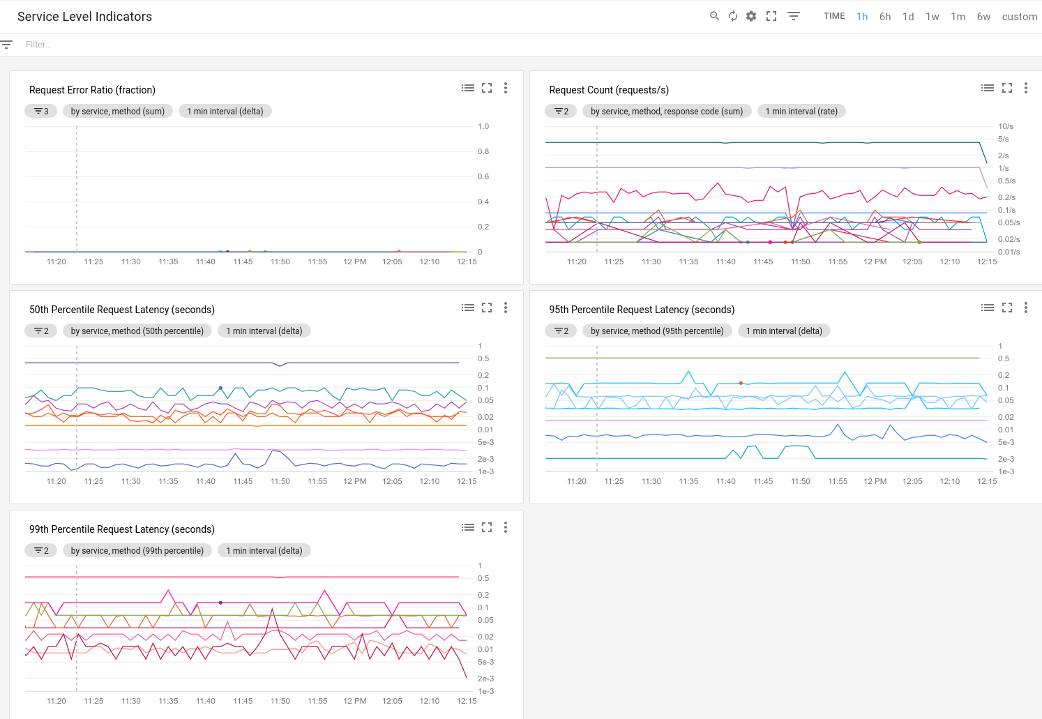 |
An example dashboard for GCP services that groups metrics by service, method and response code. You can also view latency charts on a log scale to quickly find outliers.
|
Data is power
Transparent SLIs give you the ability to transform your cloud operations for the better. By helping you drill down into interactions between your software and our services, GCP service metrics can tell you whether our services are behaving abnormally for your app’s traffic to speed the problem triage process. Furthermore, when you’re communicating with Google tech support, you can direct them to these charts so that everyone is working from the same data and can agree as to what’s being experienced. By shortening triage time and back and forth with tech support, we can dramatically reduce resolution times.Here are some examples of how using GCP service metrics can improve the support experience:
- If all of your calls to a service are failing for a single credential ID, but not any other, chances are there’s something wrong with that account that you can fix yourself without opening a ticket.
- You’re troubleshooting a problem with your app, and notice a correlation between your application’s degraded performance and a sustained increase in the 50th percentile latency of a critical GCP service. Definitely call us and point us to this data so we can start working on the problem as quickly as possible.
- The latencies for a GCP service report look good and unchanged from before, but your in-app client-side metrics report that the latency on calls to the service is abnormally high. That suggests that there might be some trouble in the network. Call your network provider (in some cases, Google) to get the debugging process started.
Transparent SLIs may also help you understand that latency results for most services fall within a normal distribution: a big hump in the middle, and outliers on either side. The metrics will help you understand the normal distribution so that you can engineer your app to work well within the distribution curve. For example, the metrics can help you correlate distribution changes with times when your app is not working as intended, helping you find the root cause of an issue. We expect the 99th percentile to look very different than the median—what we don’t expect are dramatic changes in those percentiles over time. Thus, when investigating whether a GCP service is at fault for an application problem, you should examine the return codes and latency rates over time and look for sustained changes from the norm that are correlated with observed issues in your application. (We suggest that you consider the last week to be the norm.)
Setting up dashboards for Transparent SLIs
To get started collecting and exploring Transparent SLIs, go to Stackdriver Metrics Explorer and select "Consumed API" as the resource type. Stackdriver then introspects your project and creates a list of metrics that you can chart based on the products and services you are using. You can then pick the metrics that make the most sense for your environment. You can narrow down the data you display by specifying which project or service you want to monitor. It may also be helpful to specify which credentials’ traffic to view so that you only monitor traffic from production applications and not from other sources.
Stackdriver Metrics Explorer supports availability and latency metrics, which you can combine with filters and aggregations for new and insightful views into your application performance. For example, you can combine a request count metric with a filter on the HTTP Response Code class to build a dashboard that shows error rates over time. Or you can look at the 95th percentile latency of requests to the Cloud Pub/Sub API.
Since the main use case for Transparent SLIs is to help you triage issues with your application and see if GCP services may be the cause, the ideal way to use this data is to mix our metrics with yours. If you have an app that is highly dependent on Cloud SQL, for example, don’t graph the SLIs for Cloud SQL on their own—create a chart with your app’s error rate as one line and the Cloud SQL error rate as another line on the same chart. Doing this allows you to see at a glance whether Cloud SQL errors are a likely cause of unavailability in your app.
Keep us honest
We here at Google Cloud are committed to transparency, and sharing metrics about our services is an important part of that ethic. By sharing them with you, you can easily check up on how we are doing, so that when we work together on a service ticket, everyone is on the same page. We think Transparent SLIs will radically improve your tech support experience and increase your confidence in Google Cloud. Try it out and let us know what you think!