Tag Archives: UX

Designing for Wear OS: Getting started with designing inclusive smartwatch apps

Posted by Matthew Pateman & Mallory Carroll (UX Research), and Josef Burnham (UX Design)

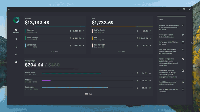
Smartwatches are becoming increasingly popular, with many people using them to stay connected, track their health, and control their devices. Watches enable people to get information at a glance and then take action. These quick and frequent interactions can help people get back to being present in their daily lives.

To help with the challenges of designing and building great watch experiences that work for all, we have created a series of videos. These videos cover a variety of topics starting with how to understand what people want from a smartwatch app. We cover how best to design for your target audience, and how to make the most of the watch’s form factor with a series of design principles. Lastly, we give you an introduction on how to approach product inclusion throughout the whole development lifecycle, and how this approach can help make your products better for all. If you’re interested in learning more, be sure to check out the videos below.


1. Introduction to UX Research & Product Inclusion on Wear OS

If you’re considering building a smartwatch app but don’t know how to begin, this video will help you get started. It shows how to uncover what people want from a smartwatch app, what a great Wear OS experience should look like, and how to ensure it addresses real needs of the people you are building for. Lastly, you’ll find out how to take an equity-focused approach when developing products, apps, and experiences.


2. Introduction to UX Design on Wear OS

Did you know that the average smartwatch interaction is approximately 5 seconds long? In this video you will learn how to design effective and engaging experiences for Wear OS. We’ll guide you on how to make the most out of these short watch interactions by covering key differences between mobile and smartwatch design, the importance of a glanceable user experience, and practical tips for designing for different Wear OS surfaces.


3. Introduction to Product Inclusion & Equity

We will introduce you to Product Inclusion and Equity, and how to approach it when designing for Wear OS. You will learn how to build for belonging and make products more accessible and usable by all.


4. Case Studies: Inclusion and Exclusion in Technology Design

Here you will see a series of case studies showing how product and design choices can be impactful on a personal, community, and systemic level. Designs can both be affirming and inclusive, or harmful and exclusionary to various people and communities. We’ll use some examples to highlight how important inclusion and equity considerations are when making product decisions.


5. Considerations for Community Co-Design

The last video in this series will give you an introduction into community co-design, a powerful approach that focuses on building solutions with, not for, historically marginalized communities. In community co-design, we engage with people based on identity, culture, community, and context. You’ll find out how to engage people and communities in a safe, respectful, and equity-centered way in product development.


Keep your eyes peeled for more updates from us as we continue to share and evolve our latest design thinking and practices, principles, and guidelines.

We also have many more resources to help get you started designing for Wear OS:

  • Find inspiring designs for different types of apps in our gallery
  • Interested in designing for multiple devices from TV’s to mobiles to tablets, check out our design hub
  • Access developer documentation for Wear OS

U-NEXT sees 1.5X increase in tablet installations after boosting support for large screens

Posted by the Android team

As the largest domestic streaming and digital content service in Japan, U-NEXT is always looking for new ways to connect its users to their favorite content. With just a single application, the platform hosts an extensive library of over 840,000 titles, ranging from movies, anime, and live streams to manga, magazines, and e-books.

Always looking for ways to improve its UX for its expanding user base, U-NEXT recently turned to the growing market of large screens and foldables, which includes devices like tablets and Chromebooks. Here, U-NEXT engineers saw an opportunity to create a better way to view content by focusing on what makes these devices special. For example, better multi-window support on larger screens could offer a more visually rich UX, while an improved foldable UX might better mimic the experience readers get with a traditional paperback.

But some users bumped into bugs while using the U-NEXT app with these larger and foldable viewing formats. For instance, the app would often hide important buttons when users opened U-NEXT on larger screens, forcing them to search the page for those navigation tools.

To optimize a UX overhaul to support these formats, the U-NEXT team tackled the project in two phases: remove any existing bugs, then add the features that its large-screen users would benefit from the most.

Headshot of Tomoya Miwa, Principal engineer at U-NEXT, smiling, with text quote 'We wanted to provide a better user experience using the advantages of large screens and foldables'

Clearing out the bugs

To fix the visibility issue for important in-app navigation buttons, U-NEXT engineers used a ConstraintLayout to set constraint barriers. These barriers prevented UI elements from being pushed off-screen while ensuring they’re always oriented correctly, no matter the screen size.

What’s more, U-NEXT’s application didn’t always display properly on larger screens. For example, pages displaying browsable video lists typically consist of a header and a curated list of content. These lists are supposed to occupy most of the space on the page. But on larger screens, the headers occupied the most on-screen real estate, making video content harder to navigate. The U-NEXT team resolved this issue by restricting the width of the header image on larger screens, giving the list more space and making browsing easier for large-screen users.

When users view books on the U-NEXT application, they can tap the screen to reveal a horizontal, scrollable wheel that lets them quickly and easily navigate their place in the text. But when users tried to access this navigation tool on Chromebooks, it wouldn’t appear on the page.

“Originally, we used SystemUiVisibility to determine whether a Chromebook was full-screen when a user tapped it,” said Tomoya Miwa, principal engineer at U-NEXT. “If SystemUiVisibility detected it wasn’t full screen, it’s supposed to display the controller. However, this listener isn’t called on when SystemUiVisibility is changed on Chromebooks, so the controller couldn’t be displayed.”

This meant U-NEXT had to change how they manage the visibility of the controller when SystemUiVisibility changes on Chromebooks. After this bug fix, the application would hide and display the controller at the same time when the screen is tapped on a Chromebook, resolving the issue for these users.

The last bug U-NEXT devs tackled was one that temporarily disrupted video when users folded their device during viewing. Switching device orientation while viewing content is supposed to be seamless, but the automatic deletion and recreation of the Activity during orientation changes caused videos to momentarily cut out.

Instead of letting Android handle these configuration changes automatically, U-NEXT developers changed the app to handle them manually. Using onConfigurationChanged(), the team overrode the change and prevented the UI elements from automatically being deleted and recreated, letting the app preserve them and prevent any viewing interruptions.

Making the most with more form factors

As part of its feature overhaul, U-NEXT replaced the traditional navigation bar with a navigation rail, which U-NEXT engineers anticipated would significantly improve the user experience. U-NEXT made this change in line with Android’s Do’s and Don't for Large Screens presentation from its recent Android Developer Summit, which provided best practices for developers optimizing for large screens.

“Reachability is an important factor when it comes to curating comfortable user experiences,” said Tomoya. “With a traditional, horizontal navigation bar, it makes it difficult to reach the buttons in the middle. With a navigation rail, it becomes much easier to reach these buttons.”

Image showing side by side rendering of UI before the implementation of the navigation rail on the left and after on the right

Next, the team enhanced support for two-page spreads when users viewed any e-books content on large screens. Apps typically display a single page when devices are oriented vertically on large screens and foldables. But because most large screens and foldables offer plenty of room for a double-page view, U-NEXT developers wanted to ensure users would always see a double-page spread whether in portrait or landscape orientation—even when the device was slightly folded.

The U-NEXT team also included some smaller, quality-of-life updates to make the user experience for large screens and foldables even better. These included enhancing the app’s compatibility with Compose by ensuring the Navigation component was consistent on every screen size, adding better support for Google Play in-app billing on large screens, and optimizing picture-in-picture viewing.

'The number of installations on tablets increased by more than 1.5x following the update for large screen devices.' — Tomoya Miwa, principal engineer at U-NEXT

Android support makes optimization easy

The U-NEXT team was surprised by how easy it was to optimize its app for large screens and foldable devices. Thanks to Android’s developer resources, U-NEXT was able to improve content viewing on its app, across devices, while also minimizing time and effort.

“It’s not that difficult,” said Tomoya. “Introducing the navigation was relatively easy, and foldable support in general is not hard as long as your app is compatible with basic screen rotation.”

Since updating the U-NEXT app to better support large screens, tablet installations have increased by 1.5X. Additionally, the watch time from users on large screen devices jumped by more than 10%.

Looking forward, the U-NEXT team plans to keep expanding its app’s large screen capabilities by enhancing mouse and keyboard compatibility, introducing list detail view to improve search functionality, adding greater support for tabletop mode, and implementing drag-and-drop features to make content sharing easier.

U-NEXT is excited to see Android add more resources to its large and expanding list of documentation, including the recently updated Material 3 library, which will further help support the growing number of users with large screen and foldable devices.

Start optimizing for large screens today

More people are using large screens, foldables, and other up-and-coming form factors. Learn how you can better support your users on these devices with examples from Android’s Large Screen Gallery.

Working Towards Android App Excellence

Posted by Jacob Lehrbaum Director of Developer Relations, Android

illustration of freckled hand over mobile phone with graphs

Great app experiences are great for business. In fact, nearly three-quarters of Android app users who leave a 5 star review on Google Play mention the quality of their experience with the app1; its speed, design, and usability. At Google, we want to help all developers achieve app excellence, and in turn help you drive user acquisition, retention, and monetization.

So what is “app excellence”? This may sound aspirational, but it is within reach for many apps. It starts with a laser focus on the user, and more specifically, with intuitive user experiences that get people to the main functionality of your app as quickly as possible — but that is just the beginning. Excellent apps are consistent across all of their screens and experiences. They perform well, no matter the device used. App excellence is achievable when all of the stakeholders who influence your app are invested in the experience of using your app.

One of the blockers that gets in the way of app excellence is shared or unclear accountability. Some of the primary measures of app quality, such as crashes and load times, are often seen as the responsibility of one group in the company, such as the engineering team. However, when we talk to best-in-class organizations2 about how they achieve app quality, it is clear that taking a cross-functional approach is key, with engineering, design, product, and business teams working toward a common goal.

So what are some internal best practices behind app excellence?

Make app quality a cross-organizational focus — not just an engineering concern

It’s a way easier conversation for me at the business end because I can say “these competitors’ apps are faster than ours; we need to reduce our load time down from 5 seconds to 4 seconds”.
Software engineer, x-platform app

App excellence helps drive business performance. New features are great, but if they slow down app start-up times or take up too much device space, people will eventually use your app less often or even delete it. Engineers who have built a company-wide focus on quality have often done so by quantifying the impact of quality issues on business performance, through:

  • Case studies showing the impact of responsiveness, APK size, start-up time, and memory usage on business KPIs. Here you can find practical case studies showcasing how developers such as Headspace and Duolingo achieved app excellence.
  • Benchmarking against competitor apps. Check out peer benchmarks and other metrics on the Google Play Console.

Organize teams around features and/or app user journey stages

Companies that organize teams around features — or stages in the user journey — are more likely to deliver consistent experiences across each operating system they support, bring new apps or features to market faster, and deliver a better app experience for all their customers. These teams are often cross-functional groups that span engineering, marketing, ux, and product — and are responsible for the success of a feature or user journey stage3 across all devices and platforms. In addition to better experiences and feature parity, this structure enables alignment of goals across functional areas while reducing silos, and it also helps teams hyper-focus on addressing specific objectives.

Feature organized team graph

Squads focused on business objectives heighten focus on the user.

Use the same devices your customers use

If a majority of your users are on a specific type of device, you can build empathy for their experience if you use the same phone, tablet or smart watch as your primary device. This is especially relevant for senior leadership in your organization who make decisions that impact the day-to-day experience of millions of users. For example, Duolingo has built this into their company DNA. Every Duolingo employee — including their CEO — either uses exclusively or has access to an entry level Android device to reflect a significant portion of their user base.

A user-centric approach to quality and app excellence is essential to business growth. If you are interested in learning how to achieve app excellence, read our case studies with practical tips, and sign up to attend our App Excellence Summit by visiting the Android app excellence webpage.

In subsequent blog posts, we will dig deep into two drivers of excellent app experiences: app performance and how it is linked to user behavior, and creating seamless user experiences across devices. Sign up to the Android developer newsletter here to be notified of the next installment, and get news and insights from the Android team.

Notes


  1. Internal Google Play data, 2021. 

  2. Google App Quality Research, 2021 

  3. The series of steps each user takes as they interact with your app is referred to as the “user journey.” Examples of user journey stages include installs, onboarding, engagement, and retention 

Expand your app beyond mobile to reach Android users at large

Posted by Sameer Samat, Vice President, Platforms & Ecosystems

dark theme graphic illustration with geometric shapes and Android 2019 logo

From day one, we designed Android to be a flexible, adaptive platform.

Most people picture a smartphone when they think of Android, but Android also powers an amazing number of large-screen devices. In fact, there are more than 175 million Android tablets with the Google Play store,1 making Android tablets a vital form factor for Google and our OEM partners today. Android apps also run on Chrome OS laptops, and the number of monthly active users who enabled Android apps grew 250% in just the last year.2

Here at Google, we’re excited to see how you can take advantage of large-screen formats - including Samsung’s new Galaxy Tab S6, the upcoming Lenovo™ Smart Tab M8 with Google Assistant, the upcoming Samsung Fold, and other devices launching this week at IFA. Our OEM partners are building experiences that help users every day:

image of two quotes

From the start, Android was designed as a platform that could handle multiple screen sizes. Over the years, we’ve continued to add functionality for developers to accommodate new devices and form factors.

  • We started with a phone. Developers could write Android apps that would work on phones of all sizes, all over the world. Part of what made this work was Android’s resource and layout system, which enabled applications to smoothly adapt to different screen sizes.
  • In Android 3.0 Honeycomb, we added support for tablets. In particular, capabilities like Fragments allow you to create applications that work across vastly different form factors.
  • Android 7 Nougat brought multi-window and multi-display capabilities, including the ability to drag-and-drop across apps. Meanwhile, Chrome OS added the capability to run Android applications on laptops. With some adjustments to handle different inputs and windowing dynamics, you could now reach app users in a desktop-style environment.
Android’s layout system helps applications smoothly resize and adjust their layout interactively.

Android’s layout system helps applications smoothly resize and adjust their layout interactively.

  • Now, in Android 10, we’ve made even more enhancements for development on large screens. We’ve improved multi-window capabilities, making it easier to use multiple apps in parallel. We also continued improving multi-display support, enabling more multi-monitor use cases. And we made it easy for you to experiment and test new form factors by adding dedicated emulator for foldables as well as publishing a foldables guide.

By optimizing your app to take advantage of different form factors, developers have an opportunity to deliver richer, more engaging experiences to millions of users on larger screens. And if you don’t have access to physical devices, the Android Emulator supports all of the form factors mentioned above, from Chrome OS to phones and tablets.


Developers of apps like Mint, Evernote, and Asphalt are just a few who have seen success from taking their existing APK to larger screens.

image of a single quote from Damien Marchi, VP of Marketing at Gameloft

To learn more about optimizing your Android apps for richer experiences on tablets, Chrome OS laptops, foldables, and more, join us at the Android Developer Summit on October 23-24 — either in person or via the livestream — or check out our recap videos on YouTube.

Sources:

[1] The number of tablets only accounts for devices that have the Google Play Store installed (for example, this excludes tablets in China); the actual number of tablets capable of running Android applications is much larger.

[2] Google Internal Data, March 2018 to March 2019.

New UI tools and a richer creative canvas come to ARCore

Posted by Evan Hardesty Parker, Software Engineer

ARCore and Sceneform give developers simple yet powerful tools for creating augmented reality (AR) experiences. In our last update (version 1.6) we focused on making virtual objects appear more realistic within a scene. In version 1.7, we're focusing on creative elements like AR selfies and animation as well as helping you improve the core user experience in your apps.

Creating AR Selfies

Example of 3D face mesh application

ARCore's new Augmented Faces API (available on the front-facing camera) offers a high quality, 468-point 3D mesh that lets users attach fun effects to their faces. From animated masks, glasses, and virtual hats to skin retouching, the mesh provides coordinates and region specific anchors that make it possible to add these delightful effects.

You can get started in Unity or Sceneform by creating an ARCore session with the "front-facing camera" and Augmented Faces "mesh" mode enabled. Note that other AR features such as plane detection aren't currently available when using the front-facing camera. AugmentedFace extends Trackable, so faces are detected and updated just like planes, Augmented Images, and other trackables.

// Create ARCore session that support Augmented Faces for use in Sceneform.
public Session createAugmentedFacesSession(Activity activity) throws UnavailableException {
// Use the front-facing (selfie) camera.
Session session = new Session(activity, EnumSet.of(Session.Feature.FRONT_CAMERA));
// Enable Augmented Faces.
Config config = session.getConfig();
config.setAugmentedFaceMode(Config.AugmentedFaceMode.MESH3D);
session.configure(config);
return session;
}

Animating characters in your Sceneform AR apps

Another way version 1.7 expands the AR creative canvas is by letting your objects dance, jump, spin and move around with support for animations in Sceneform. To start an animation, initialize a ModelAnimator (an extension of the existing Android animation support) with animation data from your ModelRenderable.

void startDancing(ModelRenderable andyRenderable) {
AnimationData data = andyRenderable.getAnimationData("andy_dancing");
animator = new ModelAnimator(data, andyRenderable);
animator.start();
}

Solving common AR UX challenges in Unity with new UI components

In ARCore version 1.7 we also focused on helping you improve your user experience with a simplified workflow. We've integrated "ARCore Elements" -- a set of common AR UI components that have been validated with user testing -- into the ARCore SDK for Unity. You can use ARCore Elements to insert AR interactive patterns in your apps without having to reinvent the wheel. ARCore Elements also makes it easier to follow Google's recommended AR UX guidelines.

ARCore Elements includes two AR UI components that are especially useful:

  • Plane Finding - streamlining the key steps involved in detecting a surface
  • Object Manipulation - using intuitive gestures to rotate, elevate, move, and resize virtual objects

We plan to add more to ARCore Elements over time. You can download the ARCore Elements app available in the Google Play Store to learn more.

Improving the User Experience with Shared Camera Access

ARCore version 1.7 also includes UX enhancements for the smartphone camera -- specifically, the experience of switching in and out of AR mode. Shared Camera access in the ARCore SDK for Java lets users pause an AR experience, access the camera, and jump back in. This can be particularly helpful if users want to take a picture of the action in your app.

More details are available in the Shared Camera developer documentation and Java sample.

Learn more and get started

For AR experiences to capture users' imaginations they need to be both immersive and easily accessible. With tools for adding AR selfies, animation, and UI enhancements, ARCore version 1.7 can help with both these objectives.

You can learn more about these new updates on our ARCore developer website.

How listening to our users helped us build a better Search Console

The new Search Console beta is up and running. We’ve been flexing our listening muscles and finding new ways to incorporate your feedback into the design. In this new release we've initially focused on building features supporting the users’ main goals and we'll be expanding functionality in the months to come. While some changes have been long expected, like refreshing the UI with Material Design, many changes are a result of continuous work with you, the Search Console users.
We’ve used 3 main communication channels to hear what our users are saying:
  • Help forum Top Contributors - Top Contributors in our help forums have been very helpful in bringing up topics seen in the forums. They communicate regularly with Google’s Search teams, and help the large community of Search Console users.
  • Open feedback - We analyzed open feedback comments about classic Search Console and identified the top requests coming in. Open feedback can be sent via the ‘Submit feedback’ button in Search Console. This open feedback helped us get more context around one of the top requests from the last years: more than 90 days of data in the Search Analytics (Performance) report. We learned of the need to compare to a similar period in the previous year, which confirmed that our decision to include 16 months of data might be on the right track.
  • Search Console panel - Last year we created a new communication channel by enlisting a group of four hundred randomly selected Search Console users, representing websites of all sizes. The panel members took part in almost every design iteration we had throughout the year, from explorations of new concepts through surveys, interviews and usability tests. The Search Console panel members have been providing valuable feedback which helped us test our assumptions and improve designs.
In one of these rounds we tested the new suggested design for the Performance report. Specifically we wanted to see whether it was clear how to use the ‘compare’ and ‘filter’ functionalities. To create an experience that felt as real as possible, we used a high fidelity prototype connected to real data. The prototype allowed study participants to freely interact with the user interface before even one row of production code had been written.
In this study we learned that the ‘compare’ functionality was often overlooked. We consequently changed the design with ‘filter’ and ‘compare’ appearing in a unified dialogue box, triggered when the ‘Add new’ chip is clicked. We continue to test this design and others to optimize its usability and usefulness.
We incorporated user feedback not only in practical design details, but also in architectural decisions. For example, user feedback led us to make major changes in the product’s core information architecture influencing the navigation and product structure of the new Search Console. The error and coverage reports were originally separated which could lead to multiple views of the same error. As a result of user feedback we united the error and coverage reporting offering one holistic view.
As the launch date grew closer, we performed several larger scale experiments. We A/B tested some of the new Search Console reports against the existing reports with 30,000 users. We tracked issue fix rates to verify new Search Console drives better results and sent out follow-up surveys to learn about their experience. This most recent feedback confirmed that export functionality was not a nice-to-have, but rather a requirement for many users and helped us tune detailed help pages in the initial release.
We are happy to announce that the new Search Console is now available to all sites. Whether it is through Search Console’s feedback button or through the user panel, we truly value a collaborative design process, where all of our users can help us build the best product.
Try out the new search console.
We're not finished yet! Which feature would you love to see in the next iteration of Search Console? Let us know below.

Get your ads ready for iPhone X

Every interaction a user has with your app matters. That’s why we’re constantly evolving our advertising recommendations and policies to ensure that no matter where and on what device users are engaging with your apps, they have good experiences.

With the launch of the iPhone X, app developers now need to plan for new design considerations as the rounded corners, notch, and home screen indicator on the extended screen can obscure content and lead to poor ad experiences for users when ads are placed in these areas.

Example of ad appearing outside of “safe area” on iPhone X
That’s why we’ve put together a guide to help you adapt your ad strategy for iPhone X. This includes guidance for how you can shift placement of banner or native ads to designated “safe areas” for this new device.

We’ve also updated our policies to indicate that ads must not be placed where objects may interfere with the user's typical interaction with the ad or app, such as under the home screen indicator on the iPhone X.

Please review these policy updates and our suggested implementation guide to ensure you’re compliant by November 20th.

If you have any questions, visit the AdMob Help Center or contact your Google account team.

Posted by Pablo Alvarez, Product Manager, AdMob

Source: Inside AdMob


User experience tips to help you design your app to engage users and drive conversions

By Jenny Gove, Senior Staff UX Researcher, Google Play

We know you work hard to acquire users and grow your customer base, which can be challenging in a crowded market. That's why we've heard from many of you that you find tools like store listing experiments and universal app campaigns are valuable. It's equally important to keep customers engaged from the beginning. Great design and delightful user experiences are fundamental to doing just that.

We partnered with AnswerLab to conduct comprehensive user experience research across a variety of verticals; including e-commerce, insurance, travel, food ordering, ticket sales and services, and financial management. The resulting insights may help you increase engagement and conversion by providing guidance on useful and usable functionality.

The best app experiences seamlessly guide users through their tasks with efficient navigation, search, forms, registration and purchasing. They provide great e-commerce facilities and integrate effective ordering and payment systems. Ultimately, an engaging app begins with attention to usability in all of these areas. Learn tips on:

  • Navigation & Exploration
  • In-App Search
  • Commerce & Conversions
  • Registration
  • Form Entry
  • Usability and Comprehension

You can read the full article, design your app to drive conversions, on the Android Developers website, complete with links to developer resources. Also get the Playbook for Developers app to stay up-to-date with features and best practices that will help you grow a successful business on Google Play.

How useful did you find this blogpost?

Three ways AdMob make UX a priority with Rewarded video

At AdMob, we know how important user experience is to creating a great app. Non-intrusive ads make for happy users and higher ad engagement rates, and we think rewarded videos are the next step in meeting and exceeding a users expectations for a great experience. Here are three ways AdMob can help improve your user experience with rewarded video ads.

1. Consistency

With reliable UX patterns, you’ll form clear breaks in your apps where users are expecting to see engaging ads. And when it comes to rewarded video, ads that appear at just the right moment will provide a mutual benefit to both user and publisher. For example, in a gaming app, you might want to reward your user with extra lives in exchange for watching a video at a moment when the game would otherwise end. Your users will thank you for it!

2. No tricks

A rewarded video is still an ad, so it is important to make the value exchange between user and publisher transparent. Users are presented with a clear description of the action required from them and what they will get in return, before choosing whether to opt-in to view the rewarded video. And while advertisers pay for an install, the option to install an app as a result of watching a rewarded video is not incentivized: the user is rewarded for viewing the message and the action to install is optional.

3. Optimum engagement

We use Firebase Analytics to help you understand your audience better. With Firebase, A/B testing is simple and can ensure you are getting the most out of your exchange with the user. Optimizing reward value, frequency of ads, and ad placement in app all contribute to a successful rewarded strategy that results in happy users.

Until next time, be sure to stay connected on all things AdMob by following our Twitter, LinkedIn and Google+ pages.

Source: Inside AdMob


Closing down for a day

Even in today's "always-on" world, sometimes businesses want to take a break. There are times when even their online presence needs to be paused. This blog post covers some of the available options so that a site's search presence isn't affected.

Option: Block cart functionality

If a site only needs to block users from buying things, the simplest approach is to disable that specific functionality. In most cases, shopping cart pages can either be blocked from crawling through the robots.txt file, or blocked from indexing with a robots meta tag. Since search engines either won't see or index that content, you can communicate this to users in an appropriate way. For example, you may disable the link to the cart, add a relevant message, or display an informational page instead of the cart.

Option: Always show interstitial or pop-up

If you need to block the whole site from users, be it with a "temporarily unavailable" message, informational page, or popup, the server should return a 503 HTTP result code ("Service Unavailable"). The 503 result code makes sure that Google doesn't index the temporary content that's shown to users. Without the 503 result code, the interstitial would be indexed as your website's content.

Googlebot will retry pages that return 503 for up to about a week, before treating it as a permanent error that can result in those pages being dropped from the search results. You can also include a "Retry after" header to indicate how long the site will be unavailable. Blocking a site for longer than a week can have negative effects on the site's search results regardless of the method that you use.

Option: Switch whole website off

Turning the server off completely is another option. You might also do this if you're physically moving your server to a different data center. For this, have a temporary server available to serve a 503 HTTP result code for all URLs (with an appropriate informational page for users), and switch your DNS to point to that server during that time.

  1. Set your DNS TTL to a low time (such as 5 minutes) a few days in advance.
  2. Change the DNS to the temporary server's IP address.
  3. Take your main server offline once all requests go to the temporary server.
  4. … your server is now offline ...
  5. When ready, bring your main server online again.
  6. Switch DNS back to the main server's IP address.
  7. Change the DNS TTL back to normal.

We hope these options cover the common situations where you'd need to disable your website temporarily. If you have any questions, feel free to drop by our webmaster help forums!

PS If your business is active locally, make sure to reflect these closures in the opening hours for your local listings too!