Tag Archives: korean

Google Fonts launches Japanese support

Posted by the Google Fonts team

The Google Fonts catalog now includes Japanese web fonts. Since shipping Korean in February, we have been working to optimize the font slicing system and extend it to support Japanese. The optimization efforts proved fruitful—Korean users now transfer on average over 30% fewer bytes than our previous best solution. This type of on-going optimization is a major goal of Google Fonts.

Japanese presents many of the same core challenges as Korean:

  1. Very large character set
  2. Visually complex letterforms
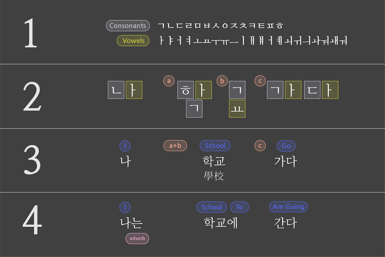
  3. A complex writing system: Japanese uses several distinct scripts (explained well by Wikipedia)
  4. More character interactions: Line layout features (e.g. kerning, positioning, substitution) break when they involve characters that are split across different slices

The impact of the large character set made up of complex glyph contours is multiplicative, resulting in very large font files. Meanwhile, the complex writing system and character interactions forced us to refine our analysis process.

To begin supporting Japanese, we gathered character frequency data from millions of Japanese webpages and analyzed them to inform how to slice the fonts. Users download only the slices they need for a page, typically avoiding the majority of the font. Over time, as they visit more pages and cache more slices, their experience becomes ever faster. This approach is compatible with many scripts because it is based on observations of real-world usage.

Frequency of the popular Japanese and Korean characters on the web

As shown above, Korean and Japanese have a relatively small set of characters that are used extremely frequently, and a very long tail of rarely used characters. On any given page most of the characters will be from the high frequency part, often with a few rarer characters mixed in.

We tried fancier segmentation strategies, but the most performant method for Korean turned out to be simple:

  1. Put the 2,000 most popular characters in a slice
  2. Put the next 1,000 most popular characters in another slice
  3. Sort the remaining characters by Unicode codepoint number and divide them into 100 equally sized slices

A user of Google Fonts viewing a webpage will download only the slices needed for the characters on the page. This yielded great results, as clients downloaded 88% fewer bytes than a naive strategy of sending the whole font. While brainstorming how to make things even faster, we had a bit of a eureka moment, realizing that:

  1. The core features we rely on to efficiently deliver sliced fonts are unicode-range and woff2
  2. Browsers that support unicode-range and woff2 also support HTTP/2
  3. HTTP/2 enables the concurrent delivery of many small files

In combination, these features mean we no longer have to worry about queuing delays as we would have under HTTP/1.1, and therefore we can do much more fine-grained slicing.

Our analyses of the Japanese and Korean web shows most pages tend to use mostly common characters, plus a few rarer ones. To optimize for this, we tested a variety of finer-grained strategies on the common characters for both languages.

We concluded that the following is the best strategy for Korean, with clients downloading 38% fewer bytes than our previous best strategy:

  1. Take the 2,000 most popular Korean characters, sort by frequency, and put them into 20 equally sized slices
  2. Sort the remaining characters by Unicode codepoint number, and divide them into 100 equally sized slices

For Japanese, we found that segmenting the first 3,000 characters into 20 slices was best, resulting in clients downloading 80% fewer bytes than they would if we just sent the whole font. Having sufficiently reduced transfer sizes, we now feel confident in offering Japanese web fonts for the first time!

Now that both Japanese and Korean are live on Google Fonts, we have even more ideas for further optimization—and we will continue to ship updates to make things faster for our users. We are also looking forward to future collaborations with the W3C to develop new web standards and go beyond what is possible with today's technologies (learn more here).

PS - Google Fonts is hiring :)

Google Fonts launches Korean support

Posted by the Google Fonts team

The Google Fonts catalog now includes Korean web fonts for designers and developers working with the nation's unique Hangul writing system. While some of the fonts themselves have been available in beta for years now, we introduced official support for Korean earlier this month after devising a more efficient means of serving Chinese, Japanese, and Korean (CJK) font files, which have very large character sets and file sizes.

We've always wanted to offer CJK fonts, and over the years we've worked on foundational technologies such as WOFF2 and CSS3 unicode-range in order to make this possible. Last year, Google engineers experimented with different approaches to slicing fonts into smaller subsets, and found that certain techniques had very good results that enabled this launch.

The Hangul script is distinct from Chinese Hanzi and Japanese Kanji characters. In some ways, it shares greater similarity with Western writing systems because it is constructed from a phonetic alphabet. Whereas the visual features of Hanzi and Kanji logograms give no direct indication of their pronunciation, Hangul is a phonographic script in which written words are built from their constituent sounds.

Hangul starts with a set of 19 consonants and 21 vowels (1). When writing a sentence, individual characters are first identified (2), then combined into blocks that represent compete words (3), and finally conjugated and arranged in grammatical form to create a sentence (4).

Despite the elegant logic underlying Hangul script, Korean fonts present the same basic difficulty for developers that Chinese and Japanese fonts do. Hangul characters may be constructed from just 40 basic elements, but the final forms add up quickly. Korean fonts eventually require over ten thousand characters, meaning the files are too large for most users to download so that they will appear instantly upon visiting a website. A typical full Korean font hovers around 4Mb, whereas even fairly extensive Latin fonts rarely exceed 250Kb.

During the time that Korean fonts were only available on the Google Fonts Early Access system, we were surprised that many web developers were willing to accept the latency implications of serving full font files to their users. Still, in order to graduate these fonts out of our Early Access system, we needed to devise a way for them to work for a wider cross-section of web users, especially those with relatively slow connections.

The Google Fonts API offers larger font files as several subsets, such as "latin" and "cyrillic." When the service launched, these subsets had to be selected by developers. For a few years, we've enabled the 'unicode-range' property of CSS3 for browsers that support it. This means when a large font file is sliced into subsets, the ranges of the Unicode characters in each subset are declared as part of the @font-face declaration. This allows browsers to fetch only a particular subset when those characters appear in a web page.

One of the key benefits of the Google Fonts API is cross-site caching, and this benefit continues to apply to the delivery of font subsets through unicode-range. The font files we serve are used by many domains, so after you visit a site and your browser downloads its fonts, the files are saved in the browser's cache. Then the next time you visit another site that uses the same font files, there's no need for your browser to download it again. This latency benefit only increases over time, and since the many subsets of large font files are cached the same way, you'll see the same cross-site benefits with our CJK fonts.

Over the years we have worked with the W3C and browser developers to ensure that unicode-range would become well supported. Now that Chrome, Firefox, Safari, and Edge have shipped this feature, there is enough support to enable a new means of delivering Korean web fonts that works seamlessly for these browsers.

Support for the unicode-range feature has become widespread, according to caniuse.com

In order maximize efficiency, we wanted to know which characters it made the most sense to cluster together in a subset. We devised a slicing strategy by analyzing text on the Korean-language web to extract patterns of Unicode characters, building topic models of which ones tend to appear together on the same page.

As we evaluated different slicing strategies to decide which Korean characters to include in each subset, our goal was to minimize both the number of subsets and the number of requests. If we sliced the script into 1,000 arbitrary subsets, without factoring in usage and commonality, we would get way too many HTTP requests. We built a testing framework to see how a variety of strategies worked with real-world traffic using our Early Access system, and we launched Korean fonts in our directory with the most efficient one we've found so far.

Strategy 1 is no slicing. The best strategy had 20 times fewer connection requests than the worst, which simply divides the font into equal parts without accounting for patterns of language use.

Moving forward, we think we can do even better. With our scale, a small improvement can justify a lot of effort. By continuing to use our testing framework on different approaches to slicing, we can tune our serving to be as efficient as possible. For the web developers who use our API, and all end users, these kinds of changes are totally transparent and don't require any further work on your part. For example, when WOFF2 came out in 2015, every user with a browser supporting WOFF2 got a 25% faster experience. We transparently make things better for all users on an ongoing basis, and there's enormous potential for future improvements in the delivery of CJK fonts.

This launch began with five Korean fonts originally designed by the leading Korean type foundry Sandoll for Naver. Since the initial launch, we have grown the collection to 23 Korean families, and to showcase them we commissioned a digital specimen website from Math Practice, a digital design studio in New York City. Here you can see beautiful Korean typography in action—and with fast page loads made possible by our new slicing technique.

Thanks to SooYoung Jang, Irin Kim, E Roon Kang, Wonyoung So, Guhong Min, Hannah Son, Aaron Bell, Marc Foley, and all the typeface designers involved in growing the Korean fonts collection and developing the minisite.

Noto Serif CJK is here!

Crossposted from the Google Developers Blog

Today, in collaboration with Adobe, we are responding to the call for Serif! We are pleased to announce Noto Serif CJK, the long-awaited companion to Noto Sans CJK released in 2014. Like Noto Sans CJK, Noto Serif CJK supports Simplified Chinese, Traditional Chinese, Japanese, and Korean, all in one font.

A serif-style CJK font goes by many names: Song (宋体) in Mainland China, Ming (明體) in Hong Kong, Macao and Taiwan, Minchō (明朝) in Japan, and Myeongjo (명조) or Batang (바탕) in Korea. The names and writing styles originated during the Song and Ming dynasties in China, when China's wood-block printing technique became popular. Characters were carved along the grain of the wood block. Horizontal strokes were easy to carve and vertical strokes were difficult; this resulted in thinner horizontal strokes and wider vertical ones. In addition, subtle triangular ornaments were added to the end of horizontal strokes to simulate Chinese Kai (楷体) calligraphy. This style continues today and has become a popular typeface style.

Serif fonts, which are considered more traditional with calligraphic aesthetics, are often used for long paragraphs of text such as body text of web pages or ebooks. Sans-serif fonts are often used for user interfaces of websites/apps and headings because of their simplicity and modern feeling.

Design of '永' ('eternity') in Noto Serif and Sans CJK. This ideograph is famous for having the most important elements of calligraphic strokes. It is often used to evaluate calligraphy or typeface design.

The Noto Serif CJK package offers the same features as Noto Sans CJK:

  • It has comprehensive character coverage for the four languages. This includes the full coverage of CJK Ideographs with variation support for four regions, Kangxi radicals, Japanese Kana, Korean Hangul and other CJK symbols and letters in the Unicode Basic Multilingual Plane of Unicode. It also provides a limited coverage of CJK Ideographs in Plane 2 of Unicode, as necessary to support standards from China and Japan.


Simplified Chinese
Supports GB 18030 and China’s latest standard Table of General Chinese Characters (通用规范汉字表) published in 2013.
Traditional Chinese
Supports BIG5, and Traditional Chinese glyphs are compliant to glyph standard of Taiwan Ministry of Education (教育部國字標準字體).
Japanese
Supports all of the kanji in  JIS X 0208, JIS X 0213, and JIS X 0212 to include all kanji in Adobe-Japan1-6.
Korean
The best font for typesetting classic Korean documents in Hangul and Hanja such as Humninjeongeum manuscript, a UNESCO World Heritage.
Supports over 1.5 million archaic Hangul syllables and 11,172 modern syllables as well as all CJK ideographs in KS X 1001 and KS X 1002
Noto Serif CJK’s support of character and glyph set standards for the four languages
  • It respects diversity of regional writing conventions for the same character. The example below shows the four glyphs of '述' (describe) in four languages that have subtle differences.
From left to right are glyphs of '述' in S. Chinese, T. Chinese, Japanese and Korean. This character means "describe".
  • It is offered in seven weights: ExtraLight, Light, Regular, Medium, SemiBold, Bold, and Black. Noto Serif CJK supports 43,027 encoded characters and includes 65,535 glyphs (the maximum number of glyphs that can be included in a single font). The seven weights, when put together, have almost a half-million glyphs. The weights are compatible with Google's Material Design standard fonts, Roboto, Noto Sans and Noto Serif(Latin-Greek-Cyrillic fonts in the Noto family).
Seven weights of Noto Serif CJK
    • It supports vertical text layout and is compliant with the Unicode vertical text layout standard. The shape, orientation, and position of particular characters (e.g., brackets and kana letters) are changed when the writing direction of the text is vertical.


    The sheer size of this project also required regional expertise! Glyph design would not have been possible without leading East Asian type foundries Changzhou SinoType Technology, Iwata Corporation, and Sandoll Communications.

    Noto Serif CJK is open source under the SIL Open Font License, Version 1.1. We invite individual users to install and use these fonts in their favorite authoring apps; developers to bundle these fonts with your apps, and OEMs to embed them into their devices. The fonts are free for everyone to use!

    Noto Serif CJK font download:https://www.google.com/get/noto
    Noto Serif CJK on GitHub:https://github.com/googlei18n/noto-cjk
    Adobe's landing page for this release: http://adobe.ly/SourceHanSerif
    Source Han Serif on GitHub: https://github.com/adobe-fonts/source-han-serif/tree/release/

    By Xiangye Xiao and Jungshik Shin, Internationalization Engineering team

    Noto Serif CJK is here!


    Posted by Xiangye Xiao and Jungshik Shin, Internationalization Engineering team

    Today, in collaboration with Adobe, we are responding to the call for Serif! We are pleased to announce Noto Serif CJK, the long-awaited companion to Noto Sans CJK released in 2014. Like Noto Sans CJK, Noto Serif CJK supports Simplified Chinese, Traditional Chinese, Japanese, and Korean, all in one font.

    A serif-style CJK font goes by many names: Song (宋体) in Mainland China, Ming (明體) in Hong Kong, Macao and Taiwan, Minchō (明朝) in Japan, and Myeongjo (명조) or Batang (바탕) in Korea. The names and writing styles originated during the Song and Ming dynasties in China, when China's wood-block printing technique became popular. Characters were carved along the grain of the wood block. Horizontal strokes were easy to carve and vertical strokes were difficult; this resulted in thinner horizontal strokes and wider vertical ones. In addition, subtle triangular ornaments were added to the end of horizontal strokes to simulate Chinese Kai (楷体) calligraphy. This style continues today and has become a popular typeface style.

    Serif fonts, which are considered more traditional with calligraphic aesthetics, are often used for long paragraphs of text such as body text of web pages or ebooks. Sans-serif fonts are often used for user interfaces of websites/apps and headings because of their simplicity and modern feeling.

    Design of '永' ('eternity') in Noto Serif and Sans CJK. This ideograph is famous for having the most important elements of calligraphic strokes. It is often used to evaluate calligraphy or typeface design.

    The Noto Serif CJK package offers the same features as Noto Sans CJK:

    • It has comprehensive character coverage for the four languages. This includes the full coverage of CJK Ideographs with variation support for four regions, Kangxi radicals, Japanese Kana, Korean Hangul and other CJK symbols and letters in the Unicode Basic Multilingual Plane of Unicode. It also provides a limited coverage of CJK Ideographs in Plane 2 of Unicode, as necessary to support standards from China and Japan.


    Simplified Chinese
    Supports GB 18030 and China’s latest standard Table of General Chinese Characters (通用规范汉字表) published in 2013.
    Traditional Chinese
    Supports BIG5, and Traditional Chinese glyphs are compliant to glyph standard of Taiwan Ministry of Education (教育部國字標準字體).
    Japanese
    Supports all of the kanji in  JIS X 0208, JIS X 0213, and JIS X 0212 to include all kanji in Adobe-Japan1-6.
    Korean
    The best font for typesetting classic Korean documents in Hangul and Hanja such as Humninjeongeum manuscript, a UNESCO World Heritage.
    Supports over 1.5 million archaic Hangul syllables and 11,172 modern syllables as well as all CJK ideographs in KS X 1001 and KS X 1002
    Noto Serif CJK’s support of character and glyph set standards for the four languages
    • It respects diversity of regional writing conventions for the same character. The example below shows the four glyphs of '述' (describe) in four languages that have subtle differences.
    From left to right are glyphs of '述' in S. Chinese, T. Chinese, Japanese and Korean. This character means "describe".
    • It is offered in seven weights: ExtraLight, Light, Regular, Medium, SemiBold, Bold, and Black. Noto Serif CJK supports 43,027 encoded characters and includes 65,535 glyphs (the maximum number of glyphs that can be included in a single font). The seven weights, when put together, have almost a half-million glyphs. The weights are compatible with Google's Material Design standard fonts, Roboto, Noto Sans and Noto Serif(Latin-Greek-Cyrillic fonts in the Noto family).
    Seven weights of Noto Serif CJK
      • It supports vertical text layout and is compliant with the Unicode vertical text layout standard. The shape, orientation, and position of particular characters (e.g., brackets and hiragkana letters) are changed when the writing direction of the text is vertical.


      The sheer size of this project also required regional expertise! Glyph design would not have been possible without leading East Asian type foundries Changzhou SinoType Technology, Iwata Corporation, and Sandoll Communications.

      Noto Serif CJK is open source under the SIL Open Font License, Version 1.1. We invite individual users to install and use these fonts in their favorite authoring apps; developers to bundle these fonts with your apps, and OEMs to embed them into their devices. The fonts are free for everyone to use!

      Noto Serif CJK font download:https://www.google.com/get/noto
      Noto Serif CJK on GitHub:https://github.com/googlei18n/noto-cjk
      Adobe's landing page for this release: http://adobe.ly/SourceHanSerif
      Source Han Serif on GitHub: https://github.com/adobe-fonts/source-han-serif/tree/release/