Tag Archives: GPS

Improving urban GPS accuracy for your app

Posted by Frank van Diggelen, Principal Engineer and Jennifer Wang, Product Manager

At Android, we want to make it as easy as possible for developers to create the most helpful apps for their users. That’s why we aim to provide the best location experience with our APIs like the Fused Location Provider API (FLP). However, we’ve heard from many of you that the biggest location issue is inaccuracy in dense urban areas, such as wrong-side-of-the-street and even wrong-city-block errors.

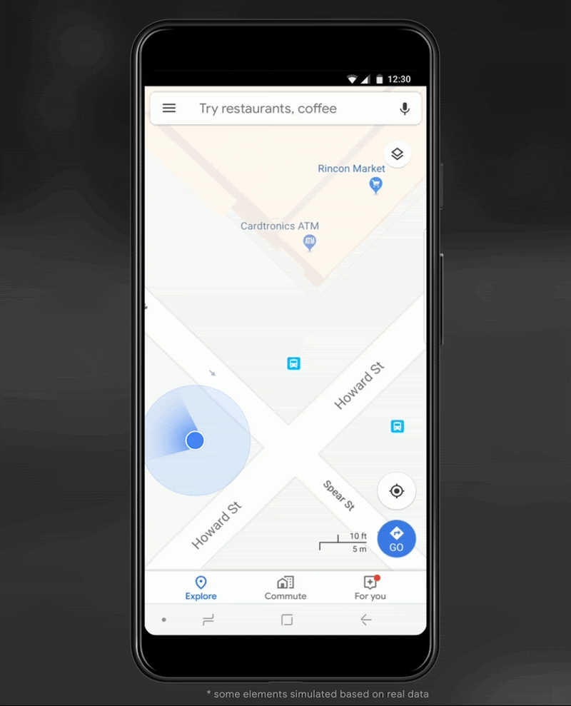
This is particularly critical for the most used location apps, such as rideshare and navigation. For instance, when users request a rideshare vehicle in a city, apps cannot easily locate them because of the GPS errors.

The last great unsolved GPS problem

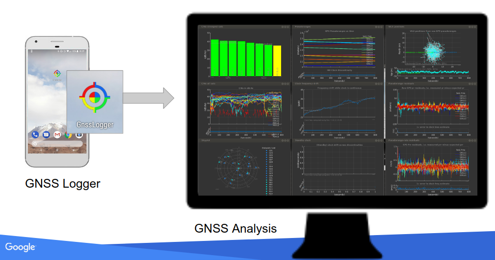
This wrong-side-of-the-street position error is caused by reflected GPS signals in cities, and we embarked on an ambitious project to help solve this great problem in GPS. Our solution uses 3D mapping aided corrections, and is only feasible to be done at scale by Google because it comprises 3D building models, raw GPS measurements, and machine learning.

The December Pixel Feature Drop adds 3D mapping aided GPS corrections to Pixel 5 and Pixel 4a (5G). With a system API that provides feedback to the Qualcomm® Snapdragon™ 5G Mobile Platform that powers Pixel, the accuracy in cities (or “urban canyons”) improves spectacularly.

Picture of a pedestrian test, with Pixel 5 phone, walking along one side of the street, then the other. Yellow = Path followed, Red = without 3D mapping aided corrections, Blue = with 3D mapping aided corrections.  The picture shows that without 3D mapping aided corrections, the GPS results frequently wander to the wrong side of the street (or even the wrong city block), whereas, with 3D mapping aided corrections, the position is many times more accurate.

Picture of a pedestrian test, with Pixel 5 phone, walking along one side of the street, then the other. Yellow = Path followed, Red = without 3D mapping aided corrections, Blue = with 3D mapping aided corrections.

Why hasn’t this been solved before?

The problem is that GPS constructively locates you in the wrong place when you are in a city. This is because all GPS systems are based on line-of-sight operation from satellites. But in big cities, most or all signals reach you through non line-of-sight reflections, because the direct signals are blocked by the buildings.

Diagram of the 3D mapping aided corrections module in Google Play services, with corrections feeding into the FLP API.   3D mapping aided corrections are also fed into the GNSS chip and software, which in turn provides GNSS measurements, position, and velocity back to the module.

The GPS chip assumes that the signal is line-of-sight and therefore introduces error when it calculates the excess path length that the signals traveled. The most common side effect is that your position appears on the wrong side of the street, although your position can also appear on the wrong city block, especially in very large cities with many skyscrapers.

There have been attempts to address this problem for more than a decade. But no solution existed at scale, until 3D mapping aided corrections were launched on Android.

How 3D mapping aided corrections work

The 3D mapping aided corrections module, in Google Play services, includes tiles of 3D building models that Google has for more than 3850 cities around the world. Google Play services 3D mapping aided corrections currently supports pedestrian use-cases only. When you use your device’s GPS while walking, Android’s Activity Recognition API will recognize that you are a pedestrian, and if you are in one of the 3850+ cities, tiles with 3D models will be downloaded and cached on the phone for that city. Cache size is approximately 20MB, which is about the same size as 6 photographs.

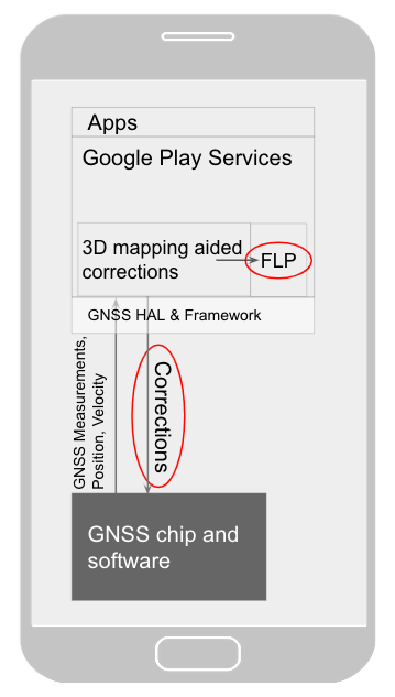
Inside the module, the 3D mapping aided corrections algorithms solve the chicken-and-egg problem, which is: if the GPS position is not in the right place, then how do you know which buildings are blocking or reflecting the signals? Having solved this problem, 3D mapping aided corrections provide a set of corrected positions to the FLP. A system API then provides this information to the GPS chip to help the chip improve the accuracy of the next GPS fix.

With this December Pixel feature drop, we are releasing version 2 of 3D mapping aided corrections on Pixel 5 and Pixel 4a (5G). This reduces wrong-side-of-street occurrences by approximately 75%. Other Android phones, using Android 8 or later, have version 1 implemented in the FLP, which reduces wrong-side-of-street occurrences by approximately 50%. Version 2 will be available to the entire Android ecosystem (Android 8 or later) in early 2021.

Android’s 3D mapping aided corrections work with signals from the USA’s Global Positioning System (GPS) as well as other Global Navigation Satellite Systems (GNSSs): GLONASS, Galileo, BeiDou, and QZSS.

Our GPS chip partners shared the importance of this work for their technologies:

“Consumers rely on the accuracy of the positioning and navigation capabilities of their mobile phones. Location technology is at the heart of ensuring you find your favorite restaurant and you get your rideshare service in a timely manner. Qualcomm Technologies is leading the charge to improve consumer experiences with its newest Qualcomm® Location Suite technology featuring integration with Google's 3D mapping aided corrections. This collaboration with Google is an important milestone toward sidewalk-level location accuracy,” said Francesco Grilli, vice president of product management at Qualcomm Technologies, Inc.

“Broadcom has integrated Google's 3D mapping aided corrections into the navigation engine of the BCM47765 dual-frequency GNSS chip. The combination of dual frequency L1 and L5 signals plus 3D mapping aided corrections provides unprecedented accuracy in urban canyons. L5 plus Google’s corrections are a game-changer for GNSS use in cities,” said Charles Abraham, Senior Director of Engineering, Broadcom Inc.

“Google's 3D mapping aided corrections is a major advancement in personal location accuracy for smartphone users when walking in urban environments. MediaTek’s Dimensity 5G family enables 3D mapping aided corrections in addition to its highly accurate dual-band GNSS and industry-leading dead reckoning performance to give the most accurate global positioning ever for 5G smartphone users,” said Dr. Yenchi Lee, Deputy General Manager of MediaTek’s Wireless Communications Business Unit.

How to access 3D mapping aided corrections

Android’s 3D mapping aided corrections automatically works when the GPS is being used by a pedestrian in any of the 3850+ cities, on any phone that runs Android 8 or later. The best way for developers to take advantage of the improvement is to use FLP to get location information. The further 3D mapping aided corrections in the GPS chip are available to Pixel 5 and Pixel 4a (5G) today, and will be rolled out to the rest of the Android ecosystem (Android 8 or later) in the next several weeks. We will also soon support more modes including driving.

Android’s 3D mapping aided corrections cover more than 3850 cities, including:

  • North America: All major cities in USA, Canada, Mexico.
  • Europe: All major cities. (100%, except Russia & Ukraine)
  • Asia: All major cities in Japan and Taiwan.
  • Rest of the world: All major cities in Brazil, Argentina, Australia, New Zealand, and South Africa.

As our Google Earth 3D models expand, so will 3D mapping aided corrections coverage.

Google Maps is also getting updates that will provide more street level detail for pedestrians in select cities, such as sidewalks, crosswalks, and pedestrian islands. In 2021, you can get these updates for your app using the Google Maps Platform. Along with the improved location accuracy from 3D mapping aided corrections, we hope we can help developers like you better support use cases for the world’s 2B pedestrians that use Android.

Continuously making location better

In addition to 3D mapping aided corrections, we continue to work hard to make location as accurate and useful as possible. Below are the latest improvements to the Fused Location Provider API (FLP):

  • Developers wanted an easier way to retrieve the current location. With the new getCurrentLocation() API, developers can get the current location in a single request, rather than having to subscribe to ongoing location changes. By allowing developers to request location only when needed (and automatically timing out and closing open location requests), this new API also improves battery life. Check out our latest Kotlin sample.
  • Android 11's Data Access Auditing API provides more transparency into how your app and its dependencies access private data (like location) from users. With the new support for the API's attribution tags in the FusedLocationProviderClient, developers can more easily audit their apps’ location subscriptions in addition to regular location requests. Check out this Kotlin sample to learn more.


Qualcomm and Snapdragon are trademarks or registered trademarks of Qualcomm Incorporated.

Qualcomm Snapdragon and Qualcomm Location Suite are products of Qualcomm Technologies, Inc. and/or its subsidiaries.

GNSS Analysis Tools from Google

Posted by Frank van Diggelen, Software Engineer

Last year in Android Nougat, we introduced APIs for retrieving Global Navigation Satellite System (GNSS) Raw measurements from Android devices. This past week, we publicly released GNSS Analysis Tools to process and analyze these measurements.

Android powers over 2 billion devices, and Android phones are made by many different manufacturers. The primary intent of these tools is to enable device manufacturers to see in detail how well the GNSS receivers are working in each particular device design, and thus improve the design and GNSS performance in their devices. However, with the tools publicly available, there is also significant value to the research and app developer community.

How to use the tool

The GNSS Analysis Tool is a desktop application that takes in raw the GNSS Measurements logged from your Android device as input.

This desktop application provides interactive plots, organized into three columns showing the behavior of the RF, Clock, and Measurements. This data allows you to see the behavior of the GNSS receiver in great detail, including receiver clock offset and drift to the order of 1 nanosecond and 1 ppb and measurement errors on a satellite-by-satellite basis. This allows you to do sophisticated analysis at a level that, until now, was almost inaccessible to anyone but the chip manufacturers themselves.

The tools support multi-constellation (GPS, GLONASS, Galileo, BeiDou and QZSS) and multi-frequency. The image below shows the satellite locations for L1, L5, E1 and E5 signals tracked by a dual frequency chip.

The tools provide an interactive control screen from which you can manipulate the plots, shown below. From this control screen, you can change the background color, enable the Menu Bars for printing or saving, and select specific satellites for the plots.

Receiver test report

The tools also provide automatic test reports of receivers. Click "Make Report" to automatically create the test report. The report evaluates the API implementation, Received Signal, Clock behavior, and Measurement accuracy. In each case it will report PASS or FAIL based on the performance against known good benchmarks. This test report is primarily meant for the device manufacturers to use as they iterate on the design and implementation of a new device. A sample report is shown below.

Our goal with providing these Analysis Tools is to empower device manufacturers, researchers, and developers with data and knowledge to make Android even better for our customers. You can visit the GNSS Measurement site to learn more and download this application.

Open source visualization of GPS displacements for earthquake cycle physics

The Earth’s surface is moving, ever so slightly, all the time. This slow, small, but persistent movement of the Earth's crust is responsible for the formation of mountain ranges, sudden earthquakes, and even the positions of the continents. Scientists around the world measure these almost imperceptible movements using arrays of Global Navigation Satellite System (GNSS) receivers to better understand all phases of an earthquake cycle—both how the surface responds after an earthquake, and the storage of strain energy between earthquakes.

To help researchers explore this data and better understand the Earthquake cycle, we are releasing a new, interactive data visualization which draws geodetic velocity lines on top of a relief map by amplifying position estimates relative to their true positions. Unlike existing approaches, which focus on small time slices or individual stations, our visualization can show all the data for a whole array of stations at once. Open sourced under an Apache 2 license, and available on GitHub, this visualization technique is a collaboration between Harvard’s Department of Earth and Planetary Sciences and Google's Machine Perception and Big Picture teams.

Our approach helps scientists quickly assess deformations across all phases of the earthquake cycle—both during earthquakes (coseismic) and the time between (interseismic). For example, we can see azimuth (direction) reversals of stations as they relate to topographic structures and active faults. Digging into these movements will help scientists vet their models and their data, both of which are crucial for developing accurate computer representations that may help predict future earthquakes.

Classical approaches to visualizing these data have fallen into two general categories: 1) a map view of velocity/displacement vectors over a fixed time interval and 2) time versus position plots of each GNSS component (longitude, latitude and altitude).

Examples of classical approaches. On the left is a map view showing average velocity vectors over the period from 1997 to 2001[1]. On the right you can see a time versus eastward (longitudinal) position plot for a single station.

Each of these approaches have proved to be informative ways to understand the spatial distribution of crustal movements and the time evolution of solid earth deformation. However, because geodetic shifts happen in almost imperceptible distances (mm) and over long timescales, both approaches can only show a small subset of the data at any time—a condensed average velocity per station, or a detailed view of a single station, respectively. Our visualization enables a scientist to see all the data at once, then interactively drill down to a specific subset of interest.

Our visualization approach is straightforward; by magnifying the daily longitude and latitude position changes, we show tracks of the evolution of the position of each station. These magnified position tracks are shown as trails on top of a shaded relief topography to provide a sense of position evolution in geographic context.

To see how it works in practice, let’s step through an an example. Consider this tiny set of longitude/latitude pairs for a single GNSS station, with the differing digits shown in bold:


Day IndexLongitudeLatitude
0139.0699040734.949757897
1139.0699040034.949757882
2139.0699041334.949757941
3139.0699040934.949757921
4139.0699041334.949757904

If we were to draw line segments between these points directly on a map, they’d be much too small to see at any reasonable scale. So we take these minute differences and multiply them by a user-controlled scaling factor. By default this factor is 105.5 (about 316,000x).


To help the user identify which end is the start of the line, we give the start and end points different colors and interpolate between them. Blue and red are the default colors, but they’re user-configurable. Although day-to-day movement of stations may seem erratic, by using this method, one can make out a general trend in the relative motion of a station.
Close-up of a single station’s movement during the three year period from 2003 to 2006.
However, static renderings of this sort suffer from the same problem that velocity vector images do; in regions with a high density of GNSS stations, tracks overlap significantly with one another, obscuring details. To solve this problem, our visualization lets the user interactively control the time range of interest, the amount of amplification and other settings. In addition, by animating the lines from start to finish, the user gets a real sense of motion that’s difficult to achieve in a static image.

We’ve applied our new visualization to the ~20 years of data from the GEONET array in Japan. Through it, we can see small but coherent changes in direction before and after the great 2011 Tohoku earthquake.
GPS data sets (in .json format) for both the GEONET data in Japan and the Plate Boundary Observatory (PBO) data in the western US are available at earthquake.rc.fas.harvard.edu.
This short animation shows many of the visualization’s interactive features. In order:
  1. Modifying the multiplier adjusts how significantly the movements are magnified.
  2. We can adjust the time slider nubs to select a particular time range of interest.
  3. Using the map controls provided by the Google Maps JavaScript API, we can zoom into a tiny region of the map.
  4. By enabling map markers, we can see information about individual GNSS stations.
By focusing on a stations of interest, we can even see curvature changes in the time periods before and after the event.
Station designate 960601 of Japan’s GEONET array during the period from 2006 to 2012. Movement magnified 105.1 times (126,000x).
To achieve fast rendering of the line segments, we created a custom overlay using THREE.js to render the lines in WebGL. Data for the GNSS stations is passed to the GPU in a data texture, which allows our vertex shader to position each point on-screen dynamically based on user settings and animation.

We’re excited to continue this productive collaboration between Harvard and Google as we explore opportunities for groundbreaking, new earthquake visualizations. If you’d like to try out the visualization yourself, follow the instructions at earthquake.rc.fas.harvard.edu. It will walk you through the setup steps, including how to download the available data sets. If you’d like to report issues, great! Please submit them through the GitHub project page.

Acknowledgments

We wish to thank Bill Freeman, a researcher on Machine Perception, who hatched the idea and developed the initial prototypes, and Fernanda Viégas and Martin Wattenberg of the Big Picture team for their visualization design guidance.

References

[1] Loveless, J. P., and Meade, B. J. (2010). Geodetic imaging of plate motions, slip rates, and partitioning of deformation in Japan, Journal of Geophysical Research.

By Jimbo Wilson, Software Engineer, Big Picture Team and Brendan Meade, Professor, Harvard Department of Earth and Planetary Sciences