Tag Archives: Fonts

The handwriting fonts that help Australian students learn how to read and write are now available in Google Workspace

Foundation fonts for Australian schools, 4 styles, 5 fonts


Google for Education Australia and Google Fonts partnered to make Foundation Fonts for Australian Schools available on Google Workspace, including Google Workspace for Education. The fonts are also available for download from the Google Fonts website. 


Australian teachers are required to use state-mandated handwriting styles to teach reading and writing to school children from ages four to nine. Designed by Tina and Corey Anderson, the five Foundation Fonts exemplify proper handwriting for English and other languages using the Latin writing system, and include common math symbols. The regular weight of each font imitates the pencil thickness of handwriting, making the fonts easy for students to recognize as they learn how to write letter shapes. 


The availability of these fonts on Google Docs, Sheets, and Slides is also important for the adoption of Chromebooks and Google Workspace for Education in Australian schools.

“Using the state-prescribed fonts in Google Workspace makes it easier for students and teachers to collaborate and create documents and projects using Chromebooks and Google Workspace for Education.  We are thrilled to improve our platforms to align with Australian education standards," explained Kimberley Hall, Australian Teaching and Learning Lead, Google for Education.


Google for Education Australia received many requests for these fonts to be added to Google’s products and since their release, teachers have expressed their excitement that the fonts are finally available.

“Having the Foundation Fonts available on Google Workspace and Google Fonts is important to Early Stage 1 (Kindergarten, ages 4-5), Stage 1 (Years 1-2, aged 5-7) and Stage 2 (Years 3-4, ages 7-9) teachers. These fonts are required in our English syllabus. To expose students to the correct ways to write, we use these fonts in worksheets, wall displays, posters, and other written materials. I did professional development with an occupational therapist who stated that exposure to Foundation Fonts in the early years is essential for children to recognize letter shapes so they can read and write,” explained Alfina Jackson, a teacher in New South Wales. 


The Foundation Fonts are in the OpenType variable font format and are available in weights ranging from 400 to 700


To use these fonts in Workspace products, select “More” in the Fonts menu and type the name of the font, or “Edu” in the search bar.  


Cursor selecting "hello world" text, selecting More in fonts menu, typing Edu in search

Select the “More” menu to find the Foundation Fonts for Australian Schools.

To download the fonts from Google Fonts, visit:


For more information, visit the AU School Handwriting GitHub page


To see how these fonts are used to teach children to write, visit the New South Wales Department of Education’s Handwriting guide for parents


Posted by Susanna Zaraysky, Google Fonts Content Strategist

Partnering to change how the world reads: Expanding Lexend to different weights

Lexend has 9 styles and is a variable font. Lowercase and uppercase letters i, j, o, and q


Google Fonts partnered with CosmosDirekt, a German insurance company, to expand Lexend, a typeface designed by Dr. Bonnie Shaver-Troup for readers with dyslexia and other reading challenges. 

When Philipp Muhlebach, Executive Creative Director of Superunion in Germany, learned about Lexend, he made it the default font in his browser. The new typeface promised to help struggling readers with various spacing options that improved readability. He noticed that Lexend did help him read more quickly and fluently than other fonts. (Reading fluency consists of three components: accuracy, speed, and expression.) 

“I was impressed with Lexend’s mission. It improves reading performance by enhancing the legibility of the words with distinctive letters and numbers. It also combats the challenges faced by millions of people with dyslexia,” said Mühlebach. 

When CosmosDirekt hired Superunion, for a rebranding project, Mühlebach suggested CosmosDirekt use Lexend to reflect the company’s new modern look. He found that the typeface could aptly work for the various types of text the insurance company used: bold and confident banners and display text, and more subtle and serious content. “As Lexend was available through Google Fonts, we knew that it could generate the best performance across multiple digital devices,” said Mühlebach.


Mobile screen with images of a car and home, prices in Euros for car and home insurance

CosmosDirekt mobile applications for car and home insurance

CosmosDirekt wanted to make it easier for customers with reading difficulties to read and understand their materials. “We loved the font and the story behind it all. Insurance language is hard enough to understand. We’re trying to make it all as simple and accessible as possible,” said Jeromy Lohmann, Head of Marketing and Sales at CosmosDirekt.  


However, there was a problem. Lexend was only available as a single weight, Regular 400. CosmosDirekt needed more font weights for its documents, websites, and marketing materials. 


CosmosDirekt partnered with Google Fonts to commission Font Bureau and Superunion to expand Lexend from one to nine weights for the insurer to use in its products and for Google Fonts to offer for anyone to use without charge. The new weights (Thin, Extra Light, Light, Medium, SemiBold, Bold, ExtraBold, and Black) were published on Google Fonts in April 2021.


Since January 2022, CosmosDirekt has been using Lexend online in their website, app, forms, and advertising. The company is going to roll out Lexend in all future communication materials. “Overall our customers are extremely impressed with our new rebranding,” said Lohmann. 


Desktop page with an man in cap taking a picture with his phone while a dog licks his face CosmosDirekt desktop homepage page for animal insurance

For CosmosDirekt, increasing the amount of Lexend offerings wasn’t just about the company’s new look, it was also about social responsibility. “We quickly understood the added value we could offer many people who are faced with reading issues. What is better than using design to improve the lives of many?” stated Lohmann. 

Shaver-Troup sees the Lexend extension as a business model for solving major problems: “What this exceptional collaboration has done to eradicate reading issues will resonate far into the future. Reading problems are often described as a global crisis. However, we need to think about how reading impacts people on an individual level. Having Lexend available in nine font weights gives many individuals the choices they need to find the right font for them.” 

Lexend fonts are available on Google Fonts, in Google Docs and in Google Workspace. Watch this video to see how to add Lexend in Google Docs. To learn more about the creation of Lexend, visit Clean and clear: making reading easier with Lexend.

Posted by Susanna Zaraysky, Google Fonts Content Strategist

Eine Partnerschaft mit dem Ziel, das Leseerlebnis weltweit zu verändern: Erweiterung von Lexend um verschiedene Schriftstärken

Lexend hat 9 verschiedene Stile und ist eine variable Schriftart. Hier zu sehen: Die Klein- und Großbuchstaben i, j, o und q.


Google Fonts arbeitet mit CosmosDirekt, einer deutschen Versicherungsgesellschaft zusammen, um Lexend, eine Schriftart, die von Dr. Bonnie Shaver-Troup für Leser mit Dyslexie und anderen Leseschwächen entwickelt wurde, weiter auszubauen. 

Als Philipp Mühlebach, Executive Creative Director bei Superunion in Deutschland, von Lexend erfuhr, legte er sie als standard Schriftart in seinem Browser fest. Die neue Schriftart versprach Nutzern mit eingeschränkten Lesefähigkeiten mithilfe von verschiedenen Abstandsoptionen eine bessere Lesbarkeit. Mühlebach stellte fest, dass Lexend ihm tatsächlich dabei half, schneller und flüssiger zu lesen als mit anderen Schriftarten. Die Leseflüssigkeit setzt sich aus drei Komponenten zusammen: Genauigkeit, Geschwindigkeit und Ausdruck. 


„Ich war von dem Anliegen von Lexend beeindruckt. Die Schriftart verbessert die Leseleistung, indem die Lesbarkeit der Wörter durch deutlich zu erkennende Buchstaben und Zahlen erhöht wird. Das Unternehmen kämpft auch gegen die Herausforderungen, denen sich Millionen von Menschen mit Dyslexie stellen müssen“, so Mühlebach. 


Als CosmosDirekt Superunion für ein Rebrandingprojekt engagierte, schlug Mühlebach CosmosDirekt vor, Lexend zu nutzen, um das neue moderne Design des Unternehmens widerzuspiegeln. Er stellte fest, dass die Schriftart gut für die verschiedenen Textarten geeignet wäre, die bei der Versicherungsgesellschaft verwendet werden: Banner und Displaytexte, die fett gedruckt sind und Vertrauen ausstrahlen, sowie dezentere und ernstere Inhalte. „Als Lexend über Google Fonts verfügbar war, wussten wir, dass diese Schriftart auf verschiedenen digitalen Geräten die beste Leistung generieren könnte“, sagte Mühlebach.


Display eines Mobilgeräts mit Bildern eines Autos und eines Hauses, Preise in Euro für Auto- und Wohngebäudeversicherungen

Mobile Anwendungen von CosmosDirekt für Auto- und Wohngebäudeversicherungen


CosmosDirekt wollte es Kunden mit Leseschwächen einfacher machen, ihre Informationen zu lesen und zu verstehen. „Uns hat die Schriftart und auch die Geschichte dahinter sehr gut gefallen. Versicherungssprache ist so schon schwer genug verständlich. Wir versuchen daher, alle Informationen so einfach und barrierefrei wie möglich zu gestalten“, sagte Jeromy Lohmann, Head of Marketing and Sales bei CosmosDirekt.


Es gab jedoch ein Problem. Lexend war nur mit einer Schriftstärke, nämlich „Regular 400“, verfügbar. CosmosDirekt brauchte jedoch mehr Schriftstärken für seine Dokumente, Websites und Marketingmaterialien. 


CosmosDirekt hat daher zusammen mit Google Fonts die Unternehmen Font Bureau und Superunion damit beauftragt, Lexend von einer auf neun Schriftstärken zu erweitern, sodass die Versicherungsgesellschaft diese in ihren Produkten nutzen und Google Fonts sie für alle Nutzer kostenlos anbieten kann. Die neuen Schriftstärken (Thin, Extra Light, Light, Medium, SemiBold, Bold, ExtraBold und Black) wurden im April 2021 bei Google Fonts veröffentlicht.


Seit Januar 2022 verwendet CosmosDirekt Lexend online auf der Website, in der App, in Formularen und in Werbung für das Unternehmen. Die Versicherungsgesellschaft möchte Lexend zukünftig in all ihren Kommunikationsmaterialien nutzen. „Insgesamt waren unsere Kunden äußerst beeindruckt von unserem neuen Rebranding“, sagte Lohmann. 


Seite auf einem Computer mit einem Mann mit einer Mütze, der ein Foto mit seinem Smartphone macht, während ein Hund sein Gesicht ableckt
CosmosDirekt-Startseite auf einem Computer für eine Haustierversicherung


Für CosmosDirekt ging es bei der Erweiterung der Anzahl an Lexend-Angeboten nicht nur um das neue Erscheinungsbild des Unternehmens, sondern auch um soziale Verantwortung. „Wir haben schnell den Mehrwert erkannt, den wir vielen Menschen mit Leseproblemen bieten können. Was ist besser, als mithilfe von Design das Leben vieler Menschen zu verbessern?“, sagte Lohmann. 


Shaver-Troup sieht die Lexend-Erweiterung als Geschäftsmodell, das große Probleme löst: „Was diese außergewöhnliche Zusammenarbeit geschaffen hat, um Leseprobleme zu beseitigen, wird noch in Zukunft nachhallen. Leseprobleme werden oft als globale Krise beschrieben. Wir müssen uns jedoch darüber Gedanken machen, wie Lesen sich auf den einzelnen Menschen auswirkt. Dadurch, dass Lexend in neun Schriftstärken verfügbar ist, können Nutzer nun genau die Schrift finden, die zu ihren Bedürfnissen passt.“ 


Lexend-Schriftarten sind bei Google Fonts, in Google Docs und in Google Workspace verfügbar. In diesem Video erfährst du, wie du Lexend in Google Docs hinzufügst. Weitere Informationen zur Erstellung von Lexend findest du unter Clean and clear: making reading easier with Lexend.

Emmy award for web fonts: faster online streaming


6 men in suits on red carpet, Blue Emmy awards background

From left to right: Googlers Roderick Sheeter, Garret Rieger, David Kuettel, Tobias Kunisch, Jimmy Mooney, Raph Levien at the Emmy® awards 
Photo credit: National Academy of Television Arts & Sciences (NATAS)


Perhaps you watch the yearly Emmy® awards to see if your favorite television shows and actors will win. (The Emmy® awards are for television shows in the United States.)


Did you know that software engineers and font teams also win Emmys®?


Google Fonts is part of the The World Wide Web Consortium (W3C)’s Web Fonts Working Group that won an Emmy this year for Standardization of Font Technology for Custom Downloadable Fonts and Typography for Web and TV Devices at the Technology & Engineering Emmy® Awards. The award ceremony took place at the National Association of Broadcasters (NAB) show in Las Vegas on April 25, 2022.


The award was for the Web Open Font Format 2 (WOFF2) that became a standard in 2018. WOFF2 is installed on all major web browsers and powers a vast majority of sites. Google Fonts collaborated on creating both WOFF 2 and its predecessor, WOFF. The team created and maintains the WOFF2 encoder and decoder that convert a font to WOFF2 and from WOFF2 back to a font. The encoder and decoder are used in most browsers.


Two men in tuxedos, one man holding Emmy statue

Google Software Engineers Jyrki Alakuijala and David Kuettel (left to right), Photo credit: NATAS


What are web fonts? How do they impact your online entertainment streaming?


Web fonts enable people to use fonts on demand without requiring installation in their operating systems. They make it easier for your movie or television series to load faster and they take up less Internet bandwidth. WOFF2 fonts are smaller and load faster than previous formats, such as TrueType Font (TTF) and Embedded OpenType File Format (EOT).


Before the invention of web fonts such as WOFF2, some fonts were embedded in images and would slow down the time it took for the pages to load. When text is embedded in images, such as in film or television posters, and not included as alt text or in adjacent text near the poster, it can cause accessibility issues for screen reader users because screen reader programs usually can’t read embedded text in images. With WOFF2, it’s more convenient for website designers to use fonts to display text. As a result, screen reader users can hear the text read to them.


Man holding Emmy statue with National Academy of Television Arts and Sciences backdrop


Garret Rieger, Google Fonts Software Engineer and Co-chair of the Web Fonts Working Group, Photo credit: NATAS


“Prior to the WOFF, if online media streaming services wanted to use web fonts, they would have to provide the web fonts in several different formats, depending on the browser. Since all major browsers support WOFF2, online streaming services only need the font in the WOFF2 format. Google Chrome was the first browser to support WOFF2,” explained Garret Rieger, Google Fonts Software Engineer and Co-chair of the Web Fonts Working Group.


The Web Fonts Working Group is currently collaborating on a standard for incremental font transfer to speed up font loading. With this technology, clients, such as a streaming company, will load only the portions of the font they actually need.

Posted by Susanna Zaraysky, Google Fonts Content Strategist

You can now use Radio-Canada’s brand typeface: The award-winning variable font comes to Google Fonts

Radio Canada character set, 2 variable axes, 317 languages supported


A typeface made to give a specific identity and distinction to the Canadian Broadcasting Corporation (CBC) and Radio-Canada’s public broadcasting platforms is now available on Google Fonts in many languages using the Latin writing system, including many indigenous languages spoken in Canada. 

CBC/Radio-Canada is Canada's national public broadcaster. Its mandate is to inform, enlighten, entertain, and strengthen Canadian culture and diversity on radio, television, and digital platforms. As part of this mandate, CBC/Radio-Canada is proud to release its original typeface publicly and make it available through Google Fonts.

The Radio-Canada typeface was created in 2017 by Montreal-based designer and typographer Charles Daoud, in collaboration with Coppers and Brasses and Alexandre Saumier Demers

The humanist style stands out with distinctive angles and subtle curves. In compliance with digital accessibility standards, the font’s x-height is intended to increase legibility, making it very effective when used in continuous text.


In 2018, the Radio-Canada typeface won three awards, in the Font Design category at Communication Arts Typography, Applied Arts Design Annual and at Grand Prix Grafika.

Several optimizations were made in 2021 thanks to Eli Heuer’s contributions. He expanded the static font into a variable font and increased the character set (490 to 679) and the number of supported Latin languages (106 to 317).  

In 2022, Jacques Le Bailly (Baron von Fonthausen), with the expertise of Aaron Bell, expanded the font to include support of indigenous languages used in Canada, such as Sechelt, Algonquin, Ojibway, Carrier, and Chipewyan (more languages to be released).

The Radio-Canada typeface is offered in two styles (Roman and Italic), two widths (Regular and Condensed), and five weights (Light to Bold); and as a variable font.

Posted by Susanna Zaraysky, Google Fonts Content Strategist

Voici Radio-Canada, la police de caractères du diffuseur public canadien, plusieurs fois primée et maintenant disponible sur Google Fonts

caractères typographiques de la police Radio-Canada, supportant deux axes variables et 317 langues.


Une police de caractères créée pour renforcer l’identité distinctive de CBC/Radio-Canada sur toutes les plateformes du diffuseur public est maintenant disponible sur Google Fonts dans plusieurs langues (dont les langues autochtones parlées au Canada) utilisant les caractères latins.

CBC/Radio-Canada est le diffuseur public du Canada. Son mandat est de renseigner, d'éclairer et de divertir, afin de renforcer la culture et la diversité canadienne à la radio, la télé et sur les plateformes numériques. À titre de diffuseur public, CBC/Radio-Canada est fier d’offrir publiquement sa police de caractères par le biais des polices de caractères Google.

De style humaniste, elle se démarque par ses angles et ses empattements distinctifs. Sa hauteur d’x assure une excellente lisibilité conformément aux normes d’accessibilité numérique, ce qui la rend très performante lorsqu’utilisée en texte continu.

La police Radio-Canada a été créée en 2017 par le designer et typographe montréalais Charles Daoud, en collaboration avec Coppers and Brasses et Alexandre Saumier Demers. Elle a été conçue spécifiquement pour CBC/Radio-Canada afin de répondre à ses besoins de diffusion de contenus, tant sur le numérique qu'à la télévision ou qu'en imprimé. 

En 2018, la police Radio-Canada a raflé trois distinctions, dans la catégorie Design de police de caractères aux Communication Arts Typography, Applied Arts Design Annual et Grand Prix Grafika.

Plusieurs optimisations ont vu le jour en 2021 grâce à la collaboration d’Eli Heuer. Il a développé la fonction variable de la police de caractères basée sur les deux familles statiques, augmentant au passage les glyphes originaux (de 490 à 679) et les langues latines (de 106 à 317). 

En 2022, Jacques Le Bailly (Baron von Fonthausen), avec l’expertise d’Aaron Bell, a optimisé la police afin de supporter les langues autochtones du Canada (dont Sechelt, Algonquin, Ojibwé, Carrier, Chipewyan et d’autres langues ajoutées en continu).

La police Radio-Canada est offerte en deux styles (Romain et Italique), deux largeurs (Regulier et Condensé), et cinq graisses (Léger à Gras) ainsi qu’en fonte variable.

Publié par Susanna Zaraysky, Google Fonts Content Strategist


Morisawa BIZ Universal Design (UD) Japaese fonts added to Google Fonts and Google Workspace


As part of our larger effort to make great type accessible in more languages, Google Fonts is pleased to announce that the Japanese type foundry Morisawa has made 2 BIZ Universal Design (UD) font families available on Google Fonts, under the SIL Open Font License. These Gothic and Mincho designs, available in regular and bold weights and proportional and full width styles, are now also available in Google Workspace 


“Having these fonts available in Japan allows Google Education to align with the most widely used fonts in education publishing in Japan,” said Stuart Miller, Head of Marketing for Google Education in Asia Pacific (APAC)​. “This makes it easier for partners to collaborate with Google Education. It also ensures a more consistent, inclusive, delightful experience for the millions of teachers and students that use Google tools.”


Drawing on extensive end-user evaluation, the BIZ UD typefaces were developed using the principles of universal design (UD) to ensure legibility (the ease of differentiating individual characters) and readability (the ease of reading text overall). BIZ UD fonts are especially suited for conveying text accurately—for example, in educational settings, corporate communication environments, and other places that use ICT


Earlier versions of these fonts are available as part of the Windows 10 Japanese Supplemental Fonts package. Morisawa and Google collaborated with Type Network to update the fonts to the latest Google Fonts technical specifications for web fonts, and expand the Latin glyph set. 


BIZ UD is available in Gothic (BIZ UDGothic and BIZ UDPGothic) and Mincho (BIZ UDMincho and BIZ UDPMincho) in two weights (Regular and Bold). Try them out and let us know what you think!


About the type foundries

Morisawa is Japan’s leading font foundry that has never wavered from its commitment to undertaking research and development in typography since its establishment in 1924 – the year it invented the first Japanese phototypesetting machine. The company provides font licenses for over 1,500 typefaces of Japanese and multi-script, web font services, embedded fonts, and multilingual e-magazine/book solution services. Their library includes typefaces from TypeBank and its group company Jiyukobo.


Type Network brings together the world’s best independent type foundries and designers, offering a carefully chosen collection of their fonts for all uses and negotiating on their behalf with our clients on custom design projects and enterprise licensing. Through their partners, they also offer a wide range of other typographic services, including consulting, teaching, and lecturing around the world. The Type Network team has been working in digital type since desktop publishing first gave designers the tools to take control of their own typography.


Posted by Dave Crossland, Google Fonts Lead UX Programs and Operations Manager

Flow and Redacted: Check out these new options for wireframes and other early-stage designs


Give your simulated text a realistic look while making it easy to add copy later on with Dan Ross’s Flow Fonts and Christian Naths’s Redacted.


Showing text in an early-stage wireframe can be distracting, even if it’s just Lorem ipsum placeholder copy. After all, a successful wireframe is clean and simple, with just enough information to communicate an idea. But how do you convey “this is text” without showing text? 


One popular technique is to draw shapes that resemble a block of redacted text. (Redacted text is usually used as a security or privacy measure in a document to make certain words unreadable.)


Another technique is to use handwritten scribbles. This creates a sketch-like look that’s especially suited to quick concepting.


Images of handwritten scribbles and a block of redacted text.


Examples of text substitution styles used in wireframing. Left: Redacted Script, a handwritten scribble style. Right: Redacted text style. 


But instead of simulating redacted text with scribbles or shapes, now you can use a typeface to achieve the same effect. 

Image of an app UI with Flow Rounded


Flow Rounded in use


Flow Circular, Flow Block, and Flow Rounded from Dan Ross and Redacted from Christian Naths are four redacted text options. For a handwritten scribble style, try Nath’s Redacted Script, which is available in Light, Regular, and Bold.


Flow and Redacted not only make it easier to give your wireframes the look you want, they also make it easier to drop in copy later on (since you won’t have to replace shapes with text or switch out components). Plus, since fonts don’t destroy the underlying text data, all it takes is a single click to go from text to redacted text—and back again. 


All five fonts are available now on fonts.google.com.


Posted by Sarah Daily, Brand and Content Consultant


The Story of Zen Fonts – interview with Yoshimichi Ohira

日本語の記事を読む


This interview is a sequel to "Say Hello to our big new Japanese collection with Zen Fonts: Learn about the complex beauty of Japanese fonts."  By Min-Young Kim


[Min]  Hi, Mr. Ohira. Thanks for making time to talk about your fonts with us. Could you tell us a little bit about yourself and your pathway to starting this project?


[Ohira]  Thanks for inviting me. It’s my pleasure to share my project on Google Fonts. I started my design career as a DTP operator for phototypesetting. The beauty of the typeface influenced me so much that I wanted to design one myself. Back then, the typesetting order came from several organizations, such as printing offices, publications, advertisers, etc. Each organization had different preferences for what kind of typefaces they wanted, but I always felt there should be something that they all have in common. With Zen Fonts, I aimed to create a highly legible, classy typeface that would work for any creative purpose, and that would live long past 100 years. 


[Min]  What kind of reaction did you get when you first released the Zen family?


[Ohira]  The first typeface was released in 1997, the Zen Old Mincho, with only one Regular weight. To be honest, I didn’t get much reaction at that time. But the following year  the typeface started to get some attention among designer communities; little by little, more and more designers contacted me to purchase the font. Back then I was so worried and not sure if I, the small independent vendor, could make a living from selling  font licenses, but after releasing multiple weight families, the business became stable and it was all worth the hard work.
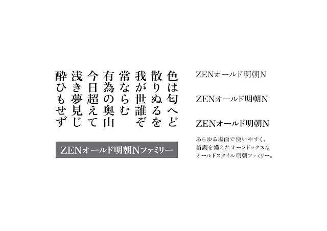

Zen Old Mincho text written in Japanese with some styles and weights

Zen Old Mincho


[Min]  What did you focus on, or have in mind, regarding the readability of the font when you designed it?


[Ohira]  In my opinion, traditional designs are friendlier to users and thus easy to read. People are always attracted to beautiful designs because they foster a smooth reading experience. A comfortable reading rhythm is created by controlling the dynamics. For these reasons, I believe traditional and beautiful design with well controlled dynamics brings high quality legibility, and so I focused on them when designing the Zen Fonts.


Man and woman sitting by fire with cups, conversation bubbles in Zen fonts
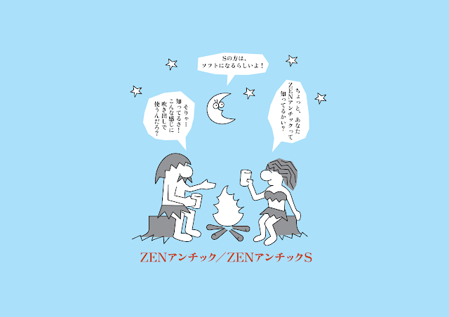
Zen Antique, Zen Antique S


[Min]  What kind of research did you do to create your font?


[Ohira]  Old typefaces and books are the core base of my work. I used to look at them often for inspiration. I could see how the flavor in the old letters influenced the legibility, and I would apply those discoveries in my designs.


[Min]  It’s amusing how you designed such a progressive typeface at that time from traditional books and letters. Why do you think there were no similar fonts like yours’ created before? Do you think the recent research or technology made it possible to create your font that didn’t exist previously?


[Ohira]  There are a lot of antique old-style metal typefaces that have good legibility. Those old typefaces gave me many ideas that I applied to my work. I believe that the good legibility of Zen Fonts comes from pursuing traditional old-style legibility. But there are many ways to approach the issue. If more type designers focus on legibility, we can have a variety of Japanese fonts with high legibility. 
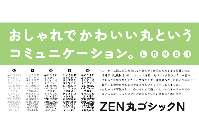
Zen Maru Gothic text written in Japanese with some styles and weights
Zen Maru Gothic


[Min]  Do you have any plans to expand your font families to multiple scripts? Are there any similar fonts that support multiple scripts?


[Ohira]  I would love to expand the family, if possible. I believe that having a wide range of glyphs and supporting many scripts are very meaningful things to do. As for the latter question, I don’t think there are any Japanese fonts similar to Zen Fonts that support multiple scripts.
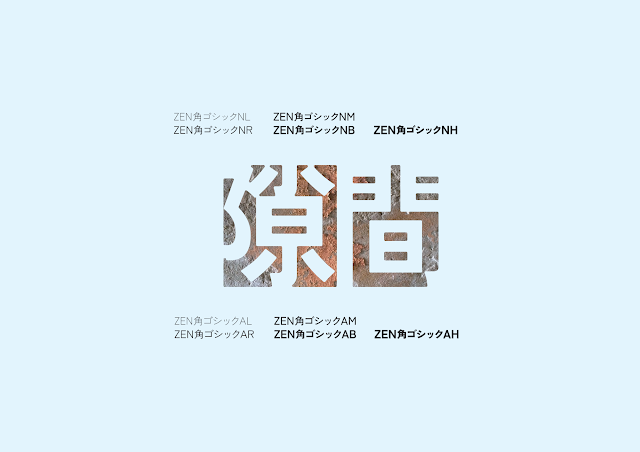
Kaku Gothic text written in Japanese with some styles and weights
Zen Kaku Gothic


[Min] What do you think we can do to help designers recognize the many factors that go into choosing fonts—that there’s more to consider (depending on the purpose of the design, or who the design is for) than the look or style of the design?


[Ohira]  Let me share my experience. I once got a commission to design a signage system for a public facility that needed to follow the principles of universal design. I offered the Zen Font family, but the client wanted to know a logical reason why this font should be used for this project. So I gave them a detailed explanation about the good legibility of the Zen Font. A few days later, the client’s answer was yes, and they said that they did not think a single font could matter this much on legibility, and that their views on fonts have changed completely. Then I realized that not many users recognize the legibility of fonts. So my answer is that we need more opportunities and places to communicate between users and type designers, to share, discuss, and ask questions about fonts.
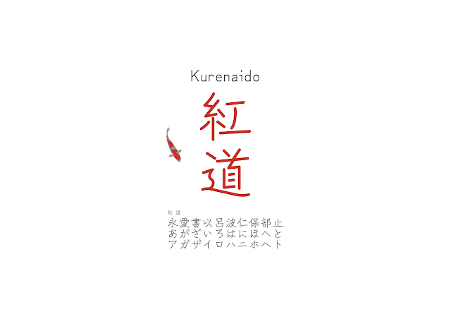


Zen Kurenaido text written in Japanese with some styles and weights
Zen Kurenaido


[Min]  What do you think is the next step for the current type and typography realm? Or, what do you wish already existed in the world for type and typography?


[Ohira]  The number of fonts and type designers are increasing every year, but I’m afraid there aren’t enough fonts with memorable designs or good legibility. I wish that the type designers put more time to think deeply about the usage, purpose, and demand of the font. You need much more time than you think to design a font. This also means that the economic situation (budget and payment on font projects) and the environment of the realm should improve too. 


[Min]  Thank you for the wonderful insights and comments. This is the last question—what’s next for you in type & typography?


[Ohira]  I’m not sure yet, but, probably wandering around the world to meet more letters and types.
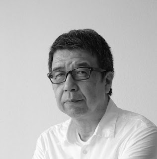

Black and white photo of Yoshimichi Ohira wearing glasses
Yoshimichi Ohira


About Yoshimichi Ohira

Ohira became a type designer after building his career in typography. He has designed 23 Japanese fonts and three Latin fonts. One of his major works is Zen Old Mincho N Family, which pursued traditional Japanese beauty. In addition to type design, he also works on creating metal seals (Hanko).  Zen Fonts

About the author
Min-Young Kim is a UI/UX and typography consultant based in Tokyo, with a focus on trilingual Korean-Japanese-Latin multiscript typography. While not yet a typeface designer herself, Min has developed a career in the font business as a type project manager, and started her own studio Em Dash in 2020. She recently worked with Google Fonts on Japanese and Korean font development projects, Adobe Creative Cloud on East-Asian UX research & design, and was invited to the jury of the D&AD Awards 2021 for type design. With a deep understanding of typography, Min is dedicating her life to diversifying the potential of fonts in various products and environments, and hopes more people can find the fun in choosing and using type. @mintoming  AtypI presentation

Zenフォントのおはなし:大平善道さんとのインタビュー


[きむ]  本日はインタビューに応じていただき誠にありがとうございます。まず、大平さんについてご紹介いただけますでしょうか?どのような経緯でタイプデザイナーになり、Zenファミリーのプロジェクトを始めることになったのかぜひ聞かせてください。


[大平] ご招待くださりありがとうございます。私は写植でのDTPオペレーターを経験した際に、書体の美しさに触れ、私自身も書体を作りたいと思うようになりました。当時の組版発注者は、印刷、出版、映像、広告関係者でした。製作者によって指定書体に偏りがありましたが、その中でも共通する書体があることを知りました。Zen書体で目指したのは、どのような制作物にも共有できるオールマイティーな書体ファミリーです。そして、読みやすく美しい、息の長い100年続く書体を生み出したいと考えました。


Zenオールド明朝の3種類のウェイトと縦書き、横書きの使用例。あらゆる場面で使いやすく、格調を備えたオーソドックスなオールドスタイル明朝ファミリー。
Zenオールド明朝

[きむ]  Zenファミリーをリリースした当時の反応はどうでしたか?


[大平]   1997年、ZENオールド明朝-R(Regular)は1ウエイトだけのリリースでした。正直に言うと、当時の反応は殆どありませんでした。しかし、翌年から徐々にデザイナーさん達のコミュニティなどで書体が認知されるようになり、ZENオールド明朝を探し求め、購入者がどんどん増えていったことを思い出します。当時を振り返ると、小さなベンダーがライセンス事業で本当に成り立つのか?とても不安でした。結果的にファミリー化も実現し、ここまで継続できたことは非常に意義のある経験でした。


[きむ]  Zenファミリーをデザインする際に、高い可読性を持たせるためにどのようなことを意識しながら制作しましたか?


[大平]    伝統的なものは、親近感が湧くのでわかりやすい。美しいものには、惹かれるので違和感が生まれにくい。そしてメリハリは、強弱などがあり、可読にふさわしい心地よいリズムをつくると考えられます。これらの理由から「伝統的」や「美しい」、「メリハリ」には、質の高い可読性を呼び込む要因があると考えて、意識していました。


イラストで男性と女性がキャンプファイヤーを囲み、Zenアンチックについて話をしている。吹き出しはZenアンチックで書かれている。
Zenアンチック、ZenアンチックS

[きむ]  制作の際に、どのようなリサーチなどをされましたか?


[大平] 古い活字や古い書物をよく眺めました。文字の中に味わい深さを感じとり、可読性も感じられました。これらの文字から多くを学び、影響を受けました。私の書体制作の基盤となっています。


[きむ]  あのような画期的な書体を古い書物等からお作りになったのは素晴らしいですね。それまでにZenファミリーのような書体が存在してなかった作られなかったのはなぜだと思いますか?現代の技術と研究があれば、Zenファミリーのような書体をもっと作ることは可能だと思いますか?


[大平] 過去の古い活字には高い可読性を持ったオールドスタイルの書体はたくさんありました。私はその古い書体から多くのヒントをいただき作品に反映させてきました。そして、オールドスタイルを重要視して読みやすさを追求した結果、Zenファミリーの「良い可読性」が得られたと思ってます。どこにアプローチするかが大切です。様々な可読性へのアプローチがあれば書体に多様性を育みます。そして、高い可読性を持つ書体がたくさん生まれてくると考えてます。


Zen丸ゴシックの縦書き、横書きを含めた5種類のウェイトの使用例。おしゃれで可愛らしい、柔らかくて優しいといったキーワードでのコミュニーケーションに最適。
Zen丸ゴシック

[きむ]  今後大平さんの書体を多言語展開をしたいと思いますか?Zenファミリーと似た方向性のほかの日本語書体の中で多言語展開しているものはありますか?


[大平] 文字の拡張や多言語展開はとても有意義なことだと思うので、ぜひ挑戦してみたいです。Zenファミリーに似た他の日本語書体で多言語展開しているものはないと思います。


Zen角ゴシックの10種類のウェイトの使用例。
Zen角ゴシック


[きむ]  フォントを利用するユーザーのみなさんに、フォントによっていかに「読みやすさ」が変わるかを認識してもらうためには、どんなことができると思いますか?見た目のデザイン的な要素だけでなく、目的や読み手によってフォントの選定基準が変わることをもっと知ってもらうために、わたしたちができることはなにがあると思いますか?


[大平] 私の体験談をお話します。以前、バリアフリーに関わる公共施設のサイン計画について、デザイン会社から相談の依頼がありました。私はZenファミリーフォントを提案しましたが、クライアントはなぜそのフォントが適しているのか詳しく説明して欲しいとのことでした。そこで、私はいかにZen書体が読みやすいか詳しく説明しました。後日、クライアントから「今まで以上に書体と可読性の関係性について理解でき、書体の見方が変わりました」との連絡をいただきました。ユーザーと接するなかで「読みやすさ」について認識されている方は少ないと感じてます。ユーザーや書体デザイナーが気軽にフォントについて相談できる場所の提供や、意見を共有できる仕組みが必要なのかも知れません。


Zen紅道の使用例。中心に縦書きで大きく”紅道”、左横に赤い鯉の絵が書かれている。
Zen紅道


[きむ]  今現在のフォントやタイポグラフィ業界における課題はなんだと思いますか?


[大平]   フォントや書体デザイナーの数が年々増えていますが、記憶に残るデザイン、良い可読性を持つフォントが少ないように感じてます。使われ方、目的、需要などを熟慮し、貴重な時間を惜しみなく使い、制作に挑んで欲しいと思います。フォント制作に挑むには多くの時間を必要とします。書体デザイナーの取り巻く環境、経済的な問題をクリアーできる仕組みも必要ではないでしょうか。


[きむ]  貴重なお時間をありがとうございました。最後になりますが、大平さんの書体やタイポグラフィにおける次の旅はどこに続きますか?


[大平] 今はわかりませんが、たぶん、文字との出会いを大切にした放浪の旅に出るかも知れません。


白黒の写真で白いYシャツ着用し、黒縁のメガネをかけた大平義道氏
大平義道氏のプロフィール写真


大平善道

文字組版と向かい合う中で、いつしか書体デザインに携わる。これまで和文23書体、欧文3書体の作品を製作し、代表作は、和文の伝統的な美しさを追求した「ZENオールド明朝Nファミリー」など。現在は印章で用いる古代文字(篆書)に関心を抱き、オリジナルデザインの文字で金属製印鑑を製作している。Zen Fonts

きむみんよん
日欧韓トリリンガルのUIUX&タイポグラフィコンサルタント。専門は多言語タイポグラフィ。日本の大手タイプファウンダリにてフォントのプロジェクトマネージャーを経て、現在は個人事務所Em Dash(エムダッシュ)を立ち上げ、様々なプロジェクトに参加している。近年ではGoogle Fontsとの日本語および韓国語のフォント開発、Adobe Creative Cloudの東アジア言語のUXリサーチ&デザイン、D&AD Awards 2021にてタイプデザイン部門の審査委員などに携わっている。タイポグラフィの知識を活かし、フォントの可能性を広げ、より多くの人々に文字とフォントの楽しさを伝えていくことを目標としている。 @mintoming  AtypI presentation