Tag Archives: Design

Celebrate Black creative visions with Chrome

This Black History Month, the Chrome team is showcasing exciting new work by Black artists in a collection of themes that let you customize the look of your browser.

We commissioned six contemporary artists and invited them to turn Chrome into their canvas. Working in different mediums and bringing different points of view, each artist has presented their interpretation of the ways people use Chrome: finding new knowledge, connecting with each other, exploring our world and taking action towards our goals.

Our design team crafted themes around their work to fuse them seamlessly into Chrome, coordinating the colors of your tabs and making sure the work looks great on all types of laptop and desktop screens.

We drew inspiration from the #drawingwhileblack hashtag, organized by featured artist Abelle Hayford, as well as from the many artists who have used their talents to advance the call for justice and give us visions of a better future. We hope these themes help you discover new artists, and bring you energy and joy throughout your day as you go to new places through art. 

Browse all 24 themes in the collection on the Chrome Web Store, and read on to hear from the artists:


A Google designer takes us inside Search’s mobile redesign

The beginning of a new year inspires people everywhere to make changes. It's when many of us take stock of our lives, our careers or even just our surroundings and think about what improvements we can make. That's also been the case for Google designer Aileen Cheng. Aileen recently led a major visual redesign of the mobile Search experience, which rolls out in the coming days. “We wanted to take a step back to simplify a bit so people could find what they’re looking for faster and more easily,” she says. “I find it really refreshing. To me, it’s a breath of fresh air!” 

Like all organizing efforts, this one came with its challenges. “Rethinking the visual design for something like Search is really complex,” Aileen says. “That’s especially true given how much Google Search has evolved. We’re not just organizing the web’s information, but all the world’s information,” Aileen says. “We started with organizing web pages, but now there’s so much diversity in the types of content and information we have to help make sense of.” 

Image showing a mock-up of a Pixel phone with Google Search pulled up on the screen. The search results show answers about Humpback whales, including two images.

We recently had the chance to learn more about the new look from Aileen, as well as the process. Here are five things that drove the redesign: 

1. Bringing information into focus. “We want to let the search results shine, allowing people to focus on the information instead of the design elements around it,” says Aileen. “It’s about simplifying the experience and getting people to the information they’re looking for as clearly and quickly as possible.” 

2. Making text easier to read. One way the team did this was by using larger, bolder text, so the human eye can scan and understand Search results faster. “We’re making the result and section titles bigger, as well,” Aileen says. While we’re on the subject of text: The update also includes more of Google’s own font, which already shows up in Android and Gmail, among other Google products. “Bringing consistency to when and how we use fonts in Search was important, too, which also helps people parse information more efficiently,” Aileen explains. 

Image showing a phone with Google Search pulled up on the screen. The search query is for "running spots sf."

3. Creating more breathing room. “We decided to create a new edge-to-edge results design and to minimize the use of shadows, making it easier to immediately see what you’re looking for,” says Aileen. “The overall effect is that you have more visual space and breathing room for Search results and other content to take center stage.”

4. Using color to highlight what’s important. Aileen says that some other iterations of the redesign experimented with using lots of bold colors, and others tried more muted tones. They weren’t quite right, though, and ultimately the team focused on centering content and images against a clean background and using color more intentionally to guide the eye to important information without being overwhelming or distracting. “It has an optimistic feel, too,” Aileen says.  

5. Leaning into that “Googley” feeling. If you’re noticing the new design feels a little bubblier and bouncier, you’re onto something. “If you look at the Google logo, you’ll notice there’s a lot of roundness to it, so we’re borrowing from that and bringing it to other places as well,” says Aileen. You’ll see that in parts of this redesign, like in rounded icons and imagery. “That form is already so much a part of our DNA. Just look at the Search bar, or the magnifying glass,” Aileen points out.

Image showing Google logo with design effects pointing to its roundness.

Part of the work is also in refreshing the look while remaining familiar. “My three-year-old recently dropped a handful of Legos in my hand, red, yellow, green, blue, and he told me, ‘Mama, this is Google,’” Aileen says. “That’s how playful and well known we are to people. And when we redesign something, we want to bring that familiarity and approachability with us, too.”

Source: Search


Fernanda Viégas puts people at the heart of AI

When Fernanda Viégas was in college, it took three years with three different majors before she decided she wanted to study graphic design and art history. And even then, she couldn’t have imagined the job she has today: building artificial intelligence and machine learning with fairness and transparency in mind to help people in their daily lives.  

Today Fernanda, who grew up in Rio de Janeiro, Brazil, is a senior researcher at Google. She’s based in London, where she co-leads the global People + AI Research (PAIR) Initiative, which she co-founded with fellow senior research scientist Martin M. Wattenberg and Senior UX Researcher Jess Holbrook, and the Big Picture team. She and her colleagues make sure people at Google think about fairness and values–and putting Google’s AI Principlesinto practice–when they work on artificial intelligence. Her team recently launched a seriesof “AI Explorables,"a collection of interactive articles to better explain machine learning to everyone. 

When she’s not looking into the big questions around emerging technology, she’s also an artist, known for her artistic collaborations with Wattenberg. Their data visualization art is a part of the permanent collection of the Museum of Modern Art in New York.  

I recently sat down with Fernanda via Google Meet to talk about her role and the importance of putting people first when it comes to AI. 

How would you explain your job to someone who isn't in tech?

As a research scientist, I try to make sure that machine learning (ML) systems can be better understood by people, to help people have the right level of trust in these systems. One of the main ways in which our work makes its way to the public is through the People + AI Guidebook, a set of principles and guidelines for user experience (UX) designers, product managers and engineering teams to create products that are easier to understand from a user’s perspective.

What is a key challenge that you’re focusing on in your research? 

My team builds data visualization tools that help people building AI systems to consider issues like fairness proactively, so that their products can work better for more people. Here’s a generic example: Let’s imagine it's time for your coffee break and you use an app that uses machine learning for recommendations of coffee places near you at that moment. Your coffee app provides 10 recommendations for cafes in your area, and they’re all well-rated. From an accuracy perspective, the app performed its job: It offered information on a certain number of cafes near you. But it didn’t account for unintended unfair bias. For example: Did you get recommendations only for large businesses? Did the recommendations include only chain coffee shops? Or did they also include small, locally owned shops? How about places with international styles of coffee that might be nearby? 

The tools our team makes help ensure that the recommendations people get aren’t unfairly biased. By making these biases easy to spot with engaging visualizations of the data, we can help identify what might be improved. 

What inspired you to join Google? 

It’s so interesting to consider this because my story comes out of repeated failures, actually! When I was a student in Brazil, where I was born and grew up, I failed repeatedly in figuring out what I wanted to do. After spending three years studying for different things—chemical engineering, linguistics, education—someone said to me, “You should try to get a scholarship to go to the U.S.” I asked them why I should leave my country to study somewhere when I wasn’t even sure of my major. “That's the thing,” they said. “In the U.S. you can be undecided and change majors.” I loved it! 

So I went to the U.S. and by the time I was graduating, I decided I loved design but I didn't want to be a traditional graphic designer for the rest of my life. That’s when I heard about the Media Lab at MIT and ended up doing a master's degree and PhD in data visualization there. That’s what led me to IBM, where I met Martin M. Wattenberg. Martin has been my working partner for 15 years now; we created a startup after IBM and then Google hired us. In joining, I knew it was our chance to work on products that have the possibility of affecting the world and regular people at scale. 

Two years ago, we shared our seven AI Principles to guide our work. How do you apply them to your everyday research?

One recent example is from our work with the Google Flights team. They offered users alerts about the “right time to buy tickets,” but users were asking themselves, Hmm, how do I trust this alert?  So the designers used our PAIR Guidebook to underscore the importance of AI explainability in their discussions with the engineering team. Together, they redesigned the feature to show users how the price for a flight has changed over the past few months and notify them when prices may go up or won’t get any lower. When it launched, people saw our price history graph and responded very well to it. By using our PAIR Guidebook, the team learned that how you explain your technology can significantly shape the user’s trust in your system. 

Historically, ML has been evaluated along the lines of mathematical metrics for accuracy—but that’s not enough. Once systems touch real lives, there’s so much more you have to think about, such as fairness, transparency, bias and explainability—making sure people understand why an algorithm does what it does. These are the challenges that inspire me to stay at Google after more than 10 years. 

What’s been one of the most rewarding moments of your career?

Whenever we talk to students and there are women and minorities who are excited about working in tech, that’s incredibly inspiring to me. I want them to know they belong in tech, they have a place here. 

Also, working with my team on a Google Doodle about the composer Johann Sebastian Bach last year was so rewarding. It was the very first time Google used AI for a Doodle and it was thrilling to tell my family in Brazil, look, there’s an AI Doodle that uses our tech! 

How should aspiring AI thinkers and future technologists prepare for a career in this field? 

Try to be deep in your field of interest. If it’s AI, there are so many different aspects to this technology, so try to make sure you learn about them. AI isn’t just about technology. It’s always useful to be looking at the applications of the technology, how it impacts real people in real situations.

Introducing an easier way to design your G Suite Add-on

Posted by Kylie Poppen, Senior Interaction Designer, G Suite and Akshay Potnis, Interaction Designer, G Suite

You’ve just scoped out an awesome new way to solve for your customer’s next challenge, but wait, what about the design? Building an integration between your software platform and another comes with a laundry list of things to think about: your vision, your users, their experience, your partners, APIs, developer docs, and so on. Caught between two different platforms, many constraints, and limited time, you're probably wondering: how might we build the most intuitive and powerful user experience?

Imagine making a presentation, with Google Slides you have all sorts of templates to get you started, and you can build a great deck easily. But, to build a seamless integration between two software platforms, those pre-built templates don’t exist and you basically have to start from scratch. In the best case scenario, you’d create your own components and layer them on top of each other with the goal of making the UI seem just about right. But this takes time. Hours longer than you want it to. Without design guidelines, you're stuck guessing what is or is not possible, looking to other apps and emulating what they've already done. Which leads us to the reality that some add-ons have a suboptimal experience, because time is limited, and you're left to build only for what you know you can do, rather than what's actually possible.

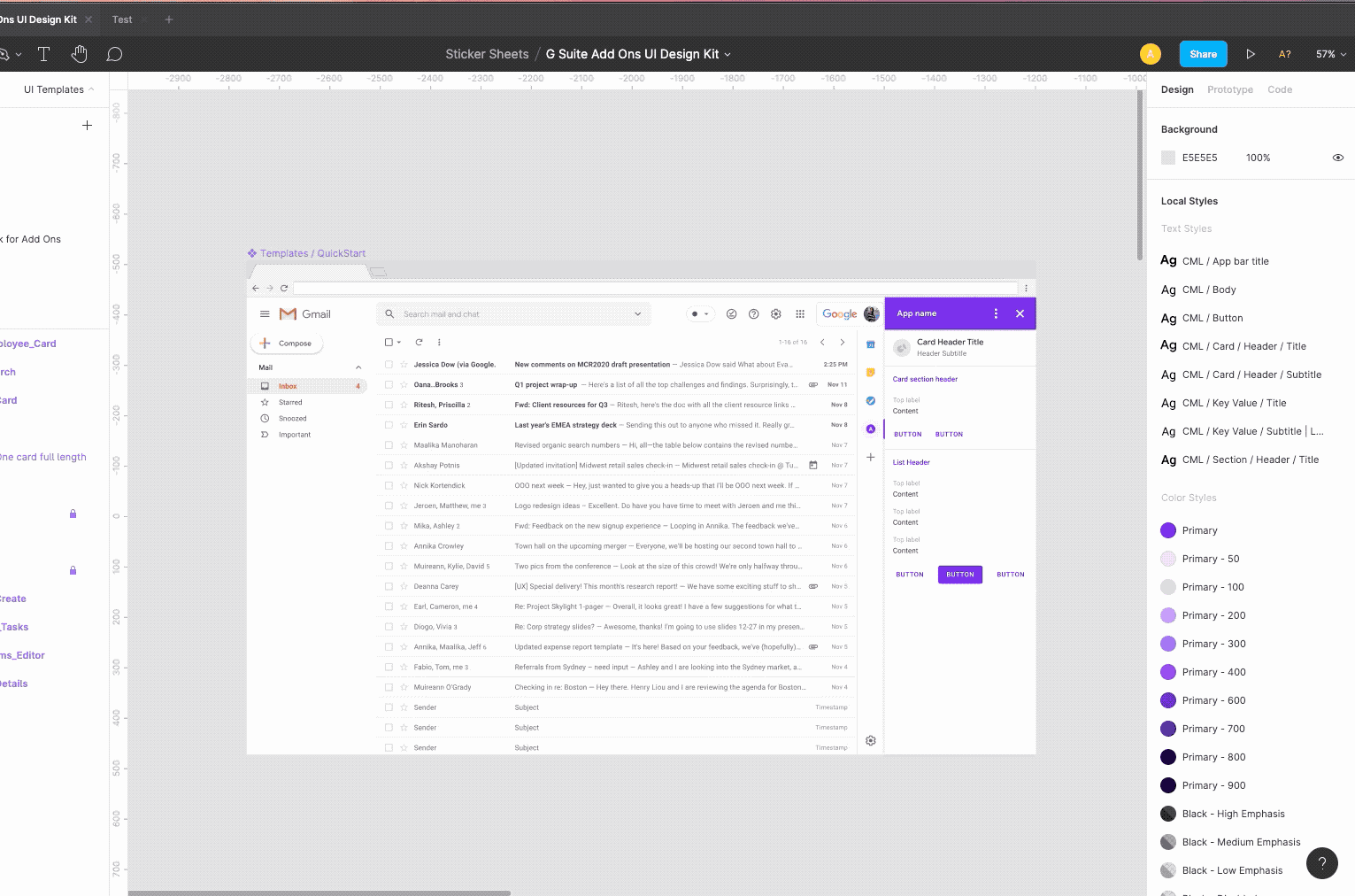
To simplify all of this, we’re introducing the G Suite Add-ons UI Design Kit, now live on Figma. With it you can browse all of the components of G Suite Add-ons’ card-based interface, learn best practices, and simply drag-and-drop to create your own unique designs. Save the time spent recreating what an add-on will look like, so that you can spend that time thinking about how your add-on will work .

While the UI Design Kit has only been live for a little over a month, we’ve already been hearing feedback from our partners about its impact.

“Zapier connects more than 2,000 apps, allowing businesses to automate repetitive, time-consuming tasks. When building these integrations, we want to ensure a seamless experience for our customers,” said Ryan Powell, Product Manager at Zapier. “However, a partner’s UI can be difficult to navigate when starting from scratch. G Suite’s UI Design Kit allows us to build, test and optimize integrations because we know from the start what is and is not possible inside of GSuite’s UI.”

Here’s how to use the UI Design Kit:

Step 1

Find and duplicate design kit

  • Search for G suite on Figma community or use this link
  • Open G Suite Add Ons UI Design Kit
  • Just click the duplicate button.
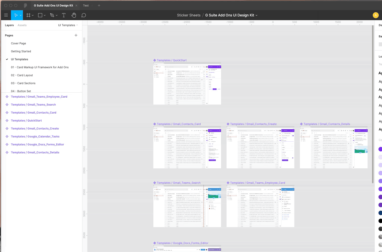
Step 2

Choose a template to begin

  • Go to UI templates page
  • Select a template from the list of templates
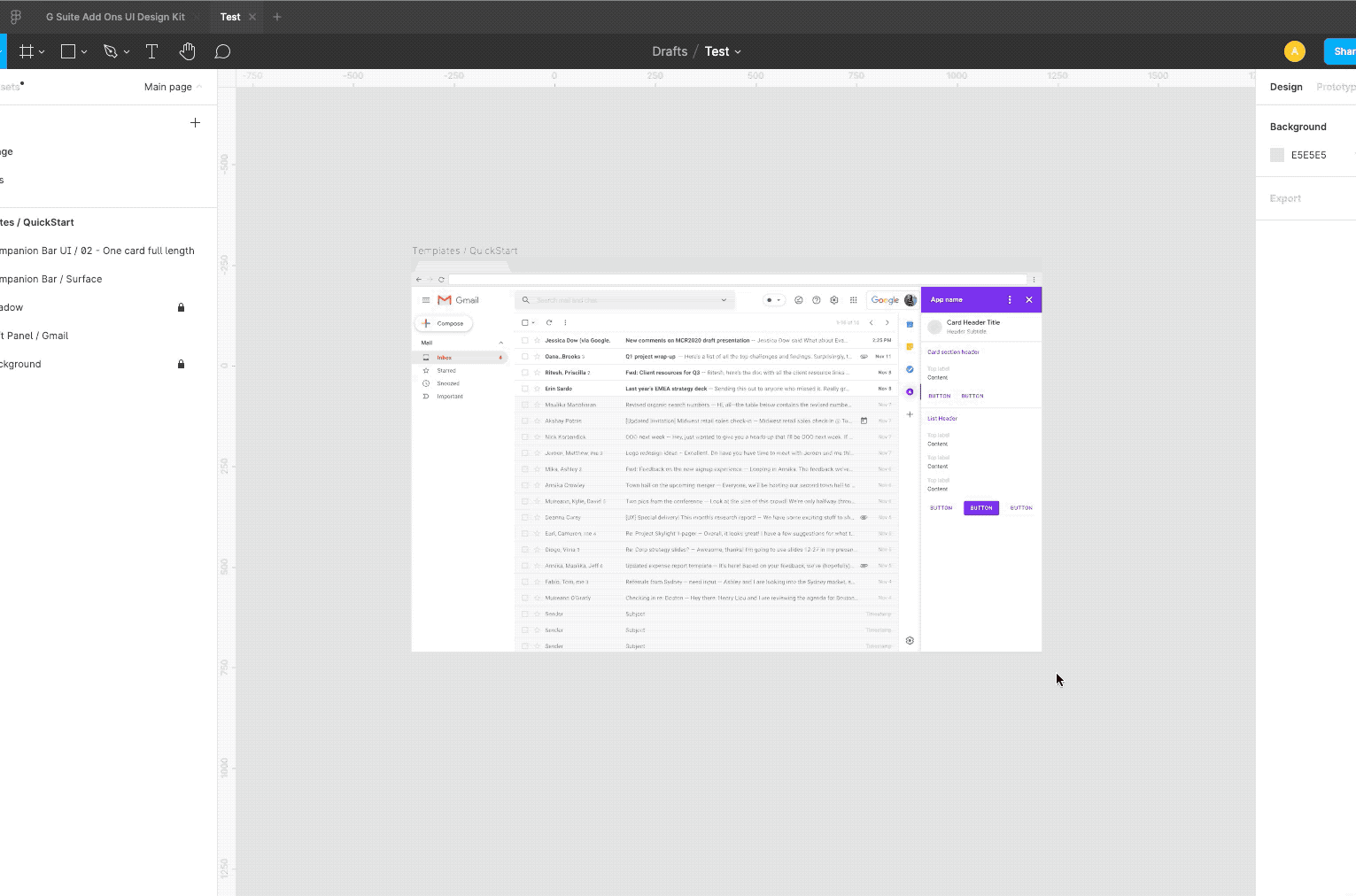
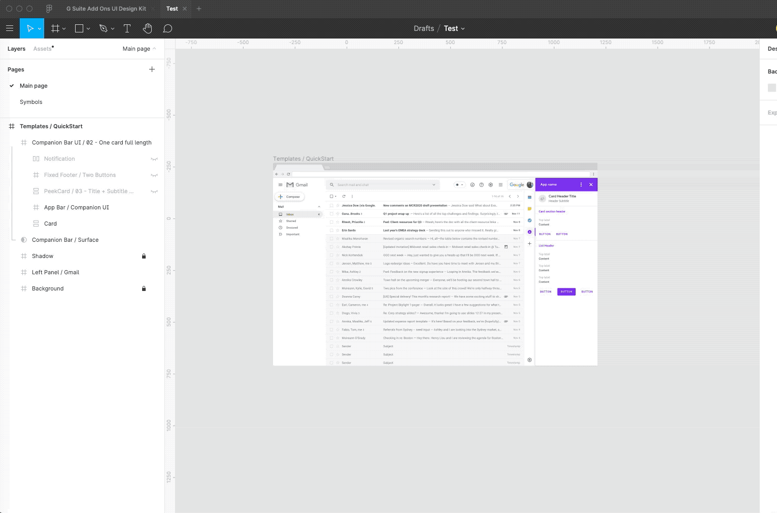
Step 3

Copy the template and detach from symbols to start editing

Helpful Hints: Features to help you iterate quickly

Build with auto layout, you don’t need to worry about the details.

  • Copy paste maintains layout padding & structure.
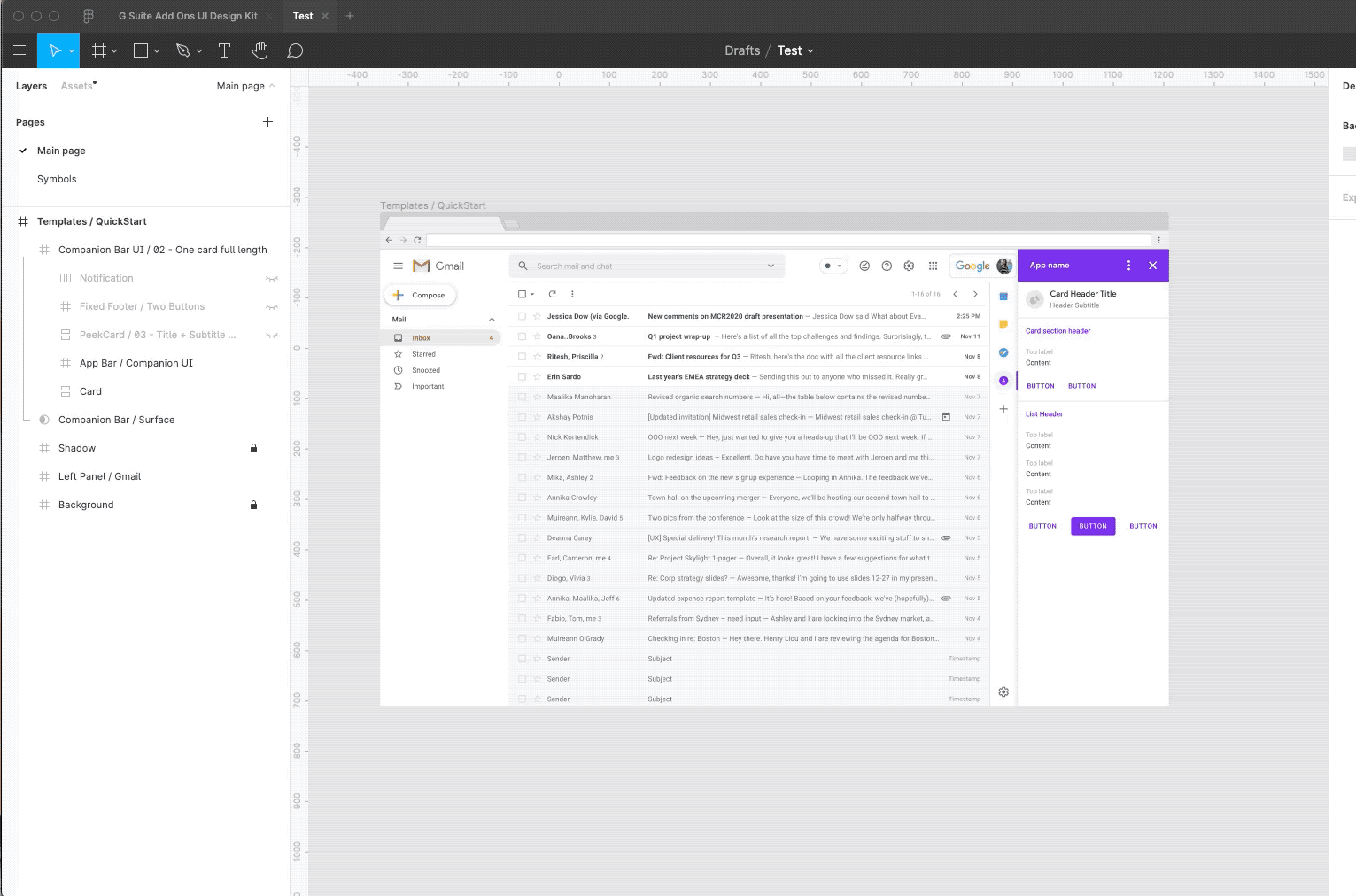
  • Maintained padding & structure while editing.
  • Built in fixed footer and peek cards.

Visualize your design against G-Suite surfaces easily.

Documentation built right into the template.

  1. Go to the component page (e.g section)
  2. Find layout + documentation / api links on respective pages

Next Steps to Consider:

With G Suite Add-ons, users and admins can seamlessly get their work done, across their favorite workplace applications, without needing to leave G Suite. With this UI Design Kit, you too can focus your time on building a great user experience inside of G Suite, while simplifying and accelerating the design process. Follow these steps to get started today:

Download the UI Design Kit

Get started with G Suite Add-ons

Hopefully this will inspire you to build more add-ons using the Cards Framework! To learn more about building for G Suite, check out the developer page, and please register for Next OnAir, which kicks off July 14th.

Flutter Create’s big winner is a self-taught “beginner”

When Zebiao Hu found out he won the $10,000 Flutter Create grand prize, he didn't even tell his own wife. She learned about it through his posts on social media. He says he didn’t boast about his big win because he still sees himself as a beginner: He taught himself Flutter just weeks before the deadline, and created a compass app that won him the big prize. 

Flutter is Google's toolkit for building beautiful apps that run on your mobile phone, laptop and web browser from the same code (instead of having to write a different app for each device, as is common today). When Google announced Flutter Create, the contest attracted attention from developers all over the world. We received nearly a thousand submissions from 60+ countries and regions, including entries from both first-time coders and Flutter experts. The contest challenged developers to build something interesting, inspiring, and beautiful with Flutter using five kilobytes or less of Dart code. That’s a tiny amount of space: to put it into perspective, that’s less than half a second of a typical digital music file.

Flutter Create highlights

Highlights from the hundreds of submissions we received.

As a coder working in Shenzhen, China, Zebiao decided to learn about mobile development, because the industry was heading in a “mobile-first direction.” He bought books about Flutter and Dart in Chinese, and started to learn during the spring of 2019. Flutter Create was less than one month away.

Zebiao is no stranger to teaching himself how to code, though. In high school, he spent days and nights in the computer room, taking up coding because of his love of video games. After becoming an accomplished player, he began to wonder, "How are these games developed? Could I make one myself?"

Zebiao Hu, Flutter Create winner

Zebiao in the park where he usually jogs.

But, at that time, information about programming was hard to get and, for a high school student, difficult to learn. Luckily, Zebiao discovered a box of CDs, with one called “Programming.” His hobby turned into a career. As an early adopter, he became well known in local software circles, and was often approached to collaborate on projects. Customers became frequent customers, and then friends, bringing even more projects to him. 

Eventually, Zebiao got married and became the father of two children. Every day, he sends his children to school, and goes home to work. In the evening, he ends his work day and picks the kids up.

He says when he’s not working, he’s “running, drinking tea, and spending the weekend with my children at the amusement park.” And he’ll still take time to play the video games he played 15 or 20 years ago. 

Zebiao Hu, Flutter Create winner, made a compass app

The compass app did not feature a globe at first. 

When he set out to build his compass app, Zebiao found useful materials on Flutter’s official  website, Flutter’s Youtube channel and from Flutter Chinese online communities. He didn’t aim for the prize because he hadn’t been using Flutter for long, but instead entered to test his knowledge. 

He started the new project on March 15, only three weeks from April 7, the final submission date for Flutter Create. After the first version of the app was completed, the code was less than 5KB, but Zebiao was not satisfied, because it lacked an interesting visual. "It was boring to read the latitude and longitude in text form," he says. So he decided to upgrade the design to display the data using an interactive globe.

There was only one small problem: he had never programmed an animation before.

“Honestly, I learned everything from scratch,” Zebiao says. “After all, I had never used these tools before.” 

Finally, two days before the deadline, Zebiao successfully submitted his compass application.

Zebiao Hu's app

 Zebiao learned how to make his app from scratch. 

Zebiao says he doesn’t want to give advice to Flutter beginners, because he sees himself as a beginner, too. But he urged people to keep learning, even if their projects don’t use Flutter yet, and to find their own community of developers to share resources. And he says it’s important to stay open to whenever an idea strikes. “Keep a notebook with you,” he says. “Write down your thoughts, ideas or problems whenever possible. And try to solve them later.” 

When you can’t find the words, 65 new emoji are here for you

Are you a ?person or a ?person? Or maybe you're more of a ??????❣ person than a simple ?person. Either way it's time to celebrate what is arguably the most important day of the year, World Emoji Day. Never heard of it? That's ok, you can look forward to 65 new emoji that we’re releasing with Android Q later this year. For those who can’t wait, here’s a sneak peek at what’s coming:

A sloth for when you’re having a slow morning and running late but looking cute.

sloth emoji.jpeg

An otter for when you need to tell your significant otter that they are otterly amazing.

otter emoji.png

Garlic for when you need to fend off some vampires.

garlic emoji.png

Waffle emoji and kneeling emoji. For when you’re proposing your undying commitment and love for … breakfast.

proposalwaffle.png

Service Dog emoji and Guide Dog emoji. Just two good boys.

dog emoji.png

There are a lot of different kinds of couples out there, and our emoji should reflect that. So we designed 71 couples with different skin tones.

multi skintone emoji.png

The Diya lamp emoji is also new. We’ve had Christmas and Thanksgiving covered for a while—now it’s time for Diwali celebrations.

diwali emoji.png

We’re supporting 53 emojis with gender inclusive designs. For example, the emoji for “police officer” is commonly displayed as male and "person getting haircut" is female. These kinds of design decisions can reinforce gender stereotypes so with this update, emojis that don’t specify gender will default to a gender-ambiguous design. You can still choose between male and female presentations if want to opt into a gender on your keyboard.

gender emojis.gif

These new emoji will officially become available with the launch of Android Q. If you have one of these phones, you can access them today by enrolling in the Q Beta program. 

♓?️??️✌ 〰?®️?D  ?♏️???️ D?️✌❕

Source: Android


The importance of influence in design

Human behavior has always intrigued me—that's the reason I studied psychology as an undergraduate. At the time, I wondered how those learnings could one day apply to life in the “real world.” As it turns out, an understanding of people and human behavior is an invaluable asset when it comes to cultivating influence—especially when it comes to design.

In my role as VP of User Experience (UX) Design at Google, I’m constantly tasked with influencing others. I lead a team of designers, researchers, writers and engineers who are behind products like Google’s Shopping, Trips, Payments and Ads. To create great experiences, we must first convince the people building these products that design is elemental to delivering not just user value, but also business value. Over the years I've seen how the ability to build influence is essential to designing the best experiences.

User empathy is a fast track to influence

As UX professionals (designers, writers, researchers and front-end engineers), it’s our job to fully grasp the needs of people using our products and be the spokesperson for them. It’s easy to fall into the trap of believing that we understand our users without witnessing them actually using our products, or to believe that our personal experiences reflect those of people everywhere. Yet every time I go out into the real world and spend time with people actually using our products, I come back with an unexpected insight that changes how I initially thought about a problem.

In 2017, I took a trip to Jakarta to research the challenges of using smartphones in a region where service is relatively expensive and bandwidth is not readily available. It wasn’t until I was on the ground that I realized how degraded the experience was from what I’d pictured. Similarly, during a recent trip to Tel Aviv, I learned how difficult it is to get funding and grow a business. Developing this kind of understanding, which can only come from experience, helps motivate you to fix a problem from a different angle.

Ideally, we’d bring all of our team members into the field to have these first-hand experiences, but that approach doesn’t scale. What does scale is empathy. We can share our personal experiences, research and user stories to build greater understanding. Once we’ve built a foundation of shared understanding, we can have better influence over decisions that affect users.


customer personas

Understanding people's experiences and stories help build better products.

Inspire action with compelling stories

Research can provide the data and anecdotes that help others understand why your design meets a specific need, but how you present that data is equally important.

Creating rich stories full of photos and video clips helps expose others to how people use products and the challenges they encounter. On multiple occasions, I’ve been in a room where research clips of people interacting with a product or prototype are shared with executives and partners. Without fail, observing real people use products gets everyone animated and excited. Watching someone fumble through a task creates a sense of urgency to solve a problem that can’t be generated through data.

One way to do this is with prototyping software or animated slides that show a product flow or tell a narrative that helps people understand the pain points of a product or the ease of its well-designed experience. An interactive prototype lets people experience the full possibilities. If you’re lucky enough to work with a UX engineer, prototypes are probably already a part of your influence repertoire. There’s nothing better than prototyping and sharing a bold idea and hearing: “We need that! Let’s make it happen!”

Listen first

User experience is highly focused on empathy for users, yet we’re often so focused on people using our products that we don’t take the time to develop empathy for our colleagues. Making sure others feel seen, heard, and understood is a significant step toward influence. Similar to how we can mistakenly make assumptions about our users, we can fall into the same trap with our peers.

Too often people equate influence with asserting their perspective. Instead, influence starts with understanding the goals, motivations and frustrations of others.

It’s easy to make incorrect conclusions, so instead of rushing to make a point, start out by listening to your colleagues. Showing the courtesy of listening often begets reciprocity, and makes others more receptive to your perspective.

Our discipline is founded on exploring human connections and motivations through empathy and listening. Now you can use those tools to build influence, whether or not you work in UX.

Finding “A Space for Being” at Salone del Mobile in Milan

Do you have favorite music that helps you unwind after a long day? Is there a particular scent that transports you back to your childhood? Or does a soft blanket on your lap help you feel calmer as you sit down to read?

These reactions are our bodies’ responses to our surroundings, whether it's something we see, touch, smell, taste or hear. Designers intuitively consider these sensory inputs to evoke certain feelings in people. Neuroaesthetics, a scientific field of study that explores the impact of aesthetic experiences on human biology, offers insight into which inputs evoke specific responses. It’s the reason your heart rate may change when you touch certain fabrics and why your energy level could shift based on the colors around you.

Neuroaesthetics gives scientific backing to what designers have always known: design matters. It’s because of this intuition that our team of hardware designers built our Made by Google products using certain colors, like the Not Pink hue option for Pixel 3 phones, and specific textures, like the fabric base on the Google Home Hub. We always strive to build products that fit seamlessly into your life, and make you feel “at ease.”  

Today, we’re opening “A Space for Being,” our exhibit at the design conference Salone del Mobile Milano, that explores this connection and endeavors to make the impact of design more visible.

The exhibit, built in conjunction with Muuto Design, Reddymade Architecture and the International Arts + Mind Lab at John Hopkins University, is made up of three spaces furnished to look like rooms in a home. However, there is more than meets the eye in the overall design experience.

Each space features a distinct look, feel, scent and sound, complete with unique textures, colors and design elements. As attendees walk through the spaces, they’ll wear a specially-made wristband that measures biological responses such as heart activity, breathing rate, skin temperature, skin conductivity and motion. At the end, before each guest’s data is deleted, they’ll see a visual representation of their response to each room and receive a customized readout that suggests which space made them feel most “at ease.”


Take a look at some of our spaces in the photos above, and think about what makes yours “A Space for Being.”

Build your next iOS and Android app with Flutter

Mobile development is full of compromises. When you’re building a new app, you’re often forced into a difficult choice: do you build the same app twice—once for iOS, once for Android—so that you have a high quality experience for both platforms? Or do you create one app from a shared codebase that works across both platforms, but doesn't have the performance or user experience you were hoping for? Flutter offers a third way: enabling high-quality user experiences with excellent performance, along with letting you express your designers’ intent and share a common codebase.

Whether you're an entrepreneur with a new app idea, a developer who’s frustrated by the edit-compile-debug cycle of building an app, or a designer who wants to be able to iterate on new design concepts, here are a few reasons why you should consider creating your next app with Flutter.

Beautifully-designed apps on each platform

Creating app designs can involve trade-offs between the creative intent of a designer and the reality of what actually goes into production. Mobile designers and developers often work in different worlds, separated by a hard boundary between the different tools that they use and challenges with iterating on a design during the development process. Sometimes the designer’s vision is compromised by limitations in the APIs or framework the developer uses; sometimes, visual polish gets deferred until “later” because of other development work (and “later” often means “never” in practice).

Two mobile phone screens showing the differences between what was designed, and what was sent into production.

With Flutter, you have control over every pixel on the screen from the beginning, including a full set of widgets that deliver pixel-perfect experiences on both iOS and Android. Designers are using Flutter to create attractive experiences like Reflectly, the number one journaling app on the Apple app store:

The user interface of Reflectly, a journaling app.

There are also some design tools made for Flutter—like 2Dimensions Flare, which you can use to build animations and incorporate them into any app with a single line of code. Here’s an example of a custom animation built with Flare that interactively follows your typing at login:

A mobile log-in screen displaying a bear who follows your cursor as it moves across the screen.

You can find more details about this example here.

And Supernova, a design-to-code tool, recently announced support for exporting Sketch designs directly to Flutter, allowing users of this popular design and wire-framing tool to turn their ideas directly into code.

Fast apps on each platform

Rather than introducing a layer of abstraction between your code and the underlying operating system, Flutter apps are native apps—meaning they compile directly to both iOS and Android devices.

Flutter’s programming language, Dart, is designed around the needs of apps that are created for global audiences. It’s easy to learn, contains a comprehensive set of libraries and packages that reduce the amount of code you have to write and is built for developer performance. When you’re ready to release your app, you can compile your code directly to the ARM machine code of your phone—meaning what you write is exactly what appears on the device—so you can harness the full power of your phone, rather than using a language like JavaScript that needs a separate engine to run.

A side-by-side comparison of two mobile screens showing Flutter rendering animations on the phone in real-time.

Flutter rendering animations on the phone in real-time.

Flutter isn’t a games engine, but it brings games-level performance to your application. Every pixel in Flutter is drawn with the Skia graphics engine: the same hardware-accelerated engine that powers Android and Chrome. This combination enables fast, glitch-free performance for apps—meaning that apps can operate on a phone's screen at 60 frames per second—which will never feel sluggish, even on a slower device.

Productive app creation on each platform

If you’re a mobile app developer, you might feel like you spend more time waiting than coding. When you make a change to your code, you have to recompile it, deploy it to a mobile phone and then bring the app back into the same state it was in before you made the change to see the results. By contrast, Flutter introduces a new capability called Stateful Hot Reload, which transforms this development cycle, letting you implement changes in milliseconds—not minutes. Stateful Hot Reload also allows better collaboration between developers and designers when they want to improve the app design and immediately see the effects.

Two side-by-side screens show how an app’s user interface and logic are updated in the app without the need for recompilation.

Changes to an app’s user interface and logic are updated in the app without the need for recompilation.

Teams using Stateful Hot Reload report major gains to their productivity when making apps. Combining the quick turnaround on changes with the ability to ship for both iOS and Android, we’ve seen apps from brands like Abbey Road Studios, Hamilton and Reflectly go from writing their first line of code to a published app in just weeks.

Get started today

We just launched version 1.2 of Flutter at Mobile World Congress 2019. We encourage you to try Flutter by visiting flutter.dev. You’ll find all the resources you need to get started including videos, codelabs, case studies, documentation and community links.

Google Play services discontinuing updates for API levels 14 and 15

Posted by Sam Spencer, Technical Program Manager, Google Play

The Android Ice Cream Sandwich (ICS) platform is seven years old and the active device count has been below 1% for some time. Consequently, we are deprecating support for ICS in future releases of Google Play services. For devices running ICS, the Google Play Store will no longer update Play Services APK beyond version 14.7.99.

What does this mean as an Application developer:

The Google Play services SDK contains the interfaces to the functionality provided by the Google Play services APK, running as background services. The functionality required by the current, released SDK versions is already present on ICS devices with Google Play services and will continue to work without change.

With the SDK version changes earlier this year, each library can be independently released and may update its own minSdkVersion. Individual libraries are not required to change based on this deprecation. Newer SDK components may continue to support API levels 14 and 15 but many will update to require the higher API level. For applications that support API level 16 or greater, you will not need to make any changes to your build. For applications that support API levels 14 or 15, you may continue to build and publish your app to devices running ICS, but you will encounter build errors when updating to newer SDK versions. The error will look like this:

Error:Execution failed for task ':app:processDebugManifest'.
> Manifest merger failed : uses-sdk:minSdkVersion 14 cannot be smaller than version 16 declared in library [com.google.android.gms:play-services-FOO:16.X.YY]
        Suggestion: use tools:overrideLibrary="com.google.android.gms:play_services" to force usage

Unfortunately, the stated suggestion will not help you successfully run your app on older devices. In order to use the newer SDK, you will need to use one of the following options:

1. Target API level 16 as the minimum supported API level.

This is the recommended course of action. To discontinue support for API levels that will no longer receive Google Play services updates, simply increase the minSdkVersion value in your app's build.gradle to at least 16. If you update your app in this way and publish it to the Play Store, users of devices with less than that level of support will not be able to see or download the update. However, they will still be able to download and use the most recently published version of the app that does target their device.

A very small percentage of all Android devices are using API levels less than 16. You can read more about the current distribution of Android devices. We believe that many of these old devices are not actively being used.

If your app still has a significant number of users on older devices, you can use multiple APK support in Google Play to deliver an APK that uses Google Play services 14.7.99. This is described below.

2. Build multiple APKs to support devices with an API level less than 16.

Along with some configuration and code management, you can build multiple APKs that support different minimum API levels, with different versions of Google Play services. You can accomplish this with build variants in Gradle. First, define build flavors for legacy and newer versions of your app. For example, in your build.gradle, define two different product flavors, with two different compile dependencies for the stand-in example play-services-FOO component:

productFlavors {
    legacy {
        minSdkVersion 14
        versionCode 1401  // Min API level 14, v01
    }
    current {
        minSdkVersion 16
        versionCode 1601  // Min API level 16, v01
    }
}

dependencies {
    legacyCompile 'com.google.android.gms:play-services-FOO:16.0.0'
    currentCompile 'com.google.android.gms:play-services-FOO:17.0.0'
}

In the above situation, there are two product flavors being built against two different versions of play-services-FOO. This will work fine if only APIs are called that are available in the 16.0.0 library. If you need to call newer APIs made available with 17.0.0, you will have to create your own compatibility library for the newer API calls so that they are only built into the version of the application that can use them:

  1. Declare a Java interface that exposes the higher-level functionality you want to perform that is only available in current versions of Play services.
  2. Build two Android libraries that implement that interface. The "current" implementation should call the newer APIs as desired. The "legacy" implementation should no-op or otherwise act as desired with older versions of Play services. The interface should be added to both libraries.
  3. Conditionally compile each library into the app using "legacyCompile" and "currentCompile" dependencies as illustrated for play-services-FOO above.
  4. In the app's code, call through to the compatibility library whenever newer Play APIs are required.

After building a release APK for each flavor, you then publish them both to the Play Store, and the device will update with the most appropriate version for that device. Read more about multiple APK support in the Play Store.