Tag Archives: Android Design

Build flexible layouts with FlexboxLayout

Posted by Takeshi Hagikura, Developer Programs Engineer

At Google I/O last year we announced ConstraintLayout, which enables you to build complex layouts while maintaining a flat view hierarchy. It is also fully supported in Android Studio's Visual Layout Editor.

At the same time, we open sourced FlexboxLayout to bring the same functionalities of the CSS Flexible Layout module to Android. Here are some cases where FlexboxLayout is particularly effective.

FlexboxLayout can be interpreted as an advanced LinearLayout because both layouts align their child views sequentially. The significant difference between LinearLayout and FlexboxLayout is that FlexboxLayout has a feature for wrapping.

That means if you add the flexWrap="wrap" attribute, FlexboxLayout puts a view to a new line if there is not enough space left in the current line as shown in the picture below.


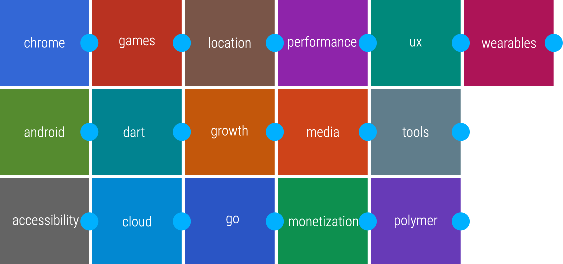
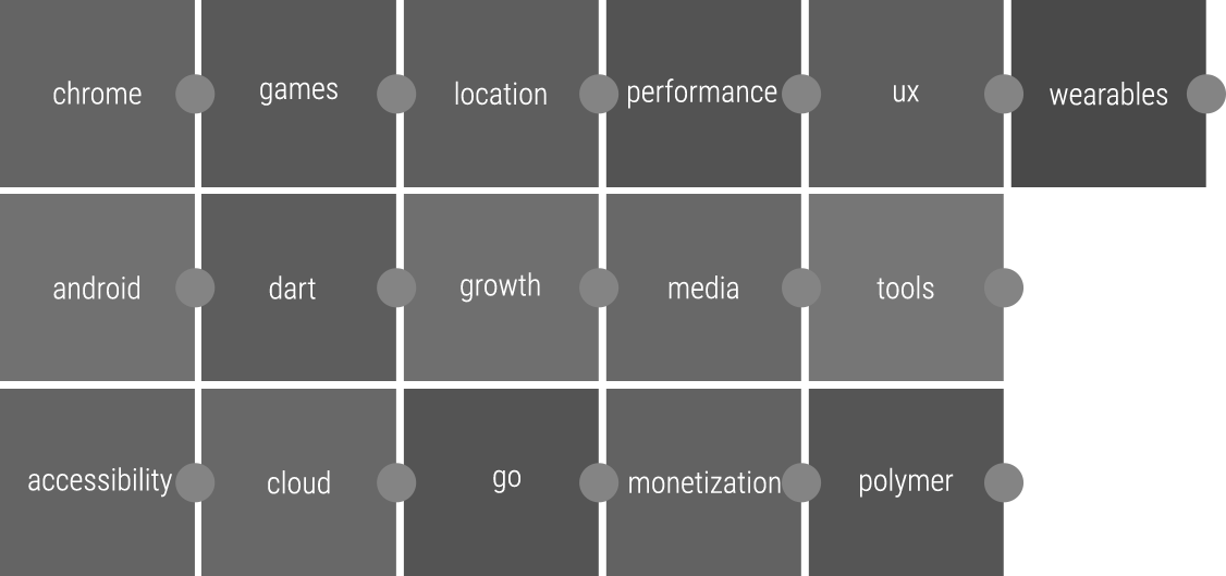
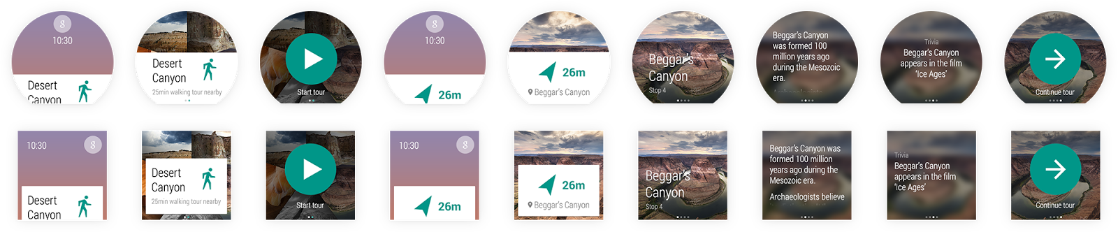
One layout for various screen sizes

With that characteristic in mind, let's take a case where you want to put views sequentially but have them move to new lines if the available space changes (due to a device factor, orientation changes or the window resizing in the multi-window mode).


Nexus5X portrait


Nexus5X landscape

Pixel C with multi window mode enabled, divider line on the left.


Pixel C with multi window mode enabled, divider line on the middle.


Pixel C with multi window mode enabled, divider line on the right.

You would need to define multiple DP-bucket layouts (such as layout-600dp, layout-720dp, layout-1020dp) to handle various screen sizes with traditional layouts such as LinearLayout or RelativeLayout. But the dialog above is built with a single FlexboxLayout.

The technique used in the example is setting the flexWrap="wrap" as explained above,

<com .google.android.flexbox.flexboxlayout 
     android:layout_width="match_parent" 
     android:layout_height="wrap_content" 
     app:flexwrap="wrap">
then you can get the following layout where child views are aligned to a new line instead of overflowing its parent.


Another technique I'd like to highlight is setting the layout_flexGrow attribute to an individual child. This helps improve the look of the final layout when free space is left over. The layout_flexGrow attribute works similar to the layout_weight attribute in LinearLayout. That means FlexboxLayout will distribute the remaining space according to the layout_flexGrow value set to each child in the same line.

In the example below, it assumes each child has the layout_flexGrow attribute set to 1, so free space will be evenly distributed to each of them.
 <android .support.design.widget.TextInputLayout
     android:layout_width="100dp"
     android:layout_height="wrap_content" 
     app:layout_flexgrow="1">


You can check out the complete layout xml file in the GitHub repository.

RecyclerView integration 

Another advantage of FlexboxLayout is that it can be integrated with RecyclerView. With the latest release of the alpha version the new FlexboxLayoutManager extends RecyclerView.LayoutManager, now you can make use of the Flexbox functionalities in a scrollable container in much more memory-efficient way.

Note that you can still achieve a scrollable Flexbox container with FlexboxLayout wrapped with ScrollView. But, you will be likely to experience jankiness or even an OutOfMemoryError if the number of items contained in the layout is large, as FlexboxLayout doesn't take view recycling into account for the views that go off the screen as the user scrolls.

(If you would like to learn more about the RecyclerView in details, you can check out the videos from the Android UI toolkit team such as 1, 2)

A real world example where the RecyclerView integration is useful is for apps like the Google Photos app or News apps, both expect large number of items while needing to handle various width of items.

One example is found in the demo application in the FlexboxLayout repository. As you can see in the repository, each image shown in RecyclerView has a different width. But by setting the flexWrap setting to wrap,

FlexboxLayoutManager layoutManager = new FlexboxLayoutManager();
layoutManager.setFlexWrap(FlexWrap.WRAP);
and setting the flexGrow (as you can see, you can configure the attributes through FlexboxLayoutManager and FlexboxLayoutManager.LayoutParams for child attributes instead of configuring it from xml) attribute to a positive value for each child,
void bindTo(Drawable drawable) {
  mImageView.setImageDrawable(drawable);
  ViewGroup.LayoutParams lp = mImageView.getLayoutParams();
  if (lp instanceof FlexboxLayoutManager.LayoutParams) {
    FlexboxLayoutManager.LayoutParams flexboxLp = 
        (FlexboxLayoutManager.LayoutParams) mImageView.getLayoutParams();
    flexboxLp.setFlexGrow(1.0f);
  }
}
you can see every image fits within the layout nicely regardless of the screen orientation.


If you would like to see complete FlexboxLayout example, you can check:


What's next?

Check out the full documentation for other attributes to build flexible layouts tailored for your needs. We're very open to hear your feedback, if you find any issues or feature requests, please file an issue on the GitHub repository.


Pixel Security: Better, Faster, Stronger

Posted by Paul Crowley, Senior Software Engineer and Paul Lawrence, Senior Software Engineer

Encryption protects your data if your phone falls into someone else's hands. The new Google Pixel and Pixel XL are encrypted by default to offer strong data protection, while maintaining a great user experience with high I/O performance and long battery life. In addition to encryption, the Pixel phones debuted running the Android Nougat release, which has even more security improvements.

This blog post covers the encryption implementation on Google Pixel devices and how it improves the user experience, performance, and security of the device.

File-Based Encryption Direct Boot experience

One of the security features introduced in Android Nougat was file-based encryption. File-based encryption (FBE) means different files are encrypted with different keys that can be unlocked independently. FBE also separates data into device encrypted (DE) data and credential encrypted (CE) data.

Direct boot uses file-based encryption to allow a seamless user experience when a device reboots by combining the unlock and decrypt screen. For users, this means that applications like alarm clocks, accessibility settings, and phone calls are available immediately after boot.

Enhanced with TrustZone® security

Modern processors provide a means to execute code in a mode that remains secure even if the kernel is compromised. On ARM®-based processors this mode is known as TrustZone. Starting in Android Nougat, all disk encryption keys are stored encrypted with keys held by TrustZone software. This secures encrypted data in two ways:

  • TrustZone enforces the Verified Boot process. If TrustZone detects that the operating system has been modified, it won't decrypt disk encryption keys; this helps to secure device encrypted (DE) data.
  • TrustZone enforces a waiting period between guesses at the user credential, which gets longer after a sequence of wrong guesses. With 1624 valid four-point patterns and TrustZone's ever-growing waiting period, trying all patterns would take more than four years. This improves security for all users, especially those who have a shorter and more easily guessed pattern, PIN, or password.

Encryption on Pixel phones

Protecting different folders with different keys required a distinct approach from full-disk encryption (FDE). The natural choice for Linux-based systems is the industry-standard eCryptFS. However, eCryptFS didn't meet our performance requirements. Fortunately one of the eCryptFS creators, Michael Halcrow, worked with the ext4 maintainer, Ted Ts'o, to add encryption natively to ext4, and Android became the first consumer of this technology. ext4 encryption performance is similar to full-disk encryption, which is as performant as a software-only solution can be.

Additionally, Pixel phones have an inline hardware encryption engine, which gives them the ability to write encrypted data at line speed to the flash memory. To take advantage of this, we modified ext4 encryption to use this hardware by adding a key reference to the bio structure, within the ext4 driver before passing it to the block layer. (The bio structure is the basic container for block I/O in the Linux kernel.) We then modified the inline encryption block driver to pass this to the hardware. As with ext4 encryption, keys are managed by the Linux keyring. To see our implementation, take a look at the source code for the Pixel kernel.

While this specific implementation of file-based encryption using ext4 with inline encryption benefits Pixel users, FBE is available in AOSP and ready to use, along with the other features mentioned in this post.

Announcing the 2016 Android Experiments I/O Challenge!

Posted by Roman Nurik, Senior Interactive Designer, and Richard The, Google Creative Lab

Last summer we launched Android Experiments: a showcase of creative Android projects, and an open invitation for all developers to submit their own experiments to the gallery. So far we’ve seen some amazing work from the developer community - from live wallpaper, to watch faces, to interesting hacks of the IOIO board - and we want to see more.

Today we announce the Android Experiments I/O Challenge: a chance for your experiment (and you) to go to I/O 2016!

From now through April 13, you can enter by submitting your experiments to the gallery. The top three winners of the contest will receive a trip to this year’s Google I/O, and the five runner-ups will get the new Nexus 6P.

So what makes a good Android Experiment? It’s a project that utilizes the unique capabilities of the Android platform in an innovative way. Here are a few suggestions:

  • Creative uses of Android’s new or distinctive features
  • Projects that explore how we interact with our devices, in small and big ways
  • Unique visual aesthetics
  • Open source projects that inspire other developers
  • Surprise us - we want to see the amazing things you’re cooking up

All projects on Android Experiments are open source. If you’re not sure where to start take a look on the site gallery, dig in and get inspired.

We can’t wait to see how you’re combining code and creativity! Enter on androidexperiments.com/challenge today.

Android Experiments: A celebration of creativity and code

Posted by Roman Nurik, Design Advocate, and Richard The, Google Creative Lab

Android was created as an open and flexible platform, giving people more ways to come together to imagine and create. This spirit of invention has allowed developers to push the boundaries of mobile development and has helped make Android the go-to platform for creative projects in more places—from phones, to tablets, to watches, and beyond. We set out to find a way to celebrate the creative, experimental Android work of developers everywhere and inspire more developers to get creative with technology and code.

Today, we’re excited to launch Android Experiments: a showcase of inspiring projects on Android and an open invitation for all developers to submit their own experiments to the gallery.


The 20 initial experiments show a broad range of creative work–from camera experiments to innovative Android Wear apps to hardware hacks to cutting edge OpenGL demos. All are built using platforms such as the Android SDK and NDK, Android Wear, the IOIO board, Cinder, Processing, OpenFrameworks and Unity. Each project creatively examines in small and big ways how we think of the devices we interact with every day.

Today is just the beginning as we’re opening up experiment submissions to creators everywhere. Whether you’re a student just starting out, or you’ve been at it for a while, and no matter the framework it uses or the device it runs on, Android Experiments is open to everybody.

Check out Android Experiments to view the completed projects, or to submit one of your own. While we can’t post every submission, we’d love to see what you’ve created.

Follow along to see what others build at AndroidExperiments.com.

EyeEm Improves User Engagement through Android Design

By Leticia Lago, Google Play team

EyeEm is a global community for photographers that goes beyond sharing photos with friends: photographers can share tips, take part in missions, and sell their photos. To win more customers, a design that best showcases photos from the community is very important for this Berlin-based company.

With the idea of bringing a beautiful, simple experience to their fast growing base of Android users, the team recently embarked on a redesign of their app. Following the Android design principles, they stripped back the UI and simplified navigation. This allowed them to deliver a more streamlined app experience, along with a clean, crisp design that presents photos beautifully. And it paid off. According to Ramzi Rizk, EyeEm co-founder and CTO, “Our new design helped improve user growth and retention across the board, in every single metric we have.”

In the following video, Rizk and colleague Matias Castello, Product Head of Mobile, talk about their experience applying Android design to their app and the improvements in user engagement it has achieved:


Resources to help you with design

To learn more about how to design your apps for Android devices and achieve great user engagement and retention, be sure to check out these resources:

  • Android Design — all the information you need to understand and implement Android design principles in your app.
  • Design.Bytes — presented by the Google designers who created Material Design and apps, such as the Google I/O 2014 app, these videos provide a fun and informative introduction to Android design.

Allthecooks on Android Wear

By Hoi Lam, Developer Advocate, Android Wear

The best cooking companion since the apron?

Android Wear is designed for serving up useful information at just the right time and in the right place. A neat example of this is Allthecooks Recipes. It gives you the right recipe, right when you need it.

This app is a great illustration of the four creative visions for Android Wear:

  1. Launched automatically
  2. Glanceable
  3. Suggest and demand
  4. Zero or low interaction

Allthecooks also shows what developers can do by combining both the power of the mobile device and the convenience of Android Wear.

Pick the best tool for the job

One particularly well-designed aspect of Allthecooks is their approach to the multi-device experience. Allthecooks lets the user search and browse the different recipes on their Android phone or tablet. When the user is ready, there is a clearly labelled blue action link to send the recipe to the watch.

The integration is natural. Using the on-screen keyboard and the larger screen real estate, Allthecooks is using the best screen to browse through the recipes. On the wearables side, the recipe is synchronised by using the DataApi and is launched automatically, fulfilling one of the key creative visions for Android Wear.

The end result? The mobile / Wear integration is seamless.

Thoughtful navigation

Once the recipe has been sent to the Android Wear device, Allthecooks splits the steps into easily glanceable pages. At the end of that list of steps, it allows the user to jump back to the beginning with a clearly marked button.

This means if you would like to browse through the steps before starting to cook, you can effortlessly get to the beginning again without swiping through all the pages. This is a great example of two other points in the vision: glanceable and zero or low interaction.

A great (cooking) assistant

One of the key ingredients of great cooking is timing, and Allthecooks is always on hand to do all the inputs for you when you are ready to start the clock. A simple tap on the blue “1” and Allthecooks will automatically set the timer to one hour. It is a gentle suggestion that Allthecooks can set the timer for you if you want.

Alternatively, if you want to use your egg timer, why not? It is a small detail but it really demonstrates the last and final element of Android Wear’s vision of suggest and demand. It is an ever ready assistant when the user wants it. At the same time, it is respectful and does not force the user to go down a route that the user does not want.

It’s about the details

Great design is about being user-centric and paying attention to details. Allthecooks could have just shrunk their mobile app for wear. Instead the Allthecooks team put a lot of thoughts into the design and leveraged all four points of the Android Wear creative vision. The end result is that the user can get the best experience out of both their Android mobile device and their Android Wear device. So developers, what will you be cooking next on Android Wear?

For more inspiring Android Wear user experiences, check out the Android Wear collection on Google Play!

The Beautiful Design Summer 2014 Collection on Google Play

Posted by Marco Paglia, Android Design Team

It’s that time again! Last summer, we published the first Beautiful Design collection on Google Play, and updated it in the winter with a fresh set of beautifully crafted apps.

Since then, developers have been hard at work updating their existing apps with new design ideas, and many new apps targeted to phones and tablets have launched on Google Play sporting exquisite detail in their UIs. Some apps are even starting to incorporate elements from material design, which is great to see. We’re on the lookout for even more material design concepts applied across the Google Play ecosystem!

Today, we're refreshing the Beautiful Design collection with our latest favorite specimens of delightful design from Google Play. As a reminder, the goal of this collection is to highlight beautiful apps with masterfully crafted design details such as beautiful presentation of photos, crisp and meaningful layout and typography, and delightful yet intuitive gestures and transitions.

The newly updated Beautiful Design Summer 2014 collection includes:

Flight Track 5, whose gorgeously detailed flight info, full of maps and interactive charts, stylishly keeps you in the know.

Oyster, a book-reading app whose clean, focused reading experience and delightful discovery makes it a joy to take your library with you, wherever you go.

Gogobot, an app whose bright colors and big images make exploring your next city delightful and fun.

Lumosity, Vivino, FIFA, Duolingo, SeriesGuide, Spotify, Runtastic, Yahoo News Digest… each with delightful design details.

Airbnb, a veteran of the collection from this past winter, remains as they continue to finesse their app.

If you’re an Android designer or developer, make sure to play with some of these apps to get a sense for the types of design details that can separate good apps from great ones. And remember to review the material design spec for ideas on how to design your next beautiful Android app!.


Material design in the 2014 Google I/O app

By Roman Nurik, lead designer for the Google I/O Android App

Every year for Google I/O, we publish an Android app for the conference that serves two purposes. First, it serves as a companion for conference attendees and those tuning in from home, with a personalized schedule, a browsing interface for talks, and more. Second, and arguably more importantly, it serves as a reference demo for Android design and development best practices.

Last week, we announced that the Google I/O 2014 app source code is now available, so you can go check out how we implemented some of the features and design details you got to play with during the conference. In this post, I’ll share a glimpse into some of our design thinking for this year’s app.

On the design front, this year’s I/O app uses the new material design approach and features of the Android L Developer Preview to present content in a rational, consistent, adaptive and beautiful way. Let’s take a look at some of the design decisions and outcomes that informed the design of the app.

Surfaces and shadows

In material design, surfaces and shadows play an important role in conveying the structure of your app. The material design spec outlines a set of layout principles that helps guide decisions like when and where shadows should appear. As an example, here are some of the iterations we went through for the schedule screen:

First iteration
Second iteration
Third iteration

The first iteration was problematic for a number of reasons. First, the single shadow below the app bar conveyed that there were two “sheets” of paper: one for the app bar and another for the tabs and screen contents. The bottom sheet was too complex: the “ink” that represents the contents of a sheet should be pretty simple; here ink was doing too much work, and the result was visual noise. An alternative could be to make the tabs a third sheet, sitting between the app bar and content, but too much layering can also be distracting.

The second and third iterations were stronger, creating a clear separation between chrome and content, and letting the ink focus on painting text, icons, and accent strips.

Another area where the concept of “surfaces” played a role was in our details page. In our first release, as you scroll the details screen, the top banner fades from the session image to the session color, and the photo scrolls at half the speed beneath the session title, producing a parallax effect. Our concern was that this design bent the physics of material design too far. It’s as if the text was sliding along a piece of paper whose transparency changed throughout the animation.

A better approach, which we introduced in the app update on June 25th, was to introduce a new, shorter surface on which the title text was printed. This surface has a consistent color and opacity. Before scrolling, it’s adjacent to the sheet containing the body text, forming a seam. As you scroll, this surface (and the floating action button attached to it) rises above the body text sheet, allowing the body text to scroll beneath it.

This aligns much better with the physics in the world of material design, and the end result is a more coherent visual, interaction and motion story for users. (See the code: Fragment, Layout XML)

Color

A key principle of material design is also that interfaces should be “bold, graphic, intentional” and that the foundational elements of print-based design should guide visual treatments. Let’s take a look at two such elements: color and margins.

In material design, UI element color palettes generally consist of one primary and one accent color. Large color fields (like the app bar background) take on the main 500 shade of the primary color, while smaller areas like the status bar use a darker shade, e.g. 700.

The accent color is used more subtly throughout the app, to call attention to key elements. The resulting juxtaposition of a tamer primary color and a brighter accent, gives apps a bold, colorful look without overwhelming the app’s actual content.

In the I/O app, we chose two accents, used in various situations. Most accents were Pink 500, while the more conservative Light Blue 500 was a better fit for the Add to Schedule button, which was often adjacent to session colors. (See the code: XML color definitions, Theme XML)

And speaking of session colors, we color each session’s detail screen based on the session’s primary topic. We used the base material design color palette with minor tweaks to ensure consistent brightness and optimal contrast with the floating action button and session images.

Below is an excerpt from our final session color palette exploration file.

Session colors, with floating action button juxtaposed to evaluate contrast
Desaturated session colors, to evaluate brightness consistency across the palette

Margins

Another important “traditional print design” element that we thought about was margins, and more specifically keylines. While we’d already been accustomed to using a 4dp grid for vertical sizing (buttons and simple list items were 48dp, the standard action bar was 56dp, etc.), guidance on keylines was new in material design. Particularly, aligning titles and other textual items to keyline 2 (72dp on phones and 80dp on tablets) immediately instilled a clean, print-like rhythm to our screens, and allowed for very fast scanning of information on a screen. Gestalt principles, for the win!

Grids

Another key principle in material design is “one adaptive design”:

A single underlying design system organizes interactions and space. Each device reflects a different view of the same underlying system. Each view is tailored to the size and interaction appropriate for that device. Colors, iconography, hierarchy, and spatial relationships remain constant.

Now, many of the screens in the I/O app represent collections of sessions. For presenting collections, material design offers a number of containers: cards, lists, and grids. We originally thought to use cards to represent session items, but since we’re mostly showing homogenous content, we deemed cards inappropriate for our use case. The shadows and rounded edges of the cards would add too much visual clutter, and wouldn’t aid in visually grouping content. An adaptive grid was a better choice here; we could vary the number of columns on screen size (see the code), and we were free to integrate text and images in places where we needed to conserve space.

Delightful details

Two of the little details we spent a lot of time perfecting in the app, especially with the L Developer Preview, were touch ripples and the Add to Schedule floating action button.

We used both the clipped and unclipped ripple styles throughout the app, and made sure to customize the ripple color to ensure the ripples were visible (but still subtle) regardless of the background. (See the code: Light ripples, Dark ripples)

But one of our favorite details in the app is the floating action button that toggles whether a session shows up in your personalized schedule or not:

We used a number of new API methods in the L preview (along with a fallback implementation) to ensure this felt right:

  1. View.setOutline and setClipToOutline for circle-clipping and dynamic shadow rendering.
  2. android:stateListAnimator to lift the button toward your finger on press (increase the drop shadow)
  3. RippleDrawable for ink touch feedback on press
  4. ViewAnimationUtils.createCircularReveal for the blue/white background state reveal
  5. AnimatedStateListDrawable to define the frame animations for changes to icon states (from checked to unchecked)

The end result is a delightful and whimsical UI element that we’re really proud of, and hope that you can draw inspiration from or simply drop into your own apps.

What’s next?

And speaking of dropping code into your own apps, remember that all the source behind the app, including L Developer Preview features and fallback code paths, is now available, so go check it out to see how we implemented these designs.

We hope this post has given you some ideas for how you can use material design to build beautiful Android apps that make the most of the platform. Stay tuned for more posts related to this year’s I/O app open source release over the coming weeks to get even more great ideas for ways to deliver the best experience to your users.

An Android Wear Design Story

By Roman Nurik and Timothy Jordan, Design and Developer Advocates on Android Wear

A few weeks ago, Timothy and I were chatting about designing apps for wearables to validate some of the content we’re planning for Google I/O 20141. We talked a lot about how these devices require scrutiny to preserve user attention while exposing some unique new surface areas for developers. We also discussed user context and how the apps we make should be opportunistic, presenting themselves in contexts where they’re useful; it’s more important than ever to think of apps on wearable devices not as icons on a grid but rather as functional overlays on the operating system itself.

But while I’d designed a number of touch UIs for Android in the past and Timothy had a ton of experience with Glass, neither of us had really gone through the exercise of actually designing an app for Android Wear. So we set out to put our ideas in practice and see what designing for this new platform is like.

Before we got started, we needed an idea. Last year, I participated in an informal Glass design sprint in NYC run by Nadya Direkova, and my sprint team came up with a walking tour app. The idea was you’d choose from a set of nearby tours, walk between the stops, and at each stop on the tour, learn about the destination.

My rough mocks of a walking tour app from a Glass design sprint.

While the design sprint ended at rough mocks, the idea stuck around in my mind, and came up again during this exercise. It seemed like a perfect example of a contextually aware app that could enhance your Android Wear experience.

Designing a walking tour app for Android Wear

We started fleshing out the idea by thinking through the app’s entry points: how will users “launch” this app? While exposing a “start XYZ walking tours app” voice command is pretty standard, it’d be interesting to also suggest nearby walking tours as you go about your day by presenting notifications in the user’s context stream. These notifications would be “low priority,” so you’d only see them after addressing the more important stuff like text messages from friends. And with today’s geofencing and location functionality in Google Play services, this type of contextual awareness is possible in a battery-friendly way.

At this point we were pretty excited and decided to begin mocking up the UI. Rather than starting from scratch, we used Taylor Ling’s excellent Android Wear 0.1 design template as a baseline, which includes templates for both square and round devices. We started with square since we were most familiar with rectangle UI design:

Idea: You get a notification in the context stream when a walking tour is available nearby.

I’ve got to admit, it was pretty thrilling designing in such a constrained environment. 140x140 dp (280x280 px @ XHDPI) isn’t a lot of space to work with, so you need to make some tough choices about when and how to present information. But these are exactly the types of problems that make design really, really fun. You end up spending more time thinking and less time actually pushing pixels around in Photoshop or Sketch.

We pretty quickly fleshed out the rest of the app for square devices. They included just a handful of additional screens: a dynamic notification showing the distance to your next stop, and a 4-page detail screen when you arrive at the tour stop, where you can spend a few moments reading about where you’re standing.

A notification guiding you to your next stop, and a multi-page stop detail screen for learning about the stop when you get there.

Seeing our design in real life

Here’s the thing—there’s only so much you can do in Photoshop. To truly understand a platform as a designer, you really need to use (and ideally live with) a real device, and see your work on that device. Only then can you fully evaluate the complexity of your flows, the size of your touch targets, or the legibility of your text.

Luckily, Timothy and I both had test devices—I sported an LG G Watch prototype and Timothy carried a Moto 360 prototype. We then needed a way to quickly send screens to our devices so we could iterate on the design. A few years ago I’d published the Android Design Preview tool that lets you mirror a part of your screen to a connected Android device. Much to our delight, the tool worked great with Android Wear! After seeing our mocks show up on my LG G Watch, we made a few small tweaks and felt much more confident that the overall idea “felt right” on the wrist.

Android Design Preview mirrors a part of your computer screen to an Android device. It’s especially awesome seeing your UI running on an LG G Watch prototype.

Designing for round devices

We’d never designed round UIs before, so we weren’t sure what this new adventure would be like. Quite frankly, it ended up being unbelievably easy: tweaking all 8 of our screen mocks for round took under an hour. When you’re only showing the most important 2 or 3 pieces of information on screen at a time, that’s only 2 or 3 pieces of information you need to optimize for round devices. All in all, there were only a few types of minor tweaks we made:

  • Scaled up backgrounds to 160x160 dp (320x320 px @ XHDPI)
  • Bumped up content margins from 12dp on square to 26dp on round; this means content was 116x116 dp on square and only a little smaller at 108x108 dp on round
  • Pushed down circular actions like “Continue tour” to better vertically center with the watch frame
  • Center-aligned certain short snippets of text on round devices as opposed to left-aligning on square
  • Dropped the side padding for context stream cards (the platform automatically does this for notifications, so there isn’t any actual work to do here)
These weren’t completely different layouts—rather, the same layout with slightly tweaked metrics.

It’s hard to articulate the excitement we felt when we mirrored the mocks to Timothy’s Moto 360 prototype with Android Design Preview. To put it lightly, our minds were blown.

There’s something special and awe-inspiring about seeing one of your UIs running on a round screen..

And that was it—with round and square mocks complete, and mirrored on our devices, we’d gotten our first glimpse at designing apps for this exciting new platform. Below are our completed mocks for the tour discovery and engagement flows, not a grid of app icons in sight. You can download the full PSDs here.

An eye-opening experience

Designing for Android Wear is pretty different from designing for the desktop, phones or tablets. Just like with Glass, you really need to think carefully about the information and actions you present to the user, and even more so about the contexts in which your app will come to the surface.

As a designer, that’s the fun part—working with constraints involving scarce resources like device size and user attention means it’s more important than ever to think deeply about your ideas and iterate on them early and often. The actual pixel-pushing part of the process is far, far easier.

So there we were, putting our ideas into practice, on real actual device prototypes that we could’ve only dreamed about only a few years ago. It was the most fun I’ve had designing UIs in a long time. Remember that feeling when you first dreamed up an app, mocked or even coded it up, and ran it on your Android phone? It was that same feeling all over again, but amplified, because you were actually wearing your app. I can’t wait for you all to experience it!

1 Have we mentioned #io14 will have tons of great content around both design and wearable computing? Make sure to tune in June 25th and 26th!

The Beautiful Design Winter 2013 Collection on Google Play

Posted by Marco Paglia, Android Design Team

While beauty’s in the eye of the beholder, designing apps for a platform also requires an attention to platform norms to ensure a great user experience. The Android Design site is an excellent resource for designers and developers alike to get familiar with Android’s visual, interaction, and written language. Many developers have taken advantage of the tools and techniques provided on the site, and every now and then we like to showcase a few notable apps that go above and beyond the guidelines.

This summer, we published the first Beautiful Design collection on Google Play. Today, we're refreshing the collection with a new set of apps just in time for the holiday season.

As a reminder, the goal of this collection is to highlight beautiful apps with masterfully crafted design details such as beautiful presentation of photos, crisp and meaningful layout and typography, and delightful yet intuitive gestures and transitions.

The newly updated Beautiful Design Winter 2013 collection includes:

Timely (by Bitspin), a clock app that takes animation to a whole new level. Screen transitions are liquid smooth and using the app feels more like playing with real objects than fussing around with knobs and buttons. If you’ve ever wondered if setting an alarm could be fun, Timely unequivocally answers “yes”.

Circa, a news reader that’s fast, elegant and full of beautiful design details throughout. Sophisticated typography and banner image effects, coupled with an innovative and "snappy" interaction, makes reading an article feel fast and very, very fun.

Etsy, an app that helps you explore a world of wonderful hand-crafted goods with thoughtfully designed screen transitions, beautifully arranged layouts, and subtle flourishes like a blur effect that lets you focus on the task at hand. This wonderfully detailed app is an absolute joy to use.

Airbnb, The Whole Pantry, Runtastic Heart Rate Pro, Tumblr, Umano, Yahoo! Weather… each with delightful design details.

Grand St. and Pinterest, veterans of the collection from this summer.

If you’re an Android developer, make sure to play with some of these apps to get a sense for the types of design details that can separate good apps from great ones. And remember to review the Android Design guidelines and the Android Design in Action video series for more ideas on how to design your next beautiful Android app.