By Chris Banes, Android Developer Relations
The Android 5.0 SDK was released last Friday, featuring new UI widgets and material design, our visual language focused on good design. To enable you to bring your latest designs to older Android platforms we have expanded our support libraries, including a major update to AppCompat, as well as new RecyclerView, CardView and Palette libraries.
In this post we'll take a look at what’s new in AppCompat and how you can use it to support material design in your apps.
What's new in AppCompat?
AppCompat (aka ActionBarCompat) started out as a backport of the Android 4.0 ActionBar API for devices running on Gingerbread, providing a common API layer on top of the backported implementation and the framework implementation. AppCompat v21 delivers an API and feature-set that is up-to-date with Android 5.0
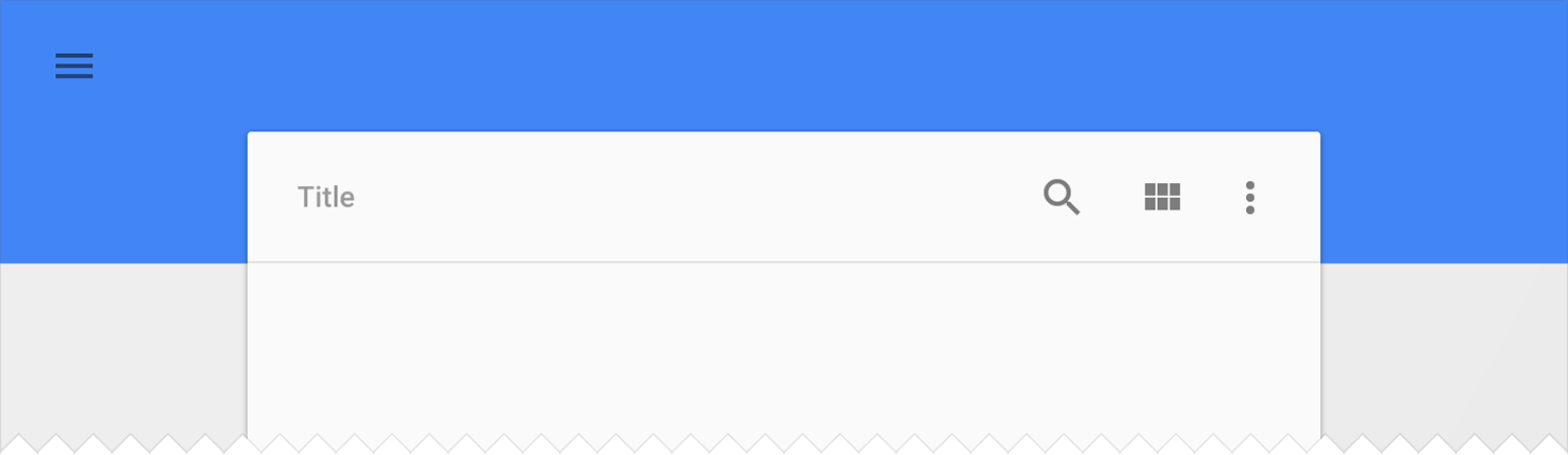
In this release, Android introduces a new Toolbar widget. This is a generalization of the Action Bar pattern that gives you much more control and flexibility. Toolbar is a view in your hierarchy just like any other, making it easier to interleave with the rest of your views, animate it, and react to scroll events. You can also set it as your Activity’s action bar, meaning that your standard options menu actions will be display within it.
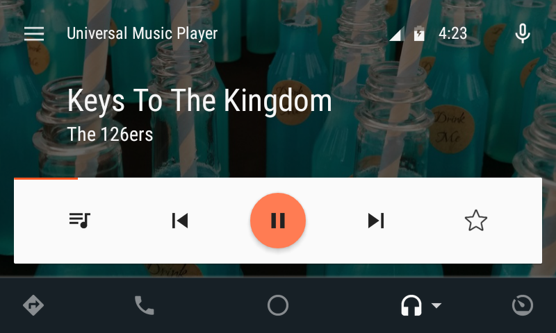
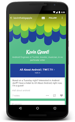
You’ve likely already been using the latest update to AppCompat for a while, it has been included in various Google app updates over the past few weeks, including Play Store and Play Newsstand. It has also been integrated into the Google I/O Android app, pictured above, which is open-source.
Setup
If you’re using Gradle, add appcompat as a dependency in your build.gradle file:
dependencies {
    compile "com.android.support:appcompat-v7:21.0.+"
}
New integration
If you are not currently using AppCompat, or you are starting from scratch, here's how to set it up:
- All of your Activities must extend from ActionBarActivity, which extends from FragmentActivity from the v4 support library, so you can continue to use fragments.
- All of your themes (that want an Action Bar/Toolbar) must inherit from
Theme.AppCompat. There are variants available, including Light and NoActionBar.
- When inflating anything to be displayed on the action bar (such as a
SpinnerAdapter for list navigation in the toolbar), make sure you use the action bar’s themed context, retrieved via getSupportActionBar().getThemedContext().
- You must use the static methods in
MenuItemCompat for any action-related calls on a MenuItem.
For more information, see the Action Bar API guide which is a comprehensive guide on AppCompat.
Migration from previous setup
For most apps, you now only need one theme declaration, in values/:
values/themes.xml:

<style name="Theme.MyTheme" parent="Theme.AppCompat.Light">
    <!-- Set AppCompat’s actionBarStyle -->
    <item name="actionBarStyle">@style/MyActionBarStyle</item>

    <!-- Set AppCompat’s color theming attrs -->
    <item name=”colorPrimary”>@color/my_awesome_red</item>
    <item name=”colorPrimaryDark”>@color/my_awesome_darker_red</item>

    <!-- The rest of your attributes -->
</style>
You can now remove all of your values-v14+ Action Bar styles.
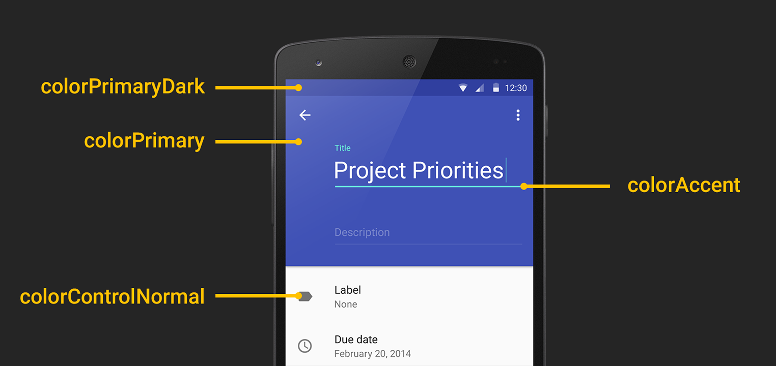
Theming
AppCompat has support for the new color palette theme attributes which allow you to easily customize your theme to fit your brand with primary and accent colors. For example:
values/themes.xml:

<style name="Theme.MyTheme" parent="Theme.AppCompat.Light">
    <!-- colorPrimary is used for the default action bar background -->
    <item name=”colorPrimary”>@color/my_awesome_color</item>

    <!-- colorPrimaryDark is used for the status bar -->
    <item name=”colorPrimaryDark”>@color/my_awesome_darker_color</item>

    <!-- colorAccent is used as the default value for colorControlActivated,
         which is used to tint widgets -->
    <item name=”colorAccent”>@color/accent</item>

    <!-- You can also set colorControlNormal, colorControlActivated
         colorControlHighlight, and colorSwitchThumbNormal. -->

</style>
When you set these attributes, AppCompat automatically propagates their values to the framework attributes on API 21+. This automatically colors the status bar and Overview (Recents) task entry.
On older platforms, AppCompat emulates the color theming where possible. At the moment this is limited to coloring the action bar and some widgets.
Widget tinting
When running on devices with Android 5.0, all of the widgets are tinted using the color theme attributes we just talked about. There are two main features which allow this on Lollipop: drawable tinting, and referencing theme attributes (of the form ?attr/foo) in drawables.
AppCompat provides similar behaviour on earlier versions of Android for a subset of UI widgets:
You don’t need to do anything special to make these work, just use these controls in your layouts as usual and AppCompat will do the rest (with some caveats; see the FAQ below).
Toolbar Widget
Toolbar is fully supported in AppCompat and has feature and API parity with the framework widget. In AppCompat, Toolbar is implemented in the android.support.v7.widget.Toolbar class. There are two ways to use Toolbar:
- Use a
Toolbar as an Action Bar when you want to use the existing Action Bar facilities (such as menu inflation and selection, ActionBarDrawerToggle, and so on) but want to have more control over its appearance.
- Use a standalone
Toolbar when you want to use the pattern in your app for situations that an Action Bar would not support; for example, showing multiple toolbars on the screen, spanning only part of the width, and so on.
Action Bar
To use Toolbar as an Action Bar, first disable the decor-provided Action Bar. The easiest way is to have your theme extend from Theme.AppCompat.NoActionBar (or its light variant).
Second, create a Toolbar instance, usually via your layout XML:
<android.support.v7.widget.Toolbar
    android:id=”@+id/my_awesome_toolbar”
    android:layout_height=”wrap_content”
    android:layout_width=”match_parent”
    android:minHeight=”?attr/actionBarSize”
    android:background=”?attr/colorPrimary” />
The height, width, background, and so on are totally up to you; these are just good examples. As Toolbar is just a ViewGroup, you can style and position it however you want.
Then in your Activity or Fragment, set the Toolbar to act as your Action Bar:
@Override
public void onCreate(Bundle savedInstanceState) {
    super.onCreate(savedInstanceState);
    setContentView(R.layout.blah);

    Toolbar toolbar = (Toolbar) findViewById(R.id.my_awesome_toolbar);
    setSupportActionBar(toolbar);
}
From this point on, all menu items are displayed in your Toolbar, populated via the standard options menu callbacks.
Standalone
The difference in standalone mode is that you do not set the Toolbar to act as your action bar. For this reason, you can use any AppCompat theme and you do not need to disable the decor-provided Action Bar.
In standalone mode, you need to manually populate the Toolbar with content/actions. For instance, if you want it to display actions, you need to inflate a menu into it:
@Override
public void onCreate(Bundle savedInstanceState) {
    super.onCreate(savedInstanceState);
    setContentView(R.layout.blah);

    Toolbar toolbar = (Toolbar) findViewById(R.id.my_awesome_toolbar);

    // Set an OnMenuItemClickListener to handle menu item clicks
    toolbar.setOnMenuItemClickListener(new Toolbar.OnMenuItemClickListener() {
        @Override
        public boolean onMenuItemClick(MenuItem item) {
            // Handle the menu item
            return true;
        }
    });

    // Inflate a menu to be displayed in the toolbar
    toolbar.inflateMenu(R.menu.your_toolbar_menu);
}
There are many other things you can do with Toolbar. For more information, see the Toolbar API reference.
Styling
Styling of Toolbar is done differently to the standard action bar, and is set directly onto the view.
Here's a basic style you should be using when you're using a Toolbar as your action bar:
<android.support.v7.widget.Toolbar
    android:layout_height="wrap_content"
    android:layout_width="match_parent"
    android:minHeight="?attr/actionBarSize"
    app:theme="@style/ThemeOverlay.AppCompat.ActionBar" />
The app:theme declaration will make sure that your text and items are using solid colors (i.e 100% opacity white).
DarkActionBar
You can style Toolbar instances directly using layout attributes. To achieve a Toolbar which looks like 'DarkActionBar' (dark content, light overflow menu), provide the theme and popupTheme attributes:
<android.support.v7.widget.Toolbar
    android:layout_height=”wrap_content”
    android:layout_width=”match_parent”
    android:minHeight=”@dimen/triple_height_toolbar”
    app:theme="@style/ThemeOverlay.AppCompat.Dark.ActionBar"
    app:popupTheme="@style/ThemeOverlay.AppCompat.Light" />
SearchView Widget
AppCompat offers Lollipop’s updated SearchView API, which is far more customizable and styleable (queue the applause). We now use the Lollipop style structure instead of the old searchView* theme attributes.
Here’s how you style SearchView:
values/themes.xml:
<style name=”Theme.MyTheme” parent=”Theme.AppCompat”>
    <item name=”searchViewStyle”>@style/MySearchViewStyle</item>
</style>
<style name=”MySearchViewStyle” parent=”Widget.AppCompat.SearchView”>
    <!-- Background for the search query section (e.g. EditText) -->
    <item name="queryBackground">...</item>
    <!-- Background for the actions section (e.g. voice, submit) -->
    <item name="submitBackground">...</item>
    <!-- Close button icon -->
    <item name="closeIcon">...</item>
    <!-- Search button icon -->
    <item name="searchIcon">...</item>
    <!-- Go/commit button icon -->
    <item name="goIcon">...</item>
    <!-- Voice search button icon -->
    <item name="voiceIcon">...</item>
    <!-- Commit icon shown in the query suggestion row -->
    <item name="commitIcon">...</item>
    <!-- Layout for query suggestion rows -->
    <item name="suggestionRowLayout">...</item>
</style>
You do not need to set all (or any) of these, the defaults will work for the majority of apps.
Toolbar is coming...
Hopefully this post will help you get up and running with AppCompat and let you create some awesome material apps. Let us know in the comments/G+/Twitter if you’re have questions about AppCompat or any of the support libraries, or where we could provide more documentation.
FAQ
- Why is my
EditText (or other widget listed above) not being tinted correctly on my pre-Lollipop device?
The widget tinting in AppCompat works by intercepting any layout inflation and inserting a special tint-aware version of the widget in its place. For most people this will work fine, but I can think of a few scenarios where this won’t work, including:
- You have your own custom version of the widget (i.e. you’ve extended
EditText)
- You are creating the EditText without a LayoutInflater (i.e., calling
new EditText()).
The special tint-aware widgets are currently hidden as they’re an unfinished implementation detail. This may change in the future.
- Why has X widget not been material-styled when running on pre-Lollipop?
- Only some of the most common widgets have been updated so far. There are more coming in future releases of AppCompat.
- Why does my Action Bar have a shadow on Android Lollipop? I’ve set
android:windowContentOverlay to null.
- On Lollipop, the action bar shadow is provided using the new elevation API. To remove it, either call
getSupportActionBar().setElevation(0), or set the elevation attribute in your Action Bar style.
- Why are there no ripples on pre-Lollipop?
- A lot of what allows RippleDrawable to run smoothly is Android 5.0’s new RenderThread. To optimize for performance on previous versions of Android, we've left RippleDrawable out for now.
- How do I use AppCompat with Preferences?
- You can continue to use
PreferenceFragment in your ActionBarActivity when running on an API v11+ device. For devices before that, you will need to provide a normal PreferenceActivity which is not material-styled.


 UIs consist of surfaces (pieces of “digital paper”) arranged at varying elevations, casting shadows on surfaces behind them.

 The “digital ink” you draw on those pieces of digital paper is informed by classic print design, with an emphasis on bold use of color and type, contextual imagery, and structured whitespace.


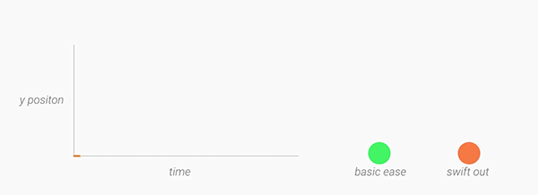
 Motion helps communicate what’s happening in the UI, providing visual continuity across app contexts and states. Motion also adds delight using smaller-scale transitions. Motion isn’t employed simply for motion’s sake.
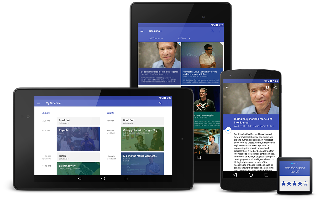
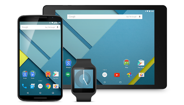
 Tangible surfaces, bold graphic design, and meaningful motion work together to bring a consistent experience across any screen, be it phones, tablets, laptops, desktops, TVs, wearables, or even cars. Additionally, the key UI patterns below help establish a consistent character for the app across devices.


.gif)


