Tag Archives: accessibility
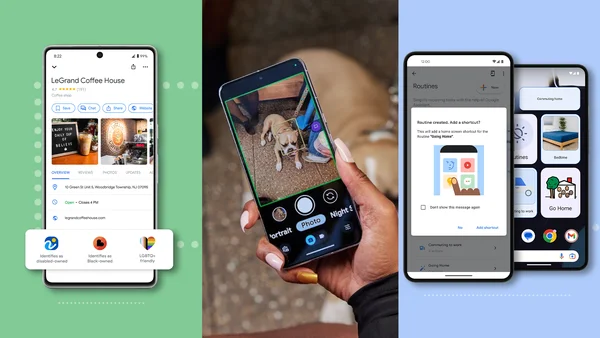
New Chromebooks, features and controls for educators
 We’re announcing new Chromebook models and features coming this year.
Source: The Official Google Blog
New guide to help screen reader users transition from Gmail HTML view to Gmail Standard view
What’s changing
Earlier this year, we informed users that Gmail Basic HTML view for desktop web and mobile web would be disabled starting in early 2024. We know that many users in the accessibility community use Basic HTML view, so today we’re sharing a guide to help screen reader users make the switch from HTML to Standard view. This new guide, along with an existing resource to ensure the best Gmail experience when using a desktop screen reader, should help users get up to speed on Gmail Standard view.
If you haven’t used Standard view recently, you’ll notice we’ve made numerous usability improvements, including enhancements for people that prefer or require the precision of navigating the user interface by keyboard or screen reader. Accessibility of Standard view has significantly improved over the last few years and we’re committed to continuing to improve the accessibility experience and making new features accessible going forward.
Getting started
- Admins: There is no admin control for this feature. You can use Gmail on your browser in Basic HTML view through February 2024. After this, Gmail automatically changes to Standard view.
- End users: Once Basic HTML view is disabled, users will automatically be redirected to the Standard Gmail view which provides the latest in Gmail security and features. Users on old browsers may need to update their browser to use the Standard view. On mobile, users can also download the official Gmail app. Visit the Help Center to learn more about using Gmail with a screen reader.
Rollout pace
- Gmail automatically changes to Standard view starting February 2024. If you prefer, you can switch to Standard view now.
Availability
- This impacts all Google Workspace customers and users with personal Google Accounts
Resources
- Gmail Help: Guide for screen reader users switching from Basic HTML view to Standard view in Gmail
- Gmail Help: Supported browsers - Computer
- Gmail Help: Use the latest version of Gmail in your browser
- Gmail Help: Use Gmail with a screen reader
- Gmail Help: Use Gmail with a screen reader (Basic HTML view)
Source: Google Workspace Updates
Open sourcing Project Guideline: A platform for computer vision accessibility technology

Two years ago we announced Project Guideline, a collaboration between Google Research and Guiding Eyes for the Blind that enabled people with visual impairments (e.g., blindness and low-vision) to walk, jog, and run independently. Using only a Google Pixel phone and headphones, Project Guideline leverages on-device machine learning (ML) to navigate users along outdoor paths marked with a painted line. The technology has been tested all over the world and even demonstrated during the opening ceremony at the Tokyo 2020 Paralympic Games.
Since the original announcement, we set out to improve Project Guideline by embedding new features, such as obstacle detection and advanced path planning, to safely and reliably navigate users through more complex scenarios (such as sharp turns and nearby pedestrians). The early version featured a simple frame-by-frame image segmentation that detected the position of the path line relative to the image frame. This was sufficient for orienting the user to the line, but provided limited information about the surrounding environment. Improving the navigation signals, such as alerts for obstacles and upcoming turns, required a much better understanding and mapping of the users’ environment. To solve these challenges, we built a platform that can be utilized for a variety of spatially-aware applications in the accessibility space and beyond.
Today, we announce the open source release of Project Guideline, making it available for anyone to use to improve upon and build new accessibility experiences. The release includes source code for the core platform, an Android application, pre-trained ML models, and a 3D simulation framework.
System design
The primary use-case is an Android application, however we wanted to be able to run, test, and debug the core logic in a variety of environments in a reproducible way. This led us to design and build the system using C++ for close integration with MediaPipe and other core libraries, while still being able to integrate with Android using the Android NDK.
Under the hood, Project Guideline uses ARCore to estimate the position and orientation of the user as they navigate the course. A segmentation model, built on the DeepLabV3+ framework, processes each camera frame to generate a binary mask of the guideline (see the previous blog post for more details). Points on the segmented guideline are then projected from image-space coordinates onto a world-space ground plane using the camera pose and lens parameters (intrinsics) provided by ARCore. Since each frame contributes a different view of the line, the world-space points are aggregated over multiple frames to build a virtual mapping of the real-world guideline. The system performs piecewise curve approximation of the guideline world-space coordinates to build a spatio-temporally consistent trajectory. This allows refinement of the estimated line as the user progresses along the path.
 |
| Project Guideline builds a 2D map of the guideline, aggregating detected points in each frame (red) to build a stateful representation (blue) as the runner progresses along the path. |
A control system dynamically selects a target point on the line some distance ahead based on the user’s current position, velocity, and direction. An audio feedback signal is then given to the user to adjust their heading to coincide with the upcoming line segment. By using the runner’s velocity vector instead of camera orientation to compute the navigation signal, we eliminate noise caused by irregular camera movements common during running. We can even navigate the user back to the line while it’s out of camera view, for example if the user overshot a turn. This is possible because ARCore continues to track the pose of the camera, which can be compared to the stateful line map inferred from previous camera images.
Project Guideline also includes obstacle detection and avoidance features. An ML model is used to estimate depth from single images. To train this monocular depth model, we used SANPO, a large dataset of outdoor imagery from urban, park, and suburban environments that was curated in-house. The model is capable of detecting the depth of various obstacles, including people, vehicles, posts, and more. The depth maps are converted into 3D point clouds, similar to the line segmentation process, and used to detect the presence of obstacles along the user’s path and then alert the user through an audio signal.
 |
| Using a monocular depth ML model, Project Guideline constructs a 3D point cloud of the environment to detect and alert the user of potential obstacles along the path. |
A low-latency audio system based on the AAudio API was implemented to provide the navigational sounds and cues to the user. Several sound packs are available in Project Guideline, including a spatial sound implementation using the Resonance Audio API. The sound packs were developed by a team of sound researchers and engineers at Google who designed and tested many different sound models. The sounds use a combination of panning, pitch, and spatialization to guide the user along the line. For example, a user veering to the right may hear a beeping sound in the left ear to indicate the line is to the left, with increasing frequency for a larger course correction. If the user veers further, a high-pitched warning sound may be heard to indicate the edge of the path is approaching. In addition, a clear “stop” audio cue is always available in the event the user veers too far from the line, an anomaly is detected, or the system fails to provide a navigational signal.
Project Guideline has been built specifically for Google Pixel phones with the Google Tensor chip. The Google Tensor chip enables the optimized ML models to run on-device with higher performance and lower power consumption. This is critical for providing real-time navigation instructions to the user with minimal delay. On a Pixel 8 there is a 28x latency improvement when running the depth model on the Tensor Processing Unit (TPU) instead of CPU, and 9x improvement compared to GPU.
 |
Testing and simulation
Project Guideline includes a simulator that enables rapid testing and prototyping of the system in a virtual environment. Everything from the ML models to the audio feedback system runs natively within the simulator, giving the full Project Guideline experience without needing all the hardware and physical environment set up.
 |
| Screenshot of Project Guideline simulator. |
Future direction
To launch the technology forward, WearWorks has become an early adopter and teamed up with Project Guideline to integrate their patented haptic navigation experience, utilizing haptic feedback in addition to sound to guide runners. WearWorks has been developing haptics for over 8 years, and previously empowered the first blind marathon runner to complete the NYC Marathon without sighted assistance. We hope that integrations like these will lead to new innovations and make the world a more accessible place.
The Project Guideline team is also working towards removing the painted line completely, using the latest advancements in mobile ML technology, such as the ARCore Scene Semantics API, which can identify sidewalks, buildings, and other objects in outdoor scenes. We invite the accessibility community to build upon and improve this technology while exploring new use cases in other fields.
Acknowledgements
Many people were involved in the development of Project Guideline and the technologies behind it. We’d like to thank Project Guideline team members: Dror Avalon, Phil Bayer, Ryan Burke, Lori Dooley, Song Chun Fan, Matt Hall, Amélie Jean-aimée, Dave Hawkey, Amit Pitaru, Alvin Shi, Mikhail Sirotenko, Sagar Waghmare, John Watkinson, Kimberly Wilber, Matthew Willson, Xuan Yang, Mark Zarich, Steven Clark, Jim Coursey, Josh Ellis, Tom Hoddes, Dick Lyon, Chris Mitchell, Satoru Arao, Yoojin Chung, Joe Fry, Kazuto Furuichi, Ikumi Kobayashi, Kathy Maruyama, Minh Nguyen, Alto Okamura, Yosuke Suzuki, and Bryan Tanaka. Thanks to ARCore contributors: Ryan DuToit, Abhishek Kar, and Eric Turner. Thanks to Alec Go, Jing Li, Liviu Panait, Stefano Pellegrini, Abdullah Rashwan, Lu Wang, Qifei Wang, and Fan Yang for providing ML platform support. We’d also like to thank Hartwig Adam, Tomas Izo, Rahul Sukthankar, Blaise Aguera y Arcas, and Huisheng Wang for their leadership support. Special thanks to our partners Guiding Eyes for the Blind and Achilles International.
Source: Google AI Blog
Enabling large-scale health studies for the research community

As consumer technologies like fitness trackers and mobile phones become more widely used for health-related data collection, so does the opportunity to leverage these data pathways to study and advance our understanding of medical conditions. We have previously touched upon how our work explores the use of this technology within the context of chronic diseases, in particular multiple sclerosis (MS). This effort leverages the FDA MyStudies platform, an open-source platform used to create clinical study apps, that makes it easier for anyone to run their own studies and collect good quality healthcare data, in a trusted and safe way.
Today, we describe the setup that we developed by expanding the FDA MyStudies platform and demonstrate how it can be used to set up a digital health study. We also present our exploratory research study created through this platform, called MS Signals, which consists of a symptom tracking app for MS patients. The goal for this app is twofold: 1) to ensure that the enhancements to the FDA MyStudies platform made for a more streamlined study creation experience; and 2) to understand how new data collection mechanisms can be used to revolutionize patients’ chronic disease management and tracking. We have open sourced our extension to the FDA MyStudies platform under the Apache 2.0 license to provide a resource for the community to build their own studies.
Extending the FDA MyStudies platform
The original FDA MyStudies platform allowed people to configure their own study apps, manage participants, and create separate iOS and Android apps. To simplify the study creation process and ensure increased study engagement, we made a number of accessibility changes. Some of the main improvements include: cross-platform (iOS and Android) app generation through the use of Flutter, an open source framework by Google for building multi-platform applications from a single codebase; a simplified setup, so that users can prototype their study quickly (under a day in most cases); and, most importantly, an emphasis on accessibility so that diverse patient’s voices are heard. The accessibility enhancements include changes to the underlying features of the platform and to the particular study design of the MS Signals study app.
Multi-platform support with rapid prototyping
We decided on the use of Flutter as it would be a single point that would generate both iOS and Android apps in one go, reducing the work required to support multiple platforms. Flutter also provides hot-reloading, which allows developers to build & preview features quickly. The design-system in the app takes advantage of this feature to provide a central point from which the branding & theme of the app can be changed to match the tone of a new study and previewed instantly. The demo environment in the app also utilizes this feature to allow developers to mock and preview questionnaires locally on their machines. In our experience this has been a huge time-saver in A/B testing the UX and the format and wording of questions live with clinicians.
System accessibility enhancements
To improve the accessibility of the platform for more users, we made several usability enhancements:
- Light & dark theme support
- Bold text & variable font-sizes
- High-contrast mode
- Improving user awareness of accessibility settings
Extended exposure to bright light themes can strain the eyes, so supporting dark theme features was necessary to make it easier to use the study app frequently. Some small or light text-elements are illegible to users with vision impairments, so we added 1) bold-text and support for larger font-sizes and 2) high-contrast color-schemes. To ensure that accessibility settings are easy to find, we placed an introductory one-time screen that was presented during the app’s first launch, which would directly take users to their system accessibility settings.
Study accessibility enhancements
To make the study itself easier to interact with and reduce cognitive overload, we made the following changes:
- Clarified the onboarding process
- Improved design for questionnaires
First, we clarified the on-boarding process by presenting users with a list of required steps when they first open the app in order to reduce confusion and participant drop-off.
The original questionnaire design in the app presented each question in a card format, which utilizes part of the screen for shadows and depth effects of the card. In many situations, this is a pleasant aesthetic, but in apps where accessibility is priority, these visual elements restrict the space available on the screen. Thus, when more accessible, larger font-sizes are used there are more frequent word breaks, which reduces readability. We fixed this simply by removing the card design elements and instead using the entire screen, allowing for better visuals with larger font-sizes.
The MS Signals prototype study
To test the usability of these changes, we used our redesigned platform to create a prototype study app called MS Signals, which uses surveys to gather information about a participant’s MS-related symptoms.
 |
| MS Signals app screenshots. |
MS Studies app design
As a first step, before entering any study information, participants are asked to complete an eligibility and study comprehension questionnaire to ensure that they have read through the potentially lengthy terms of study participation. This might include, for example, questions like "In what country is the study available?" or “Can you withdraw from the study?" A section like this is common in most health studies, and it tends to be the first drop-off point for participants.
To minimize study drop-off at this early stage, we kept the eligibility test brief and reflected correct answers for the comprehension test back to the participants. This helps minimize the number of times a user may need to go through the initial eligibility questionnaire and ensures that the important aspects of the study protocol are made clear to them.
After successful enrollment, participants are taken to the main app view, which consists of three pages:
- Activities:
This page lists the questionnaires available to the participant and is where the majority of their time is spent. The questionnaires vary in frequency — some are one-time surveys created to gather medical history, while others are repeated daily, weekly or monthly, depending on the symptom or area they are exploring. For the one-time survey we provide a counter above each question to signal to users how far they have come and how many questions are left, similar to the questionnaire during the eligibility and comprehension step. - Dashboard:
To ensure that participants get something back in return for the information they enter during a study, the Dashboard area presents a summary of their responses in graph or pie chart form. Participants could potentially show this data to their care provider as a summary of their condition over the last 6 months, an improvement over the traditional pen and paper methods that many employ today. - Resources:
A set of useful links, help articles and common questions related to MS.
Questionnaire design
Since needing to frequently input data can lead to cognitive overload, participant drop off, and bad data quality, we reduced the burden in two ways:
- We break down large questionnaires into smaller ones, resulting in 6 daily surveys, containing 3–5 questions each, where each question is multiple choice and related to a single symptom. This way we cover a total of 20 major symptoms, and present them in a similar way to how a clinician would ask these questions in an in-clinic setting.
- We ensure previously entered information is readily available in the app, along with the time of the entry.
In designing the survey content, we collaborated closely with experienced clinicians and researchers to finalize the wording and layout. While studies in this field typically use the Likert scale to gather symptom information, we defined a more intuitive verbose scale to provide better experience for participants tracking their disease and the clinicians or researchers viewing the disease history. For example, in the case of vision issues, rather than asking participants to rate their symptoms on a scale from 1 to 10, we instead present a multiple choice question where we detail common vision problems that they may be experiencing.
This verbose scale helps patients track their symptoms more accurately by including context that helps them more clearly define their symptoms. This approach also allows researchers to answer questions that go beyond symptom correlation. For example, for vision issues, data collected using the verbose scale would reveal to researchers whether nystagmus is more prominent in patients with MS compared to double vision.
 |
| Side-by-side comparison with a Likert scale on the left, and a Verbose scale on the right. |
Focusing on accessibility
Mobile-based studies can often present additional challenges for participants with chronic conditions: the text can be hard to read, the color contrast could make it difficult to see certain bits of information, or it may be challenging to scroll through pages. This may result in participant drop off, which, in turn, could yield a biased dataset if the people who are experiencing more advanced forms of a disease are unable to provide data.
In order to prevent such issues, we include the following accessibility features:
- Throughout, we employ color blind accessible color schemes. This includes improving the contrast between crucial text and important additional information, which might otherwise be presented in a smaller font and a faded text color.
- We reduced the amount of movement required to access crucial controls by placing all buttons close to the bottom of the page and ensuring that pop-ups are controllable from the bottom part of the screen.
To test the accessibility of MS Signals, we collaborated with the National MS Society to recruit participants for a user experience study. For this, a call for participation was sent out by the Society to their members, and 9 respondents were asked to test out the various app flows. The majority indicated that they would like a better way than their current method to track their symptom data, that they considered MS Signals to be a unique and valuable tool that would enhance the accuracy of their symptom tracking, and that they would want to share the dashboard view with their healthcare providers.
Next steps
We want to encourage everyone to make use of the open source platform to start setting up and running their own studies. We are working on creating a set of standard study templates, which would incorporate what we learned from above, and we hope to release those soon. For any issues, comments or questions please check out our resource page.
Source: Google AI Blog
3 ways we work to make Google Play more accessible
 For National Disability Employment Awareness Month, here’s a look at Googlers and the accessibility apps and features they work on for Google Play.
Source: The Official Google Blog
Celebrating accessibility and disability inclusion at Google
 Three Google employees share how their experiences shape their work championing for accessibility.
Source: The Official Google Blog
How AI can make classrooms more accessible
 We recently spoke at the Department of Education about the intersection of accessibility and AI, and how it informs the future of education.
Source: The Official Google Blog
8 ways we’re making daily tasks more accessible
 Today, we’re launching new products and features aimed at making daily tasks more accessible for people with disabilities.
Source: Google LatLong
Project Guideline: Helping blind people run independently
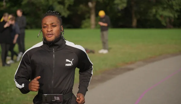 Teaming up with the Paralympic 100 meter champion, Google is testing out ‘Project Guideline’ to support blind people’s ability to move independently.