Since the new Google Fonts directory launched in May, we’ve been hard at work improving the quality of the fonts in our collection. In June we invited a team of typeface designers and font engineers from around the world to our New York City offices to kick off a 4-months font improvement project. Each member of the team was selected for their extensive industry experience in type design or font production:
- Jacques Le Bailly (Latin type designer)
- Lasse Fister (font engineer)
- Marc Foley (font engineer)
- Kalapi Gajjar (Indian type specialist)
- Thomas Jockin (Latin type designer)
- Nhung Nguyen (Vietnamese type specialist)
- Alexei Vanyashin (Cyrillic type specialist)
The team was tasked with improving the quality of fonts in our catalog. During the first week we examined the entire Google Fonts collection to determine the strengths and weaknesses. We considered various possible approaches to improving quality, and at the end of the week we decided to focus on typefaces that were already widely used and had great potential. We divided the project into three sprints.
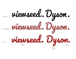
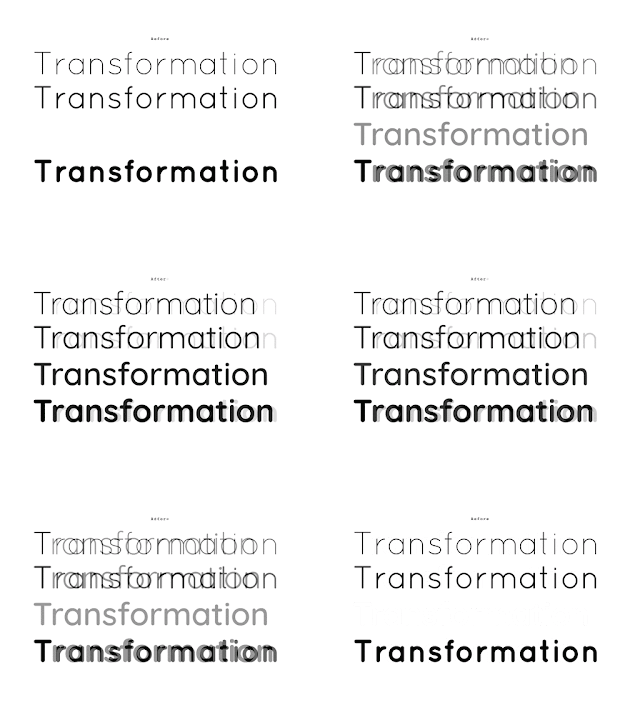
Design work consisted of adding glyphs to support more languages, fixing incorrectly placed or shaped accent marks, re-spacing the type’s metrics and kerning, and in some cases re-drawing the designs from scratch. In each sprint we spent one week on quick improvements to one or two families, and three weeks for a deep dive on a single project.
To ensure we maintained a high standard of work and stayed true to the original intent of each design, our entire design process was done in the open (on GitHub) and was regularly documented in the Google Fonts Discussions Group. For each design, our team critiqued each other’s work, and kept in touch with the original designers whenever possible.
In the coming weeks, our team will push the new versions of these fonts. Updated fonts will appear in the Google Fonts directory, and the new higher quality designs will automatically benefit any site or product that uses the Google Fonts API.
Larger, deep-dive projects:
Alfa Slab One, Cabin + Cabin Condensed, Comfortaa, Didact Gothic, Inconsolata, Jura, Maven Pro, Muli, Nunito (and a new Nunito Sans!), Pacifico, Quicksand, Rubik, VT323.
Smaller projects with wider language support:
Anaheim, Anton, Arvo, Bad Script, Bangers, Bevan, Bitter, Cabin Sketch, Cutive Mono, Dancing Script, Francois One, Homenaje, Indie Flower, Kurale, Lobster, Lora, Marmelad, Metrophobic, Merriweather, Neuton, Oswald, Play, Podkova, Poiret One, Prata, Press Start 2P, Raleway, Rokkit, Ropa Sans, Rubik Mono, Share Tech, Sigmar One, Telex, Trocchi, Varela Round, Yanone Kaffeesatz.
Keep watching this blog for new posts by the team summarizing their type design processes, thoughts and decisions.
Posted by Dave Crossland, Program Manager

