How hot will it be today? What is the traffic for my commute to work? Where’s the nearest grocery store? Every day we use data about the world around us to make decisions. One useful dataset is air pollution data, which contains much-needed information that can help us understand how to live healthier lives, build smarter and more sustainable cities, and reduce climate-changing greenhouse gases in both urban and rural areas.
Mapping air pollution at street level
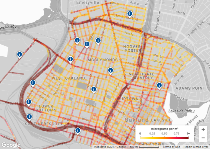
Today, with our partners at Environmental Defense Fund (EDF) and Aclima, we’re sharing the first results of an endeavor we started in 2015: to measure air quality using Aclima equipment mounted on Google Street View cars. You can now see maps for Oakland, CA, released by EDF, of nitric oxide (NO), nitrogen dioxide (NO2) and black carbon—pollutants emitted from cars, trucks and other sources that can affect our health and our climate.
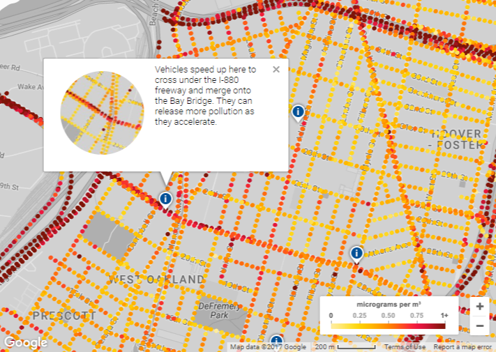
Zooming in, you can see street-level details that show how pollution can change block by block. For example, the area where the Bay Bridge meets the I-80, a major freeway, has sustained higher pollution levels due to vehicles speeding up to cross under I-80 and merge onto the bridge. These insights can help community groups like the West Oakland Environmental Indicators Project get a better understanding of local air quality and assist regulators like the Bay Area Air Quality Management District in identifying opportunities to achieve greater air quality improvements. This kind of information can also be applied to other cities, who are trying to understand local air quality patterns and implement solutions that improve the local environment.
We hope Bay Area residents use this resource to explore air quality in Oakland, and find out how you can do your part to improve it. Scientists can request access to the validated data now. You can also learn more about the science behind these maps in the journal Environmental Science & Technology, authored by a scientific team led by Dr. Joshua Apte, at the University of Texas-Austin.
Today’s news follows our 2014 project with EDF to map methane leaks, and our 2015 announcement with Aclima to map air quality in Los Angeles, San Francisco and the Central Valley communities. We’re excited to share the data that made this science possible with more researchers.
With nearly 3 million measurements and 14,000 miles captured in the course of a year, this is one of the largest air quality datasets ever published, and demonstrates the potential of neighborhood-level air quality mapping. This map makes the invisible, visible, so that we can breathe better and live healthier. It helps us understand how clean (or not clean) our air is, so that we can make changes to improve it.