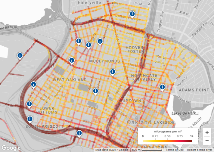
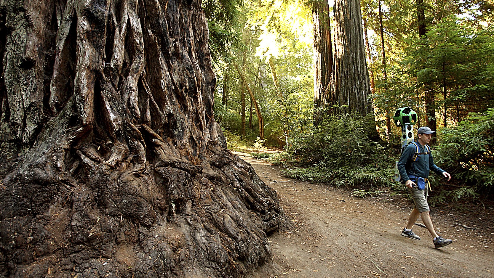
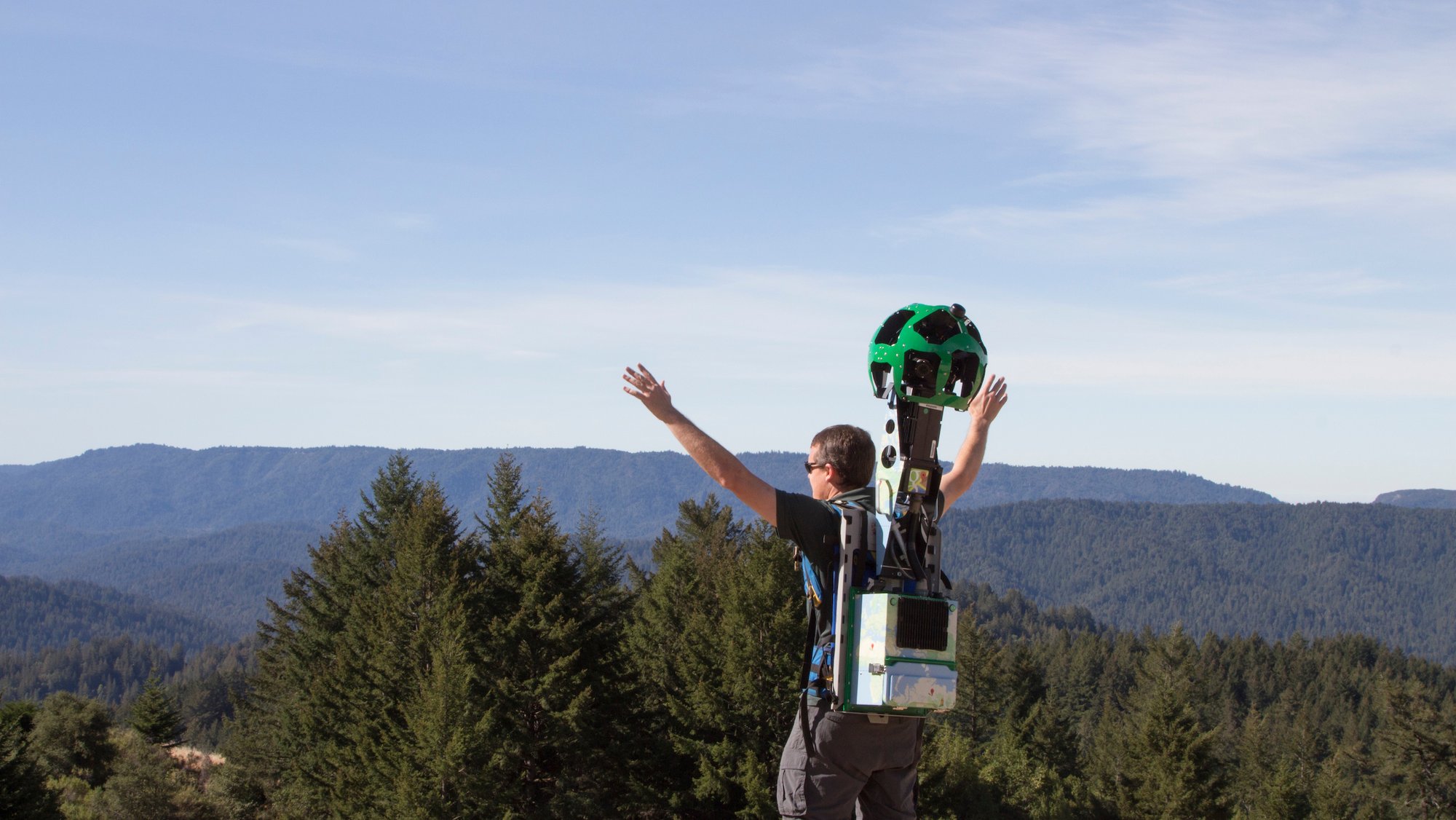
Most air pollution is measured at a city level, but air quality can change block by block, hour by hour and day to day. To better understand air quality on a more local level, we began working with our partner Aclima — to map air pollution across California using Google Street View cars—equipped with air quality sensors. Earlier this year, we shared the the first results of this effort with pollution levels throughout the city of Oakland.
We're just beginning to understand what's possible with this hyper-local information and today, we’re starting to share some of our findings for the three California regions we’ve mapped: the San Francisco Bay Area, Los Angeles, and California’s Central Valley (the Street View cars drove 100,000 miles, over the course of 4,000 hours to collect this data!) Scientists and air quality specialists can use this information to assist local organizations, governments, and regulators in identifying opportunities to achieve greater air quality improvements and solutions.
Over 195 nations will gather in Bonn for the COP23 UN Climate Climate Change conference this week. Rising to the climate challenge will involve a mix of policy, technology and international cooperation and we believe that insights about air quality at the community level can help support both local and global action on climate. Below we’ve highlighted some of our findings for these regions.
Over a three month period, our Street View cars mapped air quality in different areas of Los Angeles, ranging from urban to residential, inland to the Pacific Ocean, and areas near major freeways, ports, or refineries. The measurements indicate that traffic-choked freeways, traffic on local streets, and weather patterns that blow pollution inland all influence the patterns of air pollution.
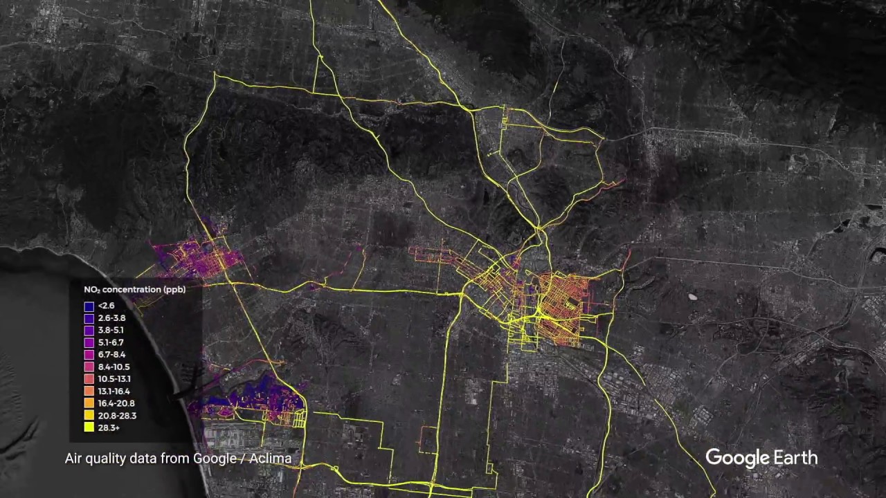
Air quality measurements in Los Angeles region (Landsat / Copernicus, Data SIO, NOAA, U.S. Navy, NGA, GEBCO, IBCAO, Data LDEO-Columbia, NSF, Data USGS, Data CSUMB SFML, CA OPC)
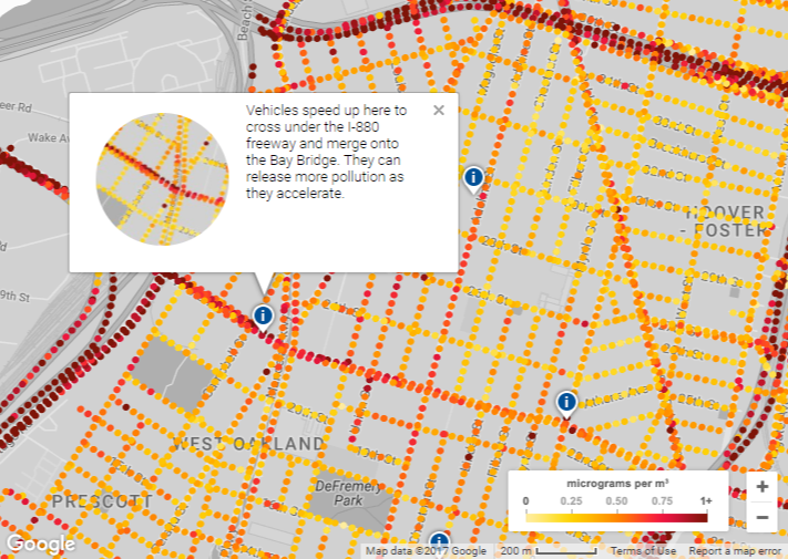
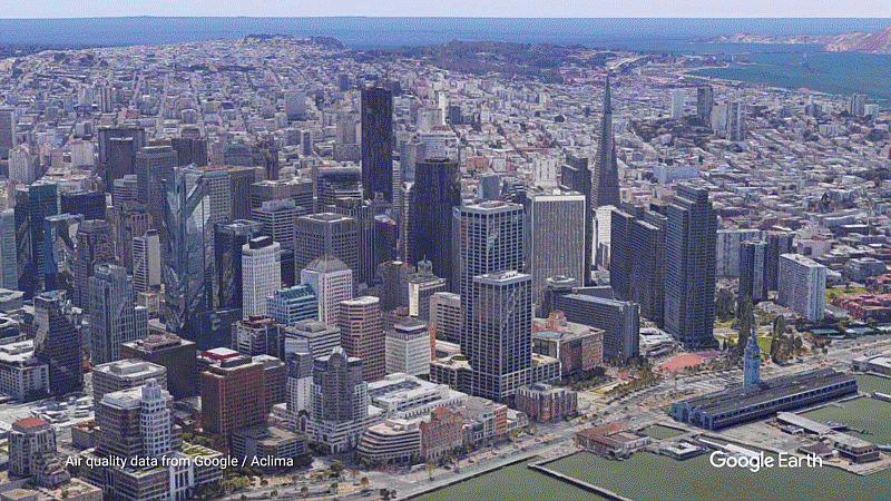
Compared to Los Angeles, the San Francisco Bay Area, which we mapped over the past two years, is a higher density city. A large percentage of air pollution emissions comes from vehicles like cars, trucks, and construction equipment, and industrial sources like refineries and power plants added to the mix. The measurements here indicate street-level pollution patterns are affected by these local and distributed sources.
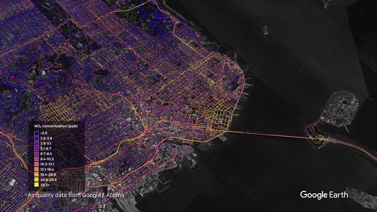
Air quality measurements in the San Francisco Bay Area region (TerraMetrics, Data CSUMB SFML, CA OPC, Data SIO, NOAA, U.S. Navy, NGA, GEBCO, Data LDEO-Columbia, NSF, Data MBARI, Landsat / Copernicus)
While much of California’s Central Valley is rural with a lot of agriculture, it’s also home to cities, such as Fresno, Bakersfield, Stockton, and Modesto. Interstate 5 and Interstate 99 are two major traffic corridors that run through the region, connecting Northern and Southern California. Interstate and regional traffic, along with industry and agriculture, are sources of air pollution in the region. Weather conditions and topography can trap air pollution between the coast and the Sierra Nevada mountains resulting in a chronic ozone and particulate matter levels that exceed public health standards.
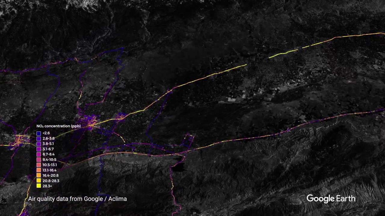
Air quality measurements in California’s Central Valley region (Landsat / Copernicus, Data MBARI, Data SIO, NOAA, U.S. Navy, NGA, GEBCO, Data LDEO-Columbia, NSF, Data CSUMB SFML, CA OPC, Data USGS)
So far, we’ve measured over one billion air quality data points but this is just the beginning—and now air quality scientists can request access to the data. Air quality impacts our planet and our health—and we hope this information helps us build smarter more sustainable cities, reduce climate changing greenhouse gases and improve air quality for healthier living.
Tune in to Aclima’s blog for more data stories from our California driving campaign in the coming days and weeks.